When the page shrinks to one column I need the order to flip on every other pair, so it goes ‘text-image’ every time otherwise it looks odd, like this:
I thought the way to go would be to use ‘.uk-flex-column-reverse’ on the grid, but nothing happens when I do that… Is there a way of forcing the widths to change their order when on small screens?
Thanks folks.
R
p.s. I can do this with ‘Sidebar’ from BWD but would like to implement in UIKit if possible (and I’m sure it will be :-) )
Ah yes… So use the flex stack with cards and don’t even bother with the grid stack… Cheers Neil. I always jump for the grid stack for layout and I probably shouldn’t!
edit: I couldn’t really get that working as the cards won’t stay the size I want… I ended up using Sidebar. Simple and does the job.
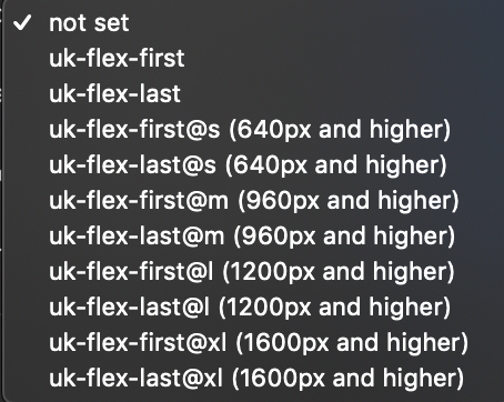
That first grid changes stacking order compared to unstacked. And as Neil says, it’s using the UK-flex-first@x class in the Grid width stack that you want to change the stacking order of.
That’s exactly what I want to achieve and weirdly, that’s exactly how I was doing it but for me it wasn’t working. I added ‘uk-flex-first@s’ but nothing happened… Syntax error??
I will have another go… Must be doing something wrong…