Does anyone know of a Contact Form stack with options for Dark Mode? Or some basic CSS to style a regular contact form to tie in with the source colours. .e.g. var(–accent-color) etc. (so that these will then automatically change to whatever i’ve set in the dark mode stack)
This is well beyond my CSS skills.
I’ve got 90% of my site working in Dark mode, now just trying to workout the contact page.
Jamie, in the main Source stack, try ticking this box that says Style: Forms.
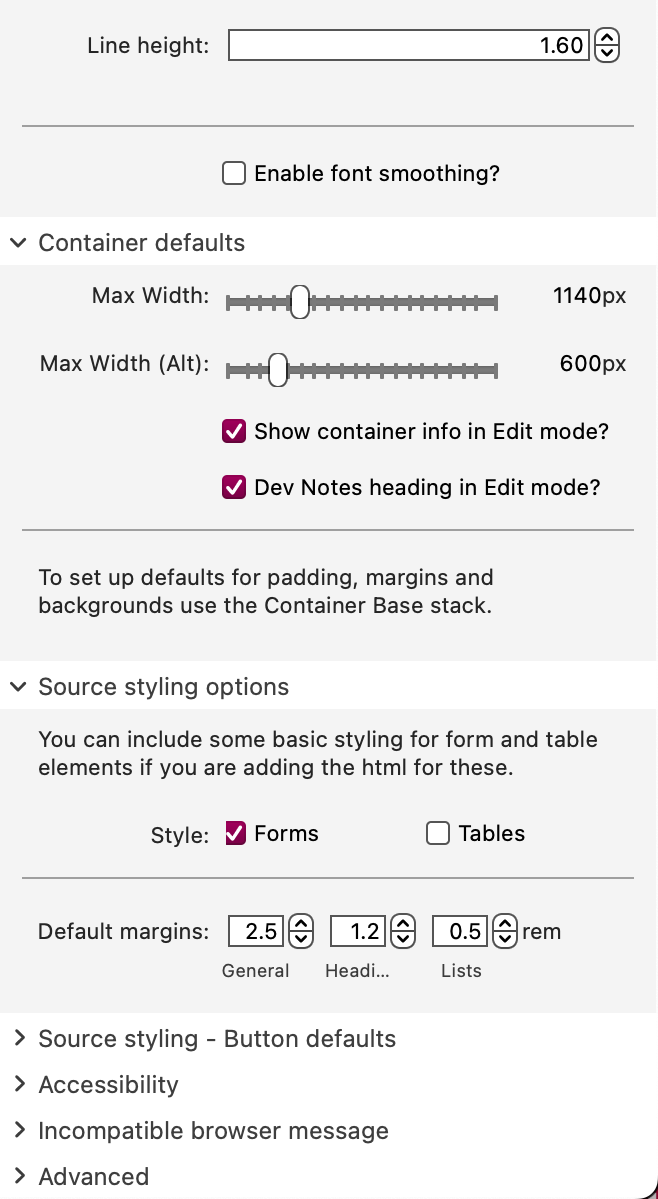
This generates CSS to set the main forms selectors (input, textarea, label etc.) to use Source colors (and fonts). And Source’s Dark Mode picks up on elements using Source colors (which are defined with CSS variables) and automatically replaces them with the appropriate alternative color when in Dark Mode.
2 Likes
What specific form are you using? A link to a page using the form would make this much easier to provide the information you are looking for.
1 Like
Hi @Webdeersign ,
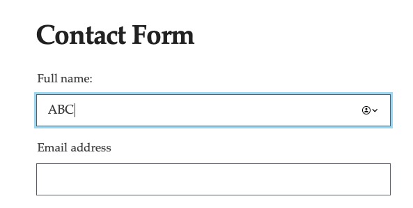
I’m currently using Forms Plus (v.2.2.1) stack by Chillidog. I’ve thrown together a demo page so you can see what I mean + added dark mode stack to show how it looks if your device is set to dark mode.
I just need to get the Chillidog input labels set to the Source Base Colour and I think it will be job done:
https://www.jamesdemosite.co.uk/contact/
Addendum - just thought - also need to get the success message on send (&failed to send message) to link to Source colours
Thanks James. I’ve just tried this but the Form stack I’m using doesn’t respond as has its own colour scheme settings. I’d be happy to go with an alternative Form stack, if there’s one that will tie in with Source Base stack in this way.
Jamie, try pasting this CSS into the (site or page) Code panel, in the CSS section.
button, input[type="submit"], input[type="reset"], input[type="button"] {
     color: var(--text-color-softer)!important;
    border: 1px solid var(--border-color)!important;
   }

button:hover, button:focus, input[type="submit"]:hover, input[type="reset"]:hover, input[type="button"]:hover, button:focus, input[type="submit"]:focus, input[type="reset"]:focus, input[type="button"]:focus {
    color: var(--text-color-normal)!important;
    border-color: var(--text-color-softer)!important;
   }

input[type="email"], input[type="number"], input[type="search"], input[type="text"], input[type="tel"], input[type="url"], input[type="password"], textarea, select {
    background-color: var(--background-color)!important;
    border: 1px solid var(--border-color-softer)!important;
 }

input[type="email"]:focus, input[type="number"]:focus, input[type="search"]:focus, input[type="text"]:focus, input[type="tel"]:focus, input[type="url"]:focus, input[type="password"]:focus, textarea:focus, select:focus {
    border: 1px solid var(--accent-color)!important;
 }
4 Likes
Looks like FormsPlus uses it’s own colours for everything. Therefore, you have quite a bit of work to do to use the Source colours and this will require plenty of testing. However, the colours are all there for youto use within Source.
I don’t use forms anymore and can’t see any reason to do so for simple name and message type contact forms like yours. Over the years I have had plenty of problems with forms and and have used many of the Stacks based ones. Why not use a Contact button linked to a mailto email address and add an obfuscated email address so that visitors can use your email address ihowever they want?
The advantages being that users will use their own email client and they can check their sent message content and date without the issues that web page forms seem to have or the form stack having the ability to pick up the light/mode colours ( or fonts). Just add a button and you would be good to go.
2 Likes
Yes, but presumably FormsPlus uses the standard HTML forms elements (input, textarea, button, form etc.) Therefore it should be possible to override its color definitions by restyling the selectors in CSS. The issue comes down to specificity — presumably the FormsPlus style sheets specify particular Stacks ids, subsidiary classes etc. which will have priority over more generic selectors. That’s why I suggested trying (Stuart’s) CSS with the !important declaration, to see if it will restyle the FormsPlus stuff (which it should). Obviously there are better ways to do this than with the !important rule, but this will be valuable to see where the solution may lie.
Thank you James. This is really helpful + although not all of it worked straight-off - I’ve managed to suss most of it out now by using your CSS. Forms Plus is really similar, but some of the classes are just sightly different.
Thanks for your help, James
Thanks @Webdeersign , makes sense to do it that way + would have been a lot less work. I think i’ve sussed it with the form now though. Best wishes, J
Hey @jamessouttar - I just had another go and got the contact form working really nicely using your CSS. You can see on this demo - if you set your device to darkmode, it looks tidy: https://www.jamesdemosite.co.uk/contact/
Thanks again for your help - this would have taken me ages to work out on my own.
Best wishes, Jamie
Jamie, that looks great. Glad to have been some help!
1 Like
Looking good. I notice that the dark version doesn’t have a focus colour. I.e. the light version has a light blue highlight around the selected field.
1 Like
Well spotted. I’ll tidy that up. Thanks for you help.