I feel like the suburb mechanic neighborg that has every car in shape but his own! I recently was hired to do radio again, and I just dropped stuff on a rapidweaver project, so I was able to let listeners know about topics on air. Now finally I have time to sit down and build a decent website for myself.
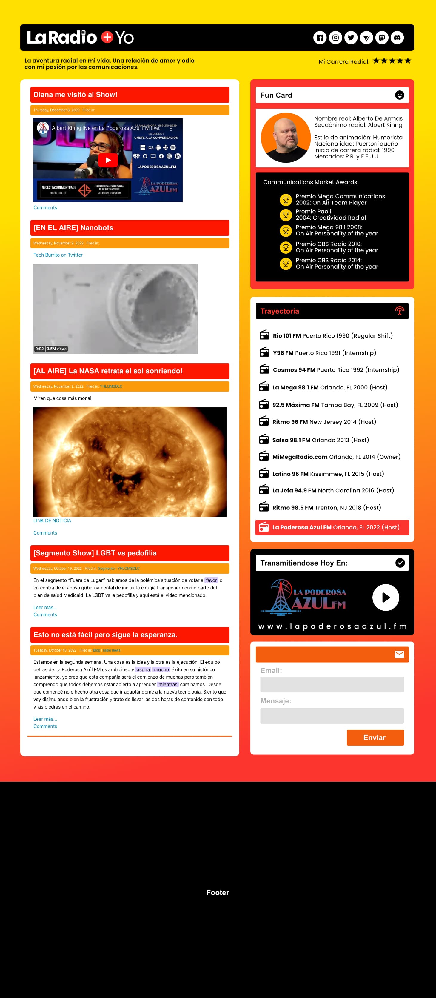
Here’s the one that is live now. (Again, it’s not a real design, basically stacks for a purpose) and this is the design I’m planning to use:
Here’s my question:
Is there a way to achieve this design? It seems simple but what I think will be a very difficult task is with the multiple icons and the cards with different content. If you have any idea on how to do this with specific stacks please let me know. Maybe I am overthinking this too much. I have Foundation 1 and 6 and also lots of stacks from 1 little designer as well. Any advice and suggestions will be great.
Your mockup site looks like it could be built with just Source and you will be able to build a site that achieves 100% Lighthouse PageSpeed by applying good practice. Not sure if the right colum needs to behave as a fixed desktop/iPad sidebar, but again this is simple in Source. No need for any additional stacks that I can see. CSS Grid will build your 4:3 ratio column layout which won’t fit into a 12 column legacy layout. The design is quite cramped so you will need to take advantage of complete flexibility of defining any breakpoint you want and be able to adjust the global responsive padding and margins to maximise the minimal space you will have below about 400px.
You have a white on red button next to the Nav logo, which I suspect has some clickable function. You should really change that for something that has an obvious visual function and maybe move it to the right side. Also all those social icons in the Nav bar are opportunities for the site visitor to leave your site. They may look good but it’s probably better to move them to the bottom of the page, depending on what you are trying to achieve, of course. I also suspect there are many things to click on, so again these will need to as accessible as possible. For example, it is not obvious what is clickable and the titles look like buttons to me. As a “Radio station” you will need to think carefully about Accessibility and should ideally offer a high contract version of the site, using the Source Palette stack.
That would be great. I have Foundation 6 though. I will have a progress update soon. I’m using Foundation 6 and 1LD html stacks to recreate the layout design. Let’s see how it goes.