Font Sizing Fiasco

I have been struggling with this for literally days. There are two problems with this file: one is enormous, and the other greatly annoying.

The enormous one: The page looks just like I want it to at X-large and large sizes. As it gets smaller than that, the font size completely screws up, especially the H1. I have tried dozens and dozens different break points and font size settings. I have tried F6 and now Source. I have tried Font Pro as well as Custom Font. I tried a 70-30 grid and I tried a 60-40 grid. I tried different alignments in the large vs. the small. I tried different vertical heights for the different widths. I even tried putting the whole shebang into a coder stack with w-auto. And all to no avail. I still encounter the same problem, which at the last coder experiment time, worked reasonably well until about 781 pixels. Then things went haywire.

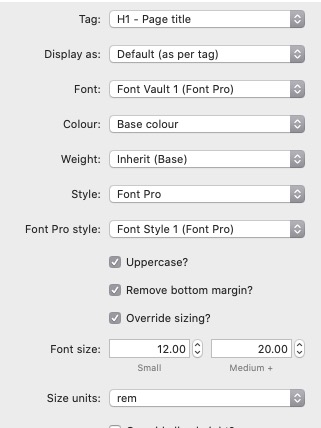
The annoying and possibly greatly aggravating one: both in edit and preview, the H1 (Rouge) is fine, it looks just like that. But the H3 (Bulo, a slim, tall X-height font)) is not the font that I see. What I see looks like the bold default font. I donā€™t understand why one font would show properly and the other one not.

Here is the file: Box

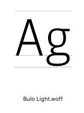
This is Bulo Light, not the short fat chunky font you see in the image below:

Screen Shot 2022-07-27 at 5.32.51 PM

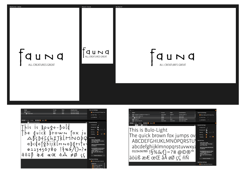
This is the X-large page:

Perhaps there are some intrepid souls out there who can tell me what Iā€™m doing wrong. I know itā€™s a big ask, but Iā€™m literally going crazy.

Update: If I change the weight settings in the Header panel to 300 from the previous Inherit Base, it definitely lightens it up, but itā€™s still the wrong font. Itā€™s still the default, which looks to be Helvetica Neue. I also donā€™t see why I should even have to do that, as the program should be getting all its specs from Font Pro.

Hi,

Sadly, I think you have created the ā€œfiascoā€ by messing around with settings that you havenā€™t grasped. It really is quite easy to create your vision ā€“ and the failure is nothing at all to do with Source or F6 or Font Pro.

Iā€™ve opened your project file and it confirmed my initial diagnosis: bad font files coupled with inexperience.

These screenshots are directly from your project and the fonts you supplied. No wonder youā€™re frustrated!

I am happy to help you (itā€™s very simple) but you must stop blaming the tools and look to yourself if you are to improve your skills. Understand this and all will be well.

2 Likes

Perhaps there are some intrepid souls out there who can tell me what Iā€™m doing wrong

Excuse me, Geoff, I absolutely did not blame anyone at all except myself. I started messing around with settings when the default settings did not work. I listed all the things that I tried because none of them seemed to produce results any better than the default settings. I clearly indicated that there was something I was doing wrong, and never at any point dissed the software.

I would dearly love for you to clarify the problem for me (of particular interest is what you perceive the problem is with the fonts), but if the cost of that is your arrogant and unwarranted character assassination, then quite simply fuggedaboudit.

Exactly.

I reiterate:

Perhaps there are some intrepid souls out there WHO CAN TELL ME WHAT I AM DOING WRONG

And I reiterate:

I absolutely did not blame anyone at all except myself. I started messing around with settings when the default settings did not work. I listed all the things that I tried because none of them seemed to produce results any better than the default settings. I clearly indicated that there was something I was doing wrong, and never at any point dissed the software.

At which point, after three days of complete frustration, I threw myself at the mercy of this forum. Bad idea, apparently, as these grand poobahs of technical prowess seem incapable of reading the English language. Maybe itā€™s a sexist guy thing to attack a woman in this way, I really have no idea.

What I do know is that I asked for help, detailing the mess of solutions I attempted, and I get garbage insults in return. Although dispiriting, that @Geoff responded in his patronizing, abrasive fashion was one thing; that @Webdeersign , with whom I have had many conversations and whose generous support I dearly valued, was quite another. It was shocking.

I repeat ad nauseam:

Perhaps there are some intrepid souls out there WHO CAN TELL ME WHAT I AM DOING WRONG

Do you get it now?

I donā€™t have font pro but it looks like you are just assigning that header to use a Source font (i.e. the Font: Heading font (Source) bit. If you select the font vault of your desired font from that dropdown do you get what you are looking for?

1 Like

This how I set it up. Is there an error here? Or an error somewhere else?

Screen Shot 2022-07-28 at 6.39.03 AM

thatā€™s for your main heading? that looks good to me. it was the h3 one in the initial screenshot that i was meaning - itā€™s not got a font vault assigned.

Yes, you are correct. I changed the H3 setting, and now Bulo (the Font Pro) appears correctly.

And now perhaps you would be kind enough to explain what to do to get both those fonts, but especially the H1, to work at the smaller screen sizes. As I indicated previously, the default settings did not work. I tinkered a little, then I tinkered a lot, because I was having no success.

What was further confusing: your and Joeā€™s base font unit differ (1 vs 1.6) and I was never sure if that was a factor or not. But I did try your font stack alone, without any better result.

The Source Heading stack allows you to override default sizing and to use alternative units - such as vw - it would be worth experimenting using that as it will give you a heading that adapts its size based on the screen width.

I donā€™t know if Font Pro lets you control the sizing? If so then it would be worth attempting something similar with that. (in that case you should turn off the ā€˜override sizingā€™ option in the Source stack.)

Using rem sizing results in a fixed size so that is why you are seeing it make the heading wider than the screen at some screen widths.

A couple of more questions, if I mayā€¦

ONE:

These are Joeā€™s unit choices:
Screen Shot 2022-07-28 at 7.25.37 AM

These are yours:
Screen Shot 2022-07-28 at 7.32.08 AM

Do you think % and VW are the same measurement?

TWO:

Your default breakpoints of choice are 600, 900, 1200.
Joeā€™s are 414, 768, 1000

Both you and he allow the user to change those settings. Obviously we have no idea what Joeā€™s thinking is, but might you explain the rationale behind yours. Also, is it worth tinkering with those numbers, or is that the path of last resort?

No. % is a % of the parent font size.

These are fixed in most of my stacks (and Foundation too). In Source I think itā€™s only my grid stacks where the user can define what breakpoint the layouts get altered. All the underlying css though for most things is applied at those fixed breakpoints.

I seldom use anything but them - even in the grid stacks - as I think they work well. It was this guide that I used when choosing them

That was a very interesting article. And quite hilarious.

For the record, Font Pro does allow you to change breakpoints:

Thank you, Stuart, for your support.

These days I prefer vw, viewport width, units for font sizes (usually added to fixed sizes, and clamped at the upper and lower ends). This ensures a smooth gradation of responsive sizing between mobile and desktop without needing a special stack to manage it. With headings, you can often get away with just using vw units, as they will ensure that the heading size is proportional to the width of the screen. It may seem counter-intuitive to use a width measure to determine the height of an element (in this case, type), but vw and vh units really have very different functions: vw units make sure everything is proportional to the screen size while vh units come into their own for determining the depth of containers or panels on the screen.

1 Like

So interesting, thank you. But wondering what you mean by ā€œclamped at the upper and lower endsā€. How do you do that?

Actually, I know what you mean. So the question is how.

The css clamp function can be used in many stacks as a value, including much of Source. Or it can be put into a stylesheet. The middle value needs to be a variable unit, though, otherwise it doesnā€™t make sense. For example:

clamp(14px, 4vw, 42px)

This will make the size 4vw until the viewport shrinks to 350px, where it fixes at 14px, or it becomes wider than 1050px, where it fixes at 42px. In between youā€™ll have a smooth increase, as the value of 4vw increases from 14px to 42px with the width of the viewport.

3 Likes

The CSS clamp looks to be wonderful solution. Its implementation is a little unclear, though.

I presume you create your header normally. If you use a webfont, you would use Stuartā€™s custom font stack.

Then, I presume you click ā€œoverride sizingā€ in the header stack.

So far, so good?

Then, because your CSS code contains both pixel and VW designations, would you click vw or px in the size unit box?

Then where to place the code? The header stack has a CSS box, which seems an obvious choice, but if you are using a self-hosted font as I am, and tend to do, the custom font stack has a box labelled ā€œassign to classā€. Which one would you use?

Thanks.

The main Source stack doesnā€™t let you specify the units for font-size (but with so many different kinds of units now, and more on the horizon with container queries, it would be nice if stacks-makers allowed us to put both values and units into the boxes).

For some time Iā€™ve thought about making a stack just for setting up typographic style sheets. But, in fact, I prefer to do this in the ā€˜Codeā€™ panel, where I can easily access it. CSS type specifications are pretty straightforward, too. Thus for each of h1, h2, h3, h4, h5, h6, p, ul etc. Iā€™ll redefine the font-size, line-height, color, wordspacing and letterspacing, margin (to get ā€˜space beforeā€™ and ā€˜space afterā€™, as well as indents if necessary) etc. as these can all be treated as paragraph styles (they are ā€˜block-levelā€™ elements). Other styles ā€” i (and ā€˜emā€™), b (and ā€˜strongā€™) and a ā€” are the equivalent of character elements in a page layout program, as they are all ā€˜inlineā€™ elements.

Thus, for example (itā€™s notional, because that 14-42 px range is a bit extreme):

h3 {
font-size: clamp(14px, 4vw, 42px);
line-height: clamp(18px, 5vw, 52px);
color:var(--text-color-normal);
margin:clamp(18px, 5vw, 52px) 0px clamp(9px, 2.5vw, 26px) 0px;
}

or, better, using Sourceā€™s 10px rems

h3 {
font-size: clamp(1.4rem, 4vw, 4.2rem);
line-height: clamp(1.8rem, 5vw, 5.2rem);
color:var(--text-color-normal);
margin:clamp(1.8rem, 5vw, 5.2rem) 0rem clamp(0.9rem, 2.5vw, 2.6rem) 0rem;
}

(The color is calling on the color set up in Sourceā€™s main settings, but Iā€™d usually set up the other settings as variables too. Margin is specifying one full line above and half a line below, for a typical subhead).

1 Like

Wow. Iā€™m in awe. Thank you so much.