In the past I used to save desktop header images at roughly 2500px wide and 1500px high, thinking that was fine, but recently I picked up a bigger 32" display and find myself opening the browser window wider than before. Some of those older image then look cropped and not always in a good way.
The obvious battle here is with quality and appearance vs weight and page loading speed. I’m just curious what widths you are all using these days for larger desktop images.
Still sticking at about 1500-2000 for desktop. Yes, BIG screens are getting popular amongst a certain section of users, but of those, few run browsers edge to edge, and the vast majority are using way smaller screens.
Reality is, depending on your market, the shift to smaller screens is far faster than to larger.
By the way, if the image isn’t crisp or has an overlay I go 1500, otherwise 2000.
Without doubt the move towards mobile is faster, but I think it’s easy to forget there is also movement at the other end. Much like TVs, the big computer displays no longer necessarily cost a fortune and if you have the desk space it’s massively easier to work.
The first inkling I had that this may be a problem came unsurprisingly when a client mentioned an image being cropped vertically when I was working on a draft and yes he did have the browser wide open. Then another one said something about an image of a computer on my website being cropped and he assumed this was an odd creative choice.
After I picked up this bigger display I looked at my old photography site and discovered the header image of a model was practically cut in half with the browser open a little wider than previously. If you want to think about bigger screens you have to pick your images more carefully and allow more open space around the main subject, both vertically and horizontally to have a safety margin.
I’ve actually come across a similar problem with page length, having found one or two pages without lots of text that suddenly have a footer floating above a white void. I think I need to look at some css ‘*vh’ to fix this.
I tend to mainly make/manage websites that are consumer facing, so my stats are very heavy towards mobile, so I design accordingly. But, my clients, I suspect everyones clients, almost all view on desktop, so they get a very skewed view of their site. I don’t think I’ve ever built a corporate site, if I did, desktop would be my focus. At the end of the day you have to build for the audience, not the client (who are almost always wrong).
This is definitely a common problem as the range of device sizes (and resolutions) is ever increasing. It’s impossible to use a single image (or even 2 images) and have it display exactly as you want on every screen. It’s especially a problem, as you say, in header/banner images which are typically 100% screen width on all devices, whether that is 320px on a mobile device in portrait orientation to (e.g) 3500px on a wide screen monitor.
Here is a good article about the issue and that highlights a few approaches to overcoming it in your web design projects.
And for info, I created a stack (Srcerer) that offers a solution to this problem using two of the methods described in the article (Resolution switching: Different sizes and Art Direction).
I think if you are worried about large screens then you need to design for large screens by not using full width images at normal resolution. One way to do this is to blur the image at large screens which will allow a non sharp image to become more of a background texture and allow the content to “pop” more. Or add a gaussian blur to a small version of the image in your graphics app and load this for large screen sizes, this will hugely reduce the kb size of an image. Even better is to use scalable patterns, tiles, etc. If you use scalable text with Billboard then the text can become the main point of focus.
One good thing that gets better every day, is that those who have large screens are very likely to have fast internet access.
On small screens there is no background image, but a colour.
Perhaps I’m a bit outdated/old skool in my thinking on this, but for really small screens (phones) I still take the approach of removing all images/content/effects that are not absolutely necessary. My thinking being that when someone is on their phone they want want the info, they are not interested in fancy website shnizzle.
For instance my wife uses her phone for everything. We were booking accom this morning for some trips this year and she’s on her phone, I’m next to her on a 17in MBP. She is getting all the info I see but without the distractions. When she looks at my screen she says it’s terrible, as you have to hunt around for the prices, on her phone, it’s pretty much just the prices on the screen.
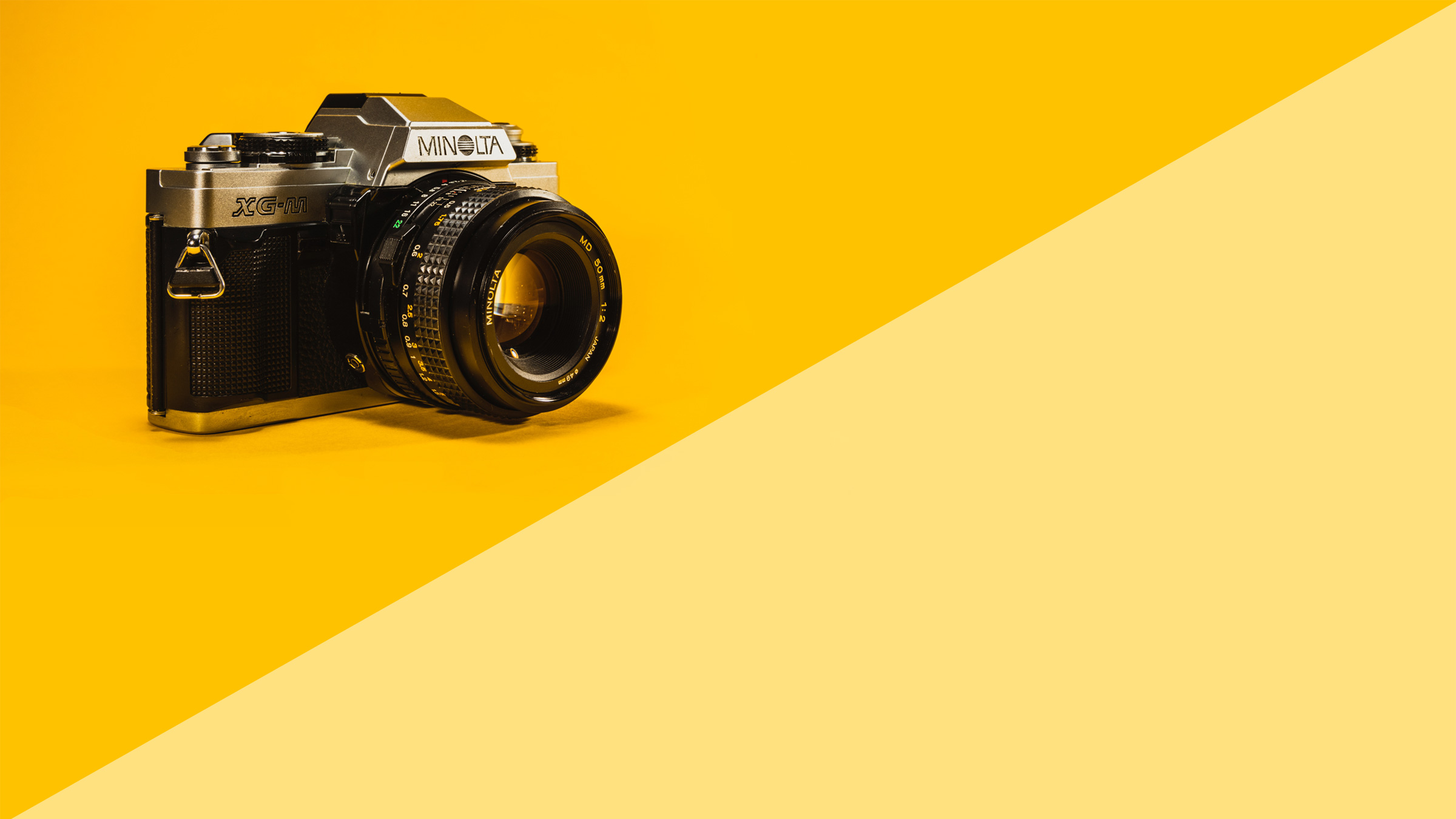
I would say that picture of a £5 boot sale crappy (now) camera is redundant and just slows the page down. You could just use a texture or pattern or colour for the BG. It’s not like the camera informs you that the pictures below are actually photographs taken on a camera as opposed to brass rubbings or effigies visible in slices of toast.
I do too. Not so happy when I find all my old cameras up in the attic, are now rusty and mirror mechanisms stuck or when I hear about them in boot sales for £5.
Camera equipment is frequently awful for depreciation, as I know only too well and everything has changed with digital. I think a lot of modern cameras also have built in obsolescence at a mechanical level with no option to repair after a few years when something fails.
I’ve been giving this some thought and I’m not sure this is really a problem of saving the image at 2500px or 3500px. The bigger issue is choosing the right image with enough flexibility, which essentially means a lot of space around the central subject, so you can easily crop at almost any point.
In terms of file size, large desktop images can become huge, even when heavily optimised. This is especially true if they are highly detailed or noisy, let alone including film grain. Obviously a fast server helps, but I invariably create separate versions for mobile and tablet as well. For image compression I’ve always saved for web using Photoshop, but have to admit ImageOptim has improved greatly and it saves a lot of time.
On the website with the image of a model lying on a beach, I eventually lost patience and replaced it with an image of an eye. This was originally cropped vertically, so I ended up having to extend the skin area around the eye in Photoshop considerably. You have to pick your images carefully, but it’s obviously easier to test if you have a large display.