Some time ago I bought a Nick Cates theme for a dear friend of mine, now that I know that support for Nick Cates themes has ended I would not like that following updates to the operating system or RW or other stacks, the theme purchased may have problems.
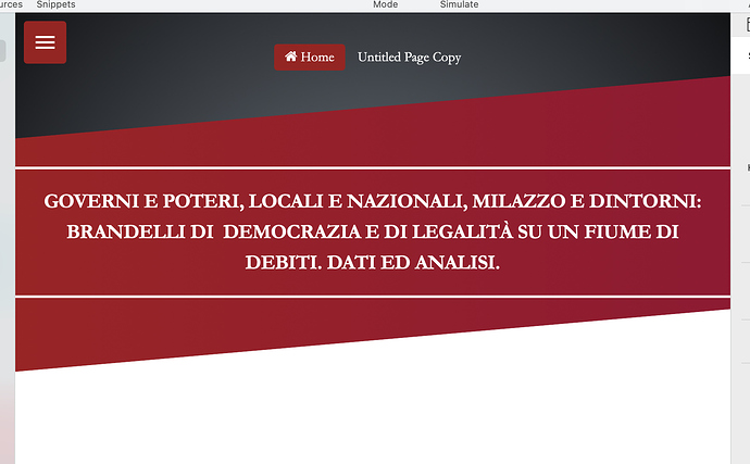
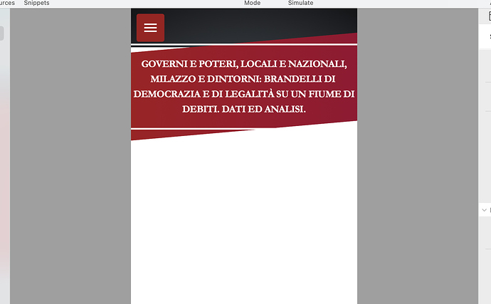
I would like to reproduce the theme graphics in Source, but I don’t understand how I could reproduce the black radial and red radial bar of the oblique head.
I tried the BWD stacks, but only messed up.
Can anyone give me advice or help me?
Thanks.
This is the website link for the graphics.
https://santamondellolibera.info/blog/
https://santamondellolibera.info
Thanks.
Looking at it on mobile, it appears extremely easy to do. I’m sure others will step in sooner, but I’d be happy to produce that effect for you can share it, only it won’t be until next week.
Here are the gradients and angles
https://apex.d.pr/pxGq7L
P.S. If you get a message about the Stacks version just click the “Later” button and it will open normally. This is just due to using the beta version of Stacks.
Thanks Tav, you are always very helpful, I had also tried in this way, unfortunately my problem is in the display from desktop to mobile, or by enlarging the browser, everything is moved and confused. I can’t keep the display between desktop and mobile correctly.
Maybe I should leave the Marvel theme, even having no more support from Nick, maybe there will be no problems in the future.
I would not like to change the graphics of the site much, also because my friend likes it very much, dark and red as blood (the site talks about many bad things that happen in Italy).
… then I should also think in the home how to insert the video made with imovie, inserting it is easy, but the problem is also positioning it in that way, even with the shadows … maybe it’s too much for me.
Then below is Poster2 just copy and paste the stack.
I could use your Bevel … but I would lose the radial colors …
Complicated.
Sticking with a cates theme? Kicking the can down the road. Sooner or later it’s going to fall over, and sure as poo smells it’ll be when you have the least time to fix things.
Once a dev moves on it’s always best to move away from their products asap, in your own time.
If you are going to use Source, which is what I take from the subject line, why not rebuild using one of @habitualshaker pre-built projects? https://source.shakingthehabitual.com/projects/
For what it’s worth, and I know you didn’t ask, but the present design feels very dated to me, so perhaps a rebuild is timely.
Ciao, , thanks Steve, unfortunately it is this dated style that my friend likes (she is a very old lady). I had already tried to do something else with Source, but unfortunately he doesn’t want to change the style, he also told me that if something is old it must be thrown away? … I think it was jokingly an illusion at his age :-) .
I would really like to find a solution with source, even paying the cost of who helps me or creates a template in source.
I am very fond of this lady (She has always wanted to be able to write her ideas on a blog, and this is her first time on the internet) and treats her blog like a jealous relic.
You could recreate the look in Source no bother. What I’m saying is that sooner or later a change of theme is going to be forced on you, so better to manage that change, instead of fire fighting it when it happens.
I’m sure there are more than a few people who will build you a source project to match, specially if you are willing to pay. Maybe put the shout out for that?
You would be able to achieve that using the BWD stacks for sure. May just take a bit of trial and error to get it working for you at all breakpoints.
I actually have a project file that I started a while ago (called ‘Skewed’) that does this kind of thing. I’ll pull it back out and see if I can make it the next project that I release.
You are absolutely right, thanks.
Yes, I’m aways right.
;-)
Thanks, I’m looking forward to seeing your project to try and adapt it to this style.
Thanks again, can’t wait for it to come out to buy it.
Thanks.
It just needs the padding set to a percentage rather than pixels - I just set the desktop to the same as the original theme and left the mobile settings.
Setting them both to a percentage is how I would normally do it - an here it is working like that
wow Thanks, as soon as I finish working I try to insert the video for the home and prepare a template for all the other pages.
For the video I will use SectionsPro.
Thank you very much.
You are always very helpful.
I will definitely bother you again to help me.
Thanks, as soon as I get off work I do some tests.
For the menu I could use ButtonPlus 2, or the Source menu (but I should figure out how to increase the size of the fonts in the menu … at least I use css … then let’s see).
Thanks again, ciao.
I would use the Source Menu in preference to using ButtonPlus.
You could then do the slide in side thing with Limelight and the Limelight Menu button.
… now I have some doubts in inserting the video correctly as if it were a screen, perhaps it is more difficult than I think to respect the graphics. As soon as I get back from work I do some tests, let’s see if I can. Thanks again.
as soon as I can insert the video correctly, I also try Limelight, thanks.
Here is the video inserted, the link just points to the video on your existing site
great, thank you, thank you, thank you.
More improvements: Max width on the video as per the original and correct dark gradient colours:
Perfect, even better than the original.
Thanks Tav.
As soon as possible I try to insert the menu trying to make it similar.
Thanks again, you are the best.

