I need some help: I have a blog which I am writing in Source with Poster 2. I very much prefer using a Markdown folder in Poster 2, rather than having “items” within the RW file. I find using the usual “items” method unwieldly for me.
However, I have run into a problem when embedding Youtube videos: I should like to limit the videos to a max width of 700px, since I find full container width too big on a desktop computer (although great on a mobile).
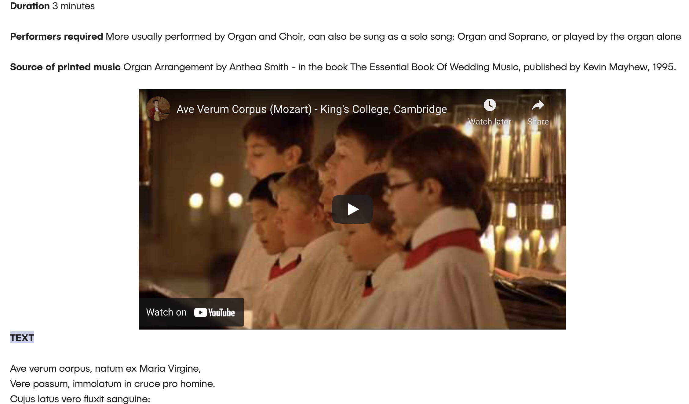
As an example, here is a page with the item in the Poster 2 stack. I put the video in a Source Container and limited the width to 700px: Ave Verum Corpus
Here is the same page in markdown using a Markdown folder: Ave Verum Corpus
(I have set allowfullscreen=“0” in the YouTube embed code.)
There are many solutions to this problem online, most of them involving some CSS or JS, which I am not very familiar with. I feel I have tried all of them: after two hours this morning, I realise that I am out of my depth and need advice.
Jannis - many thanks. Good point. In fact, I had responsive video enabled - so the videos shrink on a mobile (good), but they also grow to fill the full width on a desktop (which I don’t want).
Gary - that very nearly works. Brilliant. The only thing is that the aspect ratio of the video is not preserved, so that I get black bands above and below the video. See this link: Ave Verum Corpus.
One of the online solutions I looked at was this one, which I almost understand, but I can’t make it work. Or perhaps there is a solution with reframe or noframe, which I don’t even pretend to understand. Thank you for offering your time and expertise.
@jamessouttar - many thanks for the suggestion. It doesn’t work for me, but maybe there is something in adding aspect-ratio to the js-reframe.
The problem for me is that there are too many variables I don’t understand:
Add code to stack? Add code to page? Add code to site?
Add Source jsquery stack to page, or not?
Fiddle with YouTube embed code, or not?
etc.
@Webdeersign - thanks for reminder to post the page. The url is unchanged:
@tav Thanks for the warning - at this stage, I would probably settle for the YouTube videos scaling properly in Chrome and Edge, and put up with the black bands on other browsers. Black bands aren’t the end of the world, after all, they just don’t look tiday. I have checked in Chrome, and the aspect-ratio solution isn’t working for me. Usually I use Brave, which I think is basically Chrome.
Many thanks for all of you for adding to the discussion.
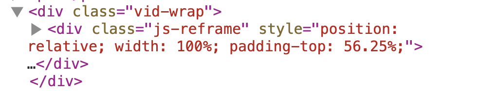
I don’t know the mechanics of how you are embedding the video but the solution is that you need another wrapper div around the js-reframe div. If you are entering the post as markdown then this is going to be trivial.
You need to apply the max-width to this wrapper div while removing the max-width and auto margins from js-reframe
@fergus I’ll also give you a second option if you want, this will mean you don’t need to change the markup if you don’t want to. Its more CSS but now you have 2 ways to do it.
@tav - many thanks for these solutions. As you might have gathered, I am a little bit out of my depth here. I laughed out loud at your description of the solution as ‘trivial’ :-) , thinking ‘Not for me, it isn’t!’
Can you please give me the afternoon? I’ll go through these and come back to you if I may.
@fergus in that case option 2 is probably the best for you. Just use that CSS and get rid of the other that you added.
Just to be more descriptive and because I wasn’t sure how you were adding the video embed, if you were using markdown then all you would need to do is to type
<div class="vid-wrap">
before your embed code and then simply
</div> immediately after it.
That would allow you to use the markup solution and just the 3 lines of CSS code.
@tav option 2 works for me. I’ve tested it with MAMP on three browsers. It didn’t seem to make any difference whether I posted the CSS site-wide, or on the page. I tried both.
Thanks for the latest advice on option 1 - I am using Markdown files, and I will investigate Option 1 as well. “Every day is a school day”.
Now I know that it is possible to have the video rescale, I have about 60 files to process, so it may take me a while to get them sorted out. I’ll re-post when I have a presentable site to look at.
I should also clarify that I used trivial in the mathematical / scientific sense - sorry. It was intended to mean that this is the simplest case / technical solution. Trivial does not mean that it is “easy” if you don’t understand it and it certainly wasn’t intended in that way.
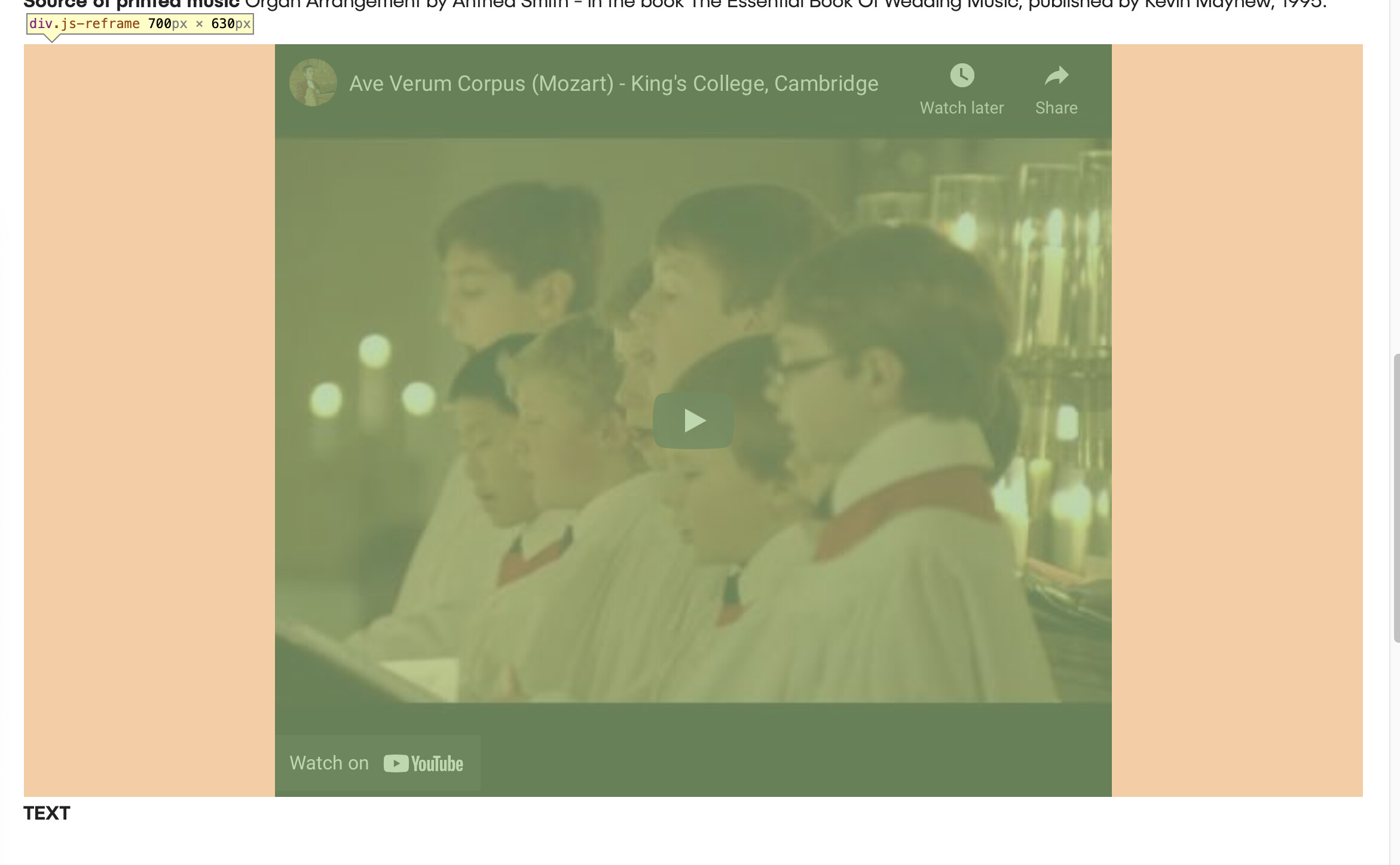
Just by way of a bit of explanation why the first solution didn’t work - feel free to stop reading if you are already interminably bored :)
The margins that are added when we apply a width or a max-width still count as part of the width of the element for the padding calculation.
We therefore add a padding-top of 56.25% ( which makes the height 56.25% of the width or 9/16ths to give us our 16:9 movie aspect ratio) and expect the video to be that aspect ratio. It is not because the margins are included and so the video plus the margins are 16:9 which is not what we want.
Here it is with the margins highlighted in orange - you can see now that it is indeed 16:9 and the code is working, just not as we expect.
The first solution applies the width and margins to another container on the outside so that the video container div can behave as we expect.
The second solution is a bit more technical and just creates a CSS generated element (a pseudo element) to which we apply the padding. This gives us our size on the video container without the padding being applied to the element with the restricted width and margins.
@tav Many thanks again - I did take trivial in the maths sense. It still made me laugh though. In the meantime, I have visited BWD and made a small donation by way to thanking you for your time and expertise