It will be with proportional height / content control. The learn sections demo project has example pages of how to use this with borders as by necessity the height has to be applied to the inner content in order to measure the overflow conditions.
Interestingly, it was that requirement that erroneously lead to the height being applied where it was in the new version as things were transposed across.
Thanks to this thread I have now fixed that before release so the box model is obeyed.
Looking great. If you make the topbar and borders proportional to height you won’t have to kill the border on mobile except for landscape small mobiles where you could maybe move the burger onto the image. I think it would be a shame to lose that beautiful white border which works so well on mobile.
@tav@habitualshaker Very informative discussion and a reminder about some of this more comlpex stuff. It seems a long time (maybe about 5 years) since someone asked the question about how to create a Hero image on the old Google forum. Then demanding web layout agnostic idiots like me started asking about adding centred text and how can stuff be pinned to the bottom, auto scaling text, etc… Good times.
Honestly, the way borders and box-sizing behaves should not be seen as complex, it is trivial and the basis of all web layout.
Just for reference for people reading this thread who may have lost the plot (in a different way than I have!) then there are two very simple solutions:
Either put the border and the height on the same div and set the box-sizing to border-box
If you need to use a height on an inner div then just apply the same height as a max-height to the outer div that has the border on it.
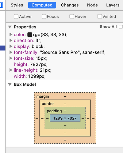
Don’t forget that this is always shown schematically in the browser inspector for reference if you forget
@Webdeersign Thanks Gary. :) To be true I have absolutely no idea how to make the topbar and borders proportional to height. I have now temporarily turned on again the border for mobile. As you see it’s a bit massive on mobile, but I can set the border thickness in pixels, rem or em, not in percent…
I believe you are using F6 which I don’t use, but the Source solution would be to add 2vh to the Container Base Margin Advanced settings for all 4 breakpoints and 0 for the top margin, set nav to transparent and add .nav-content {height: 10vh}. Then adjust 10vh to whatever “border” size you want, and then deduct this from the 100vh and use for page height, i.e. 90vh in this example. You should enable Flexbox centre on the nav Container. Then on the smallest screen you will still see a perfectly proportioned white “border”.
The trick here is to use a margin as the “border” because the margin will show the underlying white page and mimic a border. With some trial and error values for the 2vh and the nav text size, you should be able to find suitable values (use more decimal places for the vh if needed). I think this will get you very close if not perfectly close. Also note that the original site doesn’t use a nav bar and instead has just a centred burger and 2 small text links. Your solution has added the complexity of the nav bar.