John Gruber - a man of taste and common sense.
So far I’ve only heard of two people who actively like the new UI changes, lets hope majority opinion wins the day in the long term.
John Gruber - a man of taste and common sense.
So far I’ve only heard of two people who actively like the new UI changes, lets hope majority opinion wins the day in the long term.
This thread I started is not really about whether new IOS and macOS Safari changes are good or bad, but just about being aware of them and how to use them to your advantage should you choose to do so.
There are a couple of things that Mr Gruber is not correct on according to what I see.
The “coloring the entire window with the accent color of the currently frontmost web page” does not appear to happen on Safari 15 in Catalina, and I don’t agree that the accent colour is being used for the Safari window BG, although he may mean somthing else by accent.
What I am seeing is that either:
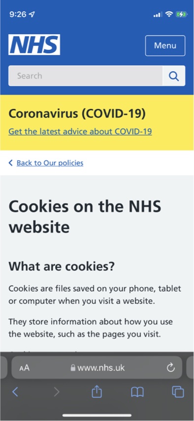
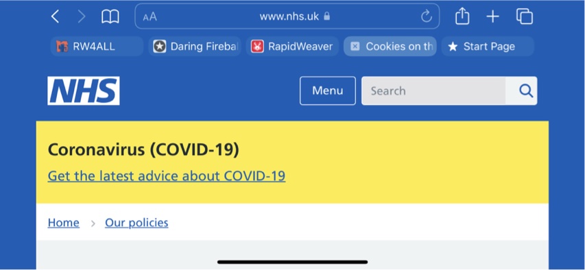
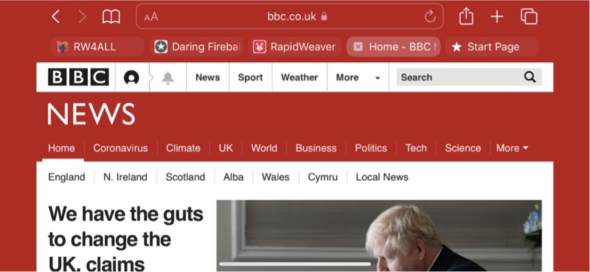
The UK NHS & BBC sites are a good example of how the unmodified page BG is used to colour the notch and wind BG:
My original point is that as web designers, we should take this new behaviour into account and test if we have a non white page BG.
Whether you like it or not, this is how it is, Apple will unlikely change it back and by all means untick the Safari option if you agree with:
" Safari 15 for Mac is a tragic own goal — a de facto gift to Chrome and its growing browser hegemony. The option to turn off “Show color in tab bar” is an admittedly appreciated glass of ice water in hell. But true relief from the boiling hot sun of these craptacular “tabs” is just a download away."
PS The IOS 15 screen shots don’t show the side bar in portrait mode but do show them in landscape mode.
The body background is only used as a fallback when it is not undefined for the meta theme-color which is what is controlling the browser UI colour. This is how the colours are changed deliberately and is a crime against humanity :) It is not, in most of the horror examples, an unfortunate by product of the page background colour.
See my post above : iOS 15 Safari new tab bar and notch background - #20 by tav
The tabs themselves are another massive UI own goal, they are much harder to use than previously and represent change for changes sake.
That’s good info.
For RW users though, they wouldn’t know if they were even setting a theme-colour or how to alter a theme-colour. That could however, be the new big feature in RW9.
I don’t doubt that some scrote will release a stack that outputs that one line to the head and charge people real $ for it. Thats the joy of the RW stupid tax.
Why you think people can’t paste one line of code into the site wide head area in RW is an interesting observation.
I like the way that Safari 15’s browser ‘chrome’ has been swept into the background colour on those NHS and BBC examples (the BBC page could do with some more space separating its menu bar from Safari’s bookmarks, though). If it’s a conscious design choice, it can be made to work well. But when it is done algorithmically, we’ll have to see how good Safari’s algorithms are. But since this is a company which thinks their algorithms are good enough to drive a car (!) we have to assume that they will be able to dodge the most obvious obstacles.
Mu problem (other than the obvious inconsistency in the MacOS UI and the overriding of users dark / light / accessibility settings is that the website cannot know what other colours are using in the users toolbar for pinned tabs and other user selected items.
Many have transparent backgrounds and get absolutely minced by a background colour that is not a neutral monochrome shade.
Why does the UI of one app behave completely differently to the whole of the OS at the behest of a website that you happen to have visited?
If wish they would sort out the bugs rather then mess around at the edges with weird “artistic” decisions. The inspector is an utter car crash for starters.
It should be an option to turn on for people who don’t get out much rather than an option to turn off for users that are disadvantaged by the ruined accessibility.
Agreed — it would be much better if Safari defaulted to white unless the website specified a colour. But one of the issues here is how much screen estate browsers take — they already have the full gamut of Apple menus at their disposal, but they want tab bars and status bars and favourites bars etc. Why all this stuff needs to be on screen, when it could be accessed from a menu, I don’t know — I guess that’s what the focus groups and usability studies tell them users want. At least we seem to have lost the title bar, which always seemed like a bit of pointless redundancy. Anyway having the URL at the top of every site integrated in a way that maintains browser consistency but also site styling feels like a nice compromise. Apple just shouldn’t try to be too clever with the algorithms.
Interesting to read the news that Safari 15.1 beta (macOS) has reverted back to the old tabs and changes the default setting to not show colour tab bars.
Sometimes its tiring being right all the time :)
No it’s not.
«Don’t you ever get tired of being right? »
« Only with the rest of you being wrong »