On the (under construction) site above, I’m using sorts-mill-goudy (500 weight) for all headers and Myriad Pro for all paragraph text. The fonts are being brought in via Adobe Fonts via Font Pro. Everything looks fine in preview and in Safari, but in Chrome (Mac or Windows) and IE (Mac or Windows), the headers are not rendering properly (screenshot below). I’ve checked to ensure the fonts are being served up correctly from Adobe (they are) and that Seams is not somehow overriding the text area (seems that would be almost impossible for the header: “Recipient examples include:”
Any thoughts on how to fix this would be appreciated. Oh, and I’m tied to Sorts Mill Goudy because that’s what is used in the logo.
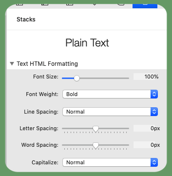
You appear to have “Bold” turned on in the headers but you have not specified a bold font - you have only loaded the single weight of 500.
Prepare for my fave soapbox…
This is faux rendering where the browser tries to make the only font that it has more bold.
Chrome and IE are obviously not doing to well with rasterising the vector and the result is what you see for the letters i, e and n.
Solution : turn off bold or load a second weight that is greater than 500.
Thanks, Tav! I wasn’t aware that I had selected bold-I’ll go look through the settings again and turn it off. 500 is what I actually want. Thanks again!
Bingo! As always, Tav hit the nail on the head. I knew I only wanted to use a weight of 500, since that is the only weight this font is available in. The issue was that I had copied the Header Pro stack from a different project, back when I used the setting in the screenshot below (I don’t ever use these anymore!).