I need to use Josefin Sans Reg in a project and downloaded a couple as woff2 and also used the Google Fonts version and used web convertor to create a woff2 version.
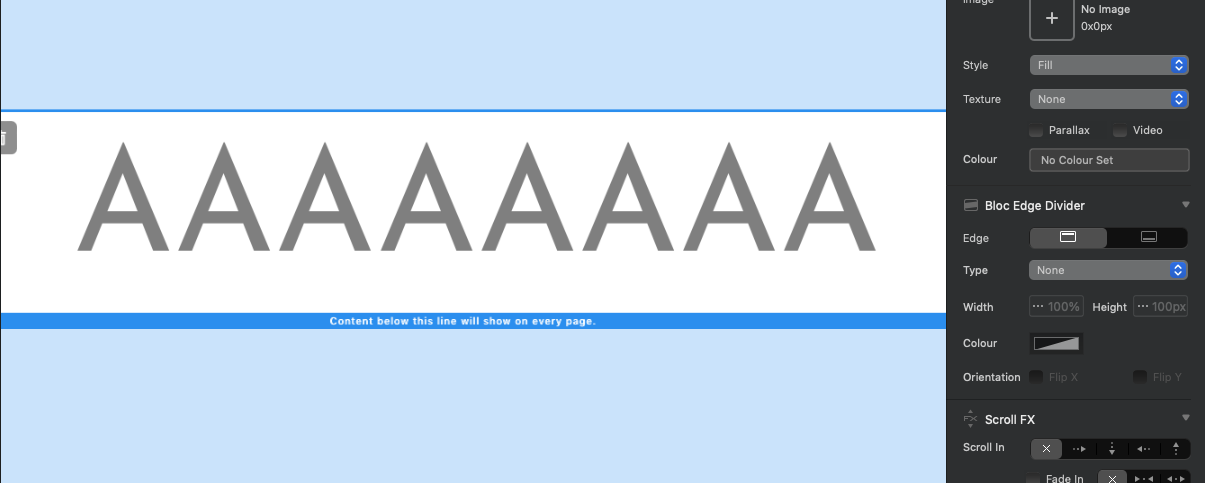
Both versions produce an ugly version of the letter A as shown below, when previewed in a browser.

Does anyone know a way around this or can point me to a good woff2 version?
Mine seems to be fine when tested in Blocs. I’ll send you the files.
1 Like
The problem is with the way the designer has drawn the character as two overlapping paths. This seems to be a vogue in type design at the moment, and it does make it easy to adjust widths etc. (especially for a variable font, as Josefin Sans was created to be). But it produces ugly overlaps when the font is outlined, and it doesn’t always render properly (as here). I’ve run it through Glyphs, removed the overlaps, corrected the path directions, and am emailing you a fixed version.
Huge thanks to Ashley for sending me what I assume is an older version of the font that works perfectly, and also to James for fixing the current version. Both work great.
Now that Josefin Sans is a variable font, I wonder if the poor rendering crept in during that whole process.
1 Like
Probably. What we’re seeing here is two paths with incompatible path directions, resulting in the overlaps dropping out. A capital A will always be made of two paths, whether it is drawn like this (with a separate crossbar) or if the ‘counter’ inside the A is a separate path (the older, more usual way). In the latter, the paths need to go in opposite directions so that the overlap does drop out. In the former, they need to go in the same direction so that there is no drop out. I suspect that someone ran ‘Correct Path Directions’ in the font editor (Glyphs will do this automatically on export, if the option is checked) and it made the paths go in opposite directions (clockwise and counterclockwise). But quality control should have picked it up.
1 Like