i use since an erahttp://www.pascal.com/software/freeruler/
I feel the need to intervene here. Not usually what I hang around for… but as a designer that sometimes receives Photoshop and Affinity Photo “layouts” to convert to web pages, I have to agree with @mark180 and some others here that — whilst it’s simple to grab a website element’s size via the web inspector, it’s useful to have an external app when trying to make sense of an Affinity image or even an RW project that’s been supplied as a design example!
I regularly use PixFit and PixelSnap to measure elements on screen and get the feeling that this thread has taken on two different directions?
Likewise in Affinity Publisher. Having an online tool like PixelStick makes quick sense of things - especially where there are lots of Publisher lines on the page.
The main use I have is to measure stuff I get sent that may be resized so that I can work out true size dimensions for creating new web graphics. Any screen measuring tool has to be easy to align the pointer so that I get the true dimension when 1 pixel out would be no good. As such Euclid, is I find perfect.
Well I’m blown away. I have to admit that I am still perplexed as to why a graphic would be measured on a screen which may or may not be “retina” or another pixel density and may or may end up on a page that is or is not displayed at retina density or not.
Someone really needs to explain to me why cmd-i to get the actual error free size of an image file is not sufficient. I am not being antagonistic here, I am genuinely lost for an explanation.
In my case, I have been sent photos or logos and scans of stuff that clients want to use in their design they want me to create. I have also used Euclid to measure buttons with non pixel padding, so shift-cmd-2 calls up Euclid and I can draw a box around a button to see its size or aspect ratio. I should also say that this is not always related to a web page.
I take photos of my willy and put them online, then use Inspect to see how big it is.
1 Like
@tav A client sent me this jpg layout to reproduce as a website. It was obviously borrowed from a web-template site as my client isn’t that creative, nor does he have anything to do with food…

If I wish to reproduce the page, cmd+I isn’t going to tell me anything about the image width, nor about the column widths…
I can take an educated guess, or I can use PixFit or PixelSnap on my Retina screen to get the ‘standard’ pixel width of each element. For images, I can then double the resolution for image widths so that I can supply Retina compatible images (if I so wish).
I’m aware that I can activate a standard Screenshot (cmd+Shift+4) to get the same dimensions, but the above mentioned apps either remain active when I let go of the mouse (without taking a screen-shot) or/AND copy the dimensions to the clipboard for future reference.
I’ve not been using the Mac so very long (just 34 years and yes, I mean that both truthfully and ironically), but I don’t remember a keyboard command that will give me the infos that I often require in the above case.
1 Like
I quite often get sent similar images, why do you need to know the precise sizes of stuff in thr picture though?
Not trying to be antagonistic, I’m genuinely curious. That image shows the page layout at a single screen size, if that page has been built well, all the dimensions and even the ratios, will change as the screen size changes.
The padding between elements might be 40px in the image, but change the screen size 1px and that might change to 30…
FWIW in my opinion the margins and padding in that image are all over the place anyway, be much better to make a version of thr page, but make it better.
I have to agree with Steve. The last thing I would do is to start measuring things on that page. I would start with the fact that the images and their associated info boxes are square and that I need a sidebar. Actual. size after that is surely unimportant because of responsiveness.
That image is just a snapshot of a certain width and so barring the aspect ratio of the images (which govern the design feel) all other sizes are fluid and so absolute measurements are not only meaningless but a dangerous way to process when making a dynamic document such as a web page.
Only at that viewport though. It may well change as the screen width changes.
Still can’t see any point in knowing the size of elements on a page at a given width, but then I’m not a designer, I just throw shit at a page til it looks OK, so what do I know!
The only times I’ve personally ever measure stuff on the screen is with images, either to see the original size of them, or to work out if they’re the right size to nick. For that, there is a great Chrome extension call Image Properties which adds an item to the right-click menu, which when you click it with the mouse hovering the image give you all the info you need.
I don’t think I’ve ever needed to see the size of a container or button or anything.
I totally agree with you Rob. This is the real need to measure stuff accurately and this is the difference between accurate design or creation of something that is vaguely in the rough ball park zone of what you are trying to create. Most people don’t see it but it always tickles me when someone shows a site they have copied or been asked to reproduce, and the result is nothing even close in my mind. Usually because all of the white space and button sizes are wrong. Of course this is a very subjective evaluation of a design but it many ways it is similar to good use of fonts. Some users (and at least 1 dev) cannot see a bad font and most users cannot even see the difference between 2 fonts. Hell, I have clients who cannot tell the difference between normal or capital letters.
This is very apparent in tight for screen area blogs, where every pixel counts. However, it’s one of those design areas that you either get or you don’t get. If you do get it, then you need an accurate on screen measuring app.
This thread is taking a somewhat funny turn. Those who use on screen measuring apps and those who don’t. Perhaps we should have a vote and implement the decision of the people and implement it. Ban them or allow them.
I would say I’m very much in the ball park of that first para! Specially about fonts. I’ve been really focusing on Fonts this year and I think my “designs” have improved massively. I just rebuilt my Mailshot Monkey site and I’ve really tried to focus on spacing and fonts. It’s entirely not the sort of site I do, but I’d say it’s one I think I’m most proud of, in terms of professionalism, or at least my attempts to get closer to professionalism than I’ve previously managed. I’m not putting a link up to the site as I don’t want my bubble burst ;-)
Anyway, regards measuring stuff on screens, horses for courses, there is no right or wrong way, just different ways. Websites are the very opposite to life: It’s all about where you end up, the journey is not important. Life on the other hand… We all die so the journey is everything.
Now we are conflating two completely different issues.
All those accuracy issues that you mention are undoubtedly best done in the browser.
I have also this morning just been on the phone to a designer from one of the 2 biggest web design agencies in the UK. Of course I asked him for an opinion on this discussion - to say he was incredulous was an understatement. He had never come across the concept of measuring a previous design to proceed with a new project and thought this thread was a good learning tool for his interns ( I won’t say why he thought that).
Me and my big mouth! 8-)
2 Likes
That all fine up to the word “browser”. There is no browser involved when a client sends you a an image or posts you a print out of an image.
When there is a browser, and a Foundation site is a good example, usually the on screen element sizes are in rem, and what you need to see is px. Otherwise you have to do a rem to px calculation and round to the nearest pixel and there is only one person in the world who can do this in their head.
I wonder if there is an app that will assist me with turning this design into a working website?
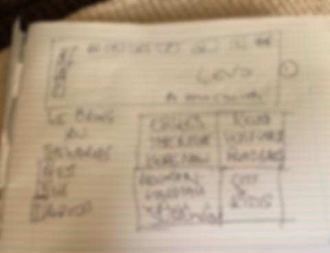
Is that 20 or 40px between the header and the body?
(blurred to protect the innocent!)
EDIT: BTW, this isn’t a piss-take, this is a design I’m actually working to at the moment.
Both Foundation and Bootstrap 4 use rem units. It is only certain stacks that force them back to px for the same reason that Fisher Price do not include small parts.
Again rem would me much much easier if only people realised. They are not DPI dependent like px are and are much much easier for margins, padding and the hallowed white space as they can be either 1, 1.5, 2 units for any given design.
Fonts are much easier to make responsive and become dependent on only one CSS definition on the page. If the client wants them a bit bigger, there is only one line or setting to change and not hundreds of them for everything to stay in proportion. Needless to say this also involves a lot less code on the page and if implemented properly, less settings and improved edit mode performance.
@steveb once sent me an image and rather than getting a pixel measuring app, I simply called the police.
4 Likes