I finished my first website using Source. Its a fairly simple design, but I’m well happy with it.
My website was previousy using an old-school RW theme, which was ok - but the the RW blog plugin was really limited. The pluses for me using Source, is its much lighter and faster than the old site, has better accessibiltiy, dark-mode and the blog is now in Poster2 - so has pagination, search tool, and a filter menu. I’ve enjoyed learning to use Source and found the Shaking the Habitual Academy course really clear and easy to follow
7 Likes
Good job. Very easy to read.
2 Likes
Yes, Source makes the most sense to me of all current themes/frameworks. I stopped using anything else to make my sites. And learning materials/support are top-notch.
1 Like
Hej
Beautiful, nice and clean. How did you make the list of “In person” classes? First I thought it was with Poster 2.
Kind Regards
Kent
1 Like
Nice, congrats, Source is pretty awesome.
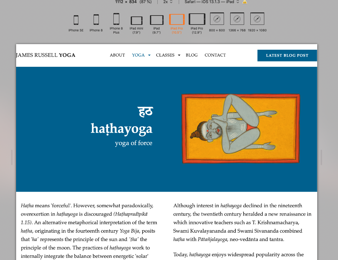
I’m looking on iPad in landscape and you could use a little padding to the left of your name. On mobile, the padding is there.
See screen shots

1 Like
Also in your blogs the text is close up to the edge in landscape, but padding is there in portrait. I slid the page over to the right a bit to highlight it better.


1 Like
Really nice site! Thanks a lot for sharing.
1 Like
Great work!
1 Like
Hi @Kent - that page uses a third party service: BookWhen - which is booking service for classes/ticket sales etc. You set up your items in your account on their website +then they then supply a simple bit of iframe code which I drop into an html stack on the RW page. So all the design of those lists and tables etc, is all from Bookwhen. Its a bit like having a third party shop in RW like ECWID etc.
1 Like
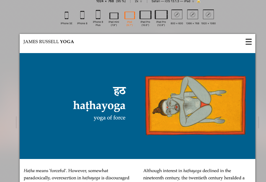
thank you @Anugyan for pointing this out. After a bit of head scratching i think i’ve fixed it. It looks like its doing this on ipad pro 10.5". I don’t have an ipad that size so I can only test it in the RW simulator but it looks like its working now. I’ve changed the breakpoint on the menu to go afer ipad pro landscape + added a bit of padding to the Blog filter and columns. Hopefully thats it sorted it. Please let me know if its still doing this on your ipad. Thanks again, J
thanks Stuart
One of the coolest features in Source is the Container Base stack. Amongst other things, you can setup an advanced padding of 10px for top, bottom, left and right below 600px and then 20px for all larger breakpoints.
You can then use this padding in all of the layouts that require responsive padding.
Eg., if you setup a Container Base with this padding, and allocate it to be no 1 (the default) then you can add this padding by simply adding base-pa-1 into the class box.
Doing it this way means you define the padding only once and apply it to wherever you need it, and in addition can adjust the Container Base settings to alter the entire web site.
It is features like this that can add a distinctive and consistent look to a web site.
2 Likes
Looking good.
The only comment I’d make, if invited, was perhaps tighten up your text a bit.
I realise that the nature of the site will lend itself to actually being read, opposed to skimmed over, like most websites, but there is no harm making you content a tight as possible.
For instance, the about James bit…
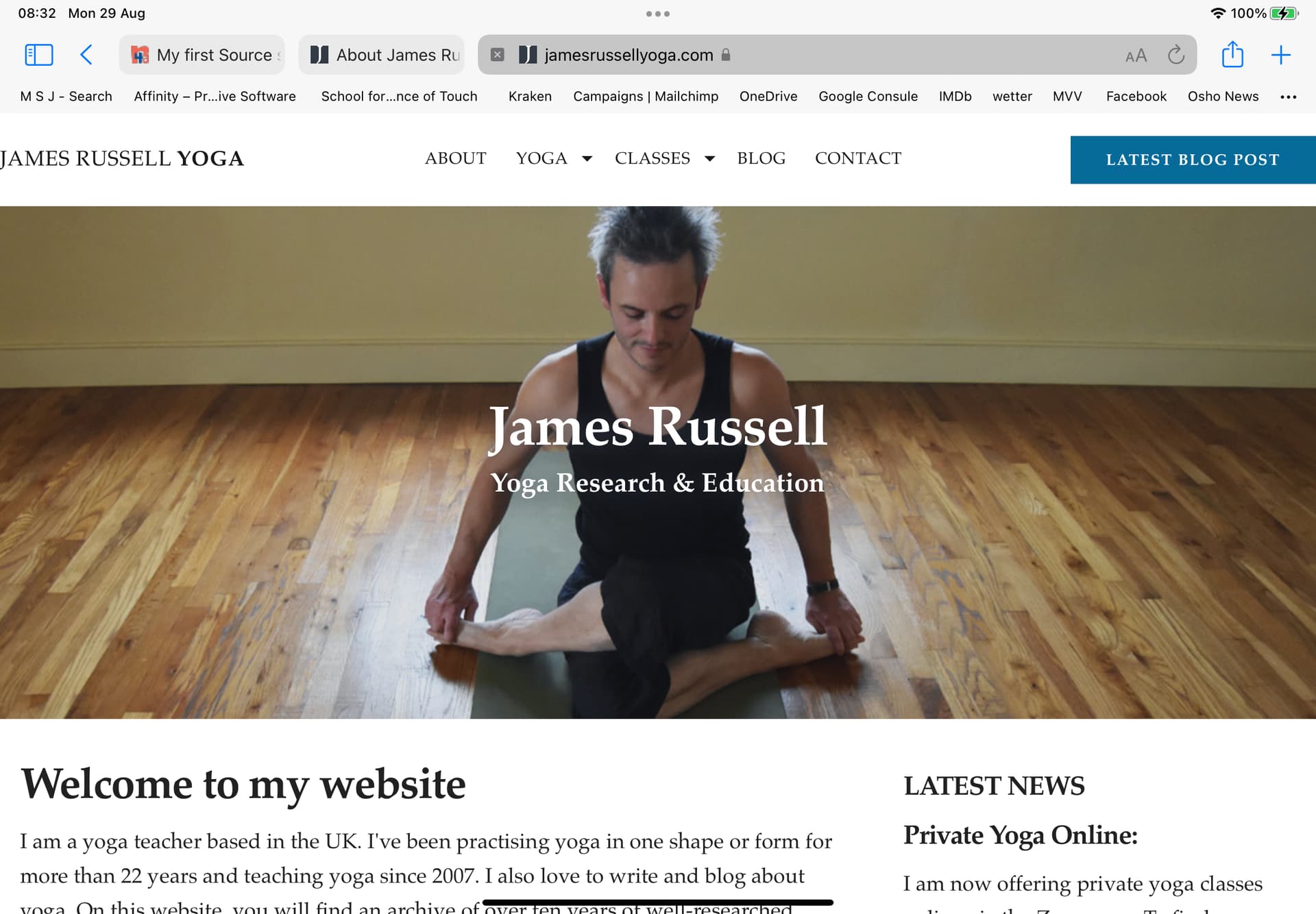
About James
James is a yoga teacher, blogger and student. He’s been practising yoga in one shape or form for over 22 years. He’s currently studying at SOAS, University of London, for an MA in Yoga and Meditation.
I’d edit as follows…
About James
Yoga teacher, blogger and Student with 22 years experience. James is currently studying for an MA in yoga & meditation at the University Of London.
Not a big change, and only drops a few characters, but it “feels” tighter. Personally, I’d apply the same to all the text on your site. Which I realise will be a PITA, but IMO worthwhile.
1 Like
@Jamies I would take the opposite approach.
You should write for Google assuming that you want visitors to find you.
Your H1 title should include more text to indicate more about you. Perhaps combine " James Russell - Yoga Research & Education.
Your H2 title “Welcome to my website” doesn’t add anything specific to you, and is there to take advantage of. Perhaps use something along the lines of “James Russell - Experienced yoga and meditation teacher in the UK.”
Then for the first paragraph, perhaps something along the lines of:
“James Russell is an experienced proffessional yoga and meditation teacher based in the UK that runs local as well as online yoga and meditation courses and workshops. James also blogs extensively about the benefits of yoga and meditation and has built up over 10 years of well researched material about how yoga and meditation can improve your life, etc…”
You need to add in words to build your phrases which may not read well to you, but should match what visitors are searching for on search engines. Repetition is good. Think about what users may be searching for and include those phrases if possible.
1 Like
Hi @Jamie, Source has the ability to set padding in the Container Base stack and apply it site wide as @Webdeersign suggests, that way you have it uniformed at every breakpoint.
I just had a look again and notice on iPad pro & desktop you have no padding, then it pads out as it goes mobil.
Its not a big deal at all. Its just your title James Russel Yoga
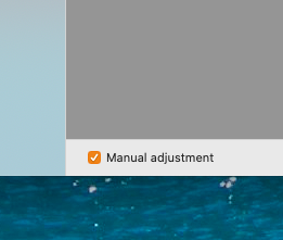
Go here in Safari
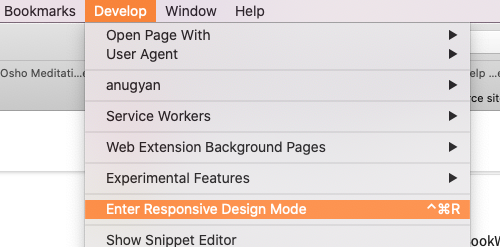
Or bottom left in Rapidweaver preview and check the box to manually size the page. It also shows you the page width for your breakpoints.
1 Like
Thanks, this makes sense and will be give me a bit more space in my footer as well
thank you - this is really helpful. I need to start thinking about my content in this way. This helps to point me in the right direction
thanks @Anugyan . this is really helpful. I’ve not used that feature in Safari before so will take a look. I’m going to go back in and take a fresh look at my sitewide padding as you and @Webdeersign have both suggested.
Thanks everyone for all your feedback and suggestions. Its been really helpful and I appreciate you taking the time to take a look a my site and offering your feedback.
Well done, Jamie. I like it 😁
1 Like