Ingore the overlapping stuff for now, that’s just some basic ideas. What I want to get sorted first is the gallery, that it’s to the left on desktop and top on mobile.
At the moment it’s made up of a simple two col stack with Shutter as the gallery. This is used in group mode, whereby the first image is displayed and the user clicks the button to view the full gallery.
What I’m thinking though is that the gallery on the left (top on mobile) is a slideshow of the gallery images, with each slide in cover mode so as to fill the full content area and no more. This needs to slide in the usual way on desktop or be manually controlled by tapping and sliding, on mobile.
The user will then have a button to view the full gallery.
I want the slider and the full gallery to pull from the same FTP folder. The images will not all be the same ratio.
I’m thinking something using @habitualshaker Splider and @Jannis Gallery3. But not sure if those two have been reworked lately to work together? Can Splider take images from a folder on the server? If so, can G3 be launched from a button?
I’m kinda going around in circles on this at the moment, waiting for that lightbulb moment, but there seems to be a power cut right now!
It can’t do this at the minute but i have actually started developing a small (and cheap) addon pack for Splider that would allow for the slides to be generated either from a csv file or by reading a folder of images. No ETA for that though I’m afraid.
Does it need to be automated? Could you not just manually link the slider to a number of the same images?
An Airbnb type grid of sliders would work very well with Grid Plus Pro and Splider. Airbnb’s implementation is elegant on desktop, with the arrows appearing on the sliders on hover and the whole slider taking you to the page on click (but I can‘t help feeling it would be better the other way around, with autoplay of the slider on hover and a link button appearing to click through). The way it works on mobile is a disappointment, though, and confusing if you’re used to the desktop version (but on mobile there is the possibility with Splider of flick-scrolling through the images).
It certainly can. In fact, given the main gallery will contain upwards of 30 images, I’d say it’s better to just put the best few in Splider. Good call.
Just need to see if G3 can be launched from an independent button. Or, perhaps float a button over Splider to launch a Limelight, and put the gallery in the Limelight. Which was actually one of my first ideas.
That is actually how AirBB does it: You click to see all images, and they appear in a grid, you then have to click again to launch a lightbox.
I’m working on other stuff today but will give this all a try later. Thanks for the idea.
Thanks for that, I’ll get a proper play with it later.
I have had an hour trying various options this morning, for now Im using the native UIkit slider for testing, but having a nightmare with the modal aspect.
Trying with UIkit native and Limelight, and Jannis’s G3 and Elixirs Shutter. G3 won’t trigger the modal sizing, so just won’t appear no matter what I’ve tried in either Uikit modal or LL. And Shutter is having issues with the z-index for the lightbox, which is opening behind the modal.
I’ll maybe go back a step and start afresh, with perhaps a simpler setup. Dunno yet, I’m in the office now with “proper” work to do, so will maybe get back to this later.
Of course, I didn’t put it down and do proper work, I carried on playing with it!
I worked out why the G3 gallery wouldn’t show: I\d selected the Masonary grid, which I’m thinking needs javascript, which isn’t working in the LL. So I’ve switched to a different grid and it’s working, although the lightbox is still hiding behind the LL, so I need to play with the z index for it.
@Jannis if you get time to remove the brown stuff from under your finger nails ;-) any ideas?
In theory, no one really needs to click to activate the lightbox, as the images won’t appear any bigger, this assumes most will be on mobile of course, which I know they will be.
So, for the majority they’ll just see the grid of images in Limelight. if they do then click an image the lightbox at least works!
Right, proper work!
Final step will be replacing the UIkit grid with Splider to maybe use the grid feature, which I’ll chat to @habitualshaker about later on.
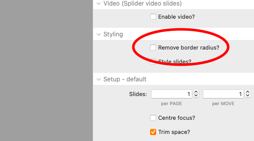
@habitualshaker I’m switching over to Splider now. All going well, but something has me stumped. No doubt just me being thick, but I can how to remove the border radius, but how do I set it, as in the size of the radius? And can it be set per breakpoint? (And possibly per corner per breakpoint?)
EDIT: D’oh! Found it. You have to click the style slide option.
I’m guessing though to adjust each corner radius individually at breakpoints I’m going to need to use some custom CSS?
yep - no built in option for different values at different breakpoints.
remember this styles the slides and not the slider. you probably wouldn’t want corners to have different values as the slide would then move and throw things out. unless i am not picturing what you are trying to do quite right.
@habitualshaker You can most likely see the problem, I think it’s what you mentioned. As the slide slides, the border radius is lost. Is there a way to achieve what I want? Border of 20px in the left and 0px on the right above 768?
Thanks. It was meant to be a hour or so play around with some ideas yesterday, it’s turned into a task taking up a chunk of time in the last two days! But ya, I’m rather pleased with the results so far.