I’m close to going live with this site, it’s for me so I’ve spent far far too long on it :(
Stuff still to do:
- Some of the wording will change once some others have had a look at it.
- Add all the SEO stuff once it’s on the proper domain.
- Knock up a few real blog posts to replace the dummy ones.
- Its a bit slow to load due to the number of images, Cloudflare might/should help
Any observations, comments etc?
2 Likes
Looks awesome, Paul! Well done. I was skeptical how that layout would work on mobile but when I flipped over it looks great.
I’m having trouble reproducing this reliably but I get the odd text cut off on my work comp here (Chrome, Windows 10). It could be a wonky browser size or something, and I can’t get it to do it in my Firefox browser…
This is likely totally inconsequential but, the nav arrows on your blog (currently Prev / Next) could maybe be renamed ((e.g. newer/older??), if it’s intention is to be a ‘Recent News’ kind of blog. As I’m typing it out, how you have it is probably how most blogs do it (and most users wouldn’t start in the middle of the blog posts) but it’s not as if my keyboard has a backspace button where I can edit my thoughts, so here we are…
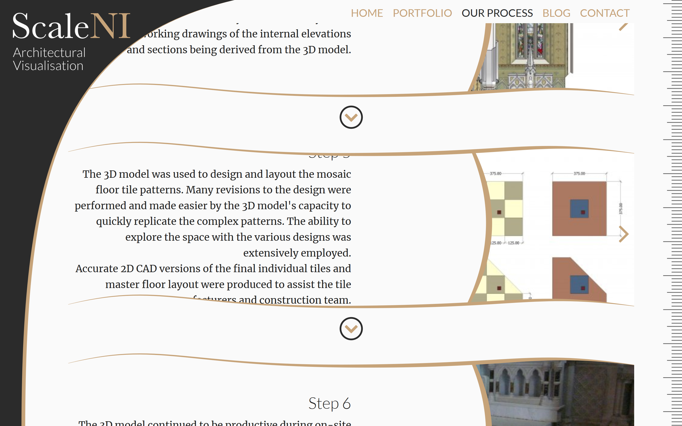
Here’s a screen size on Firefox showing it (in responsive design mode it lists this as “Laptop with HiDPI 1440x900”). Again, a bit hyper specific as it looks good on most any other browser size but if you can re-word a few of those lengthier steps, it might be worth it…
This isn’t very important, but when I looked at your site within my RSS reader (which is News Explorer Version 1.8.15 Build 123—latest version), I got this message:
Aamzing work Paul. Only comment I’d make is at full width desktop the text blocks are too wide. I turn the body text areas into two columns on large screens. (You using Scribe?)
Thanks, @jabostick, I edited that text and have obviously added a few too many additional words.
I’ll knock up a new FontPro style with a slightly smaller sizing for the process steps.
@fapkogi thanks, your rss reader must be using an older WebKit engine or has an out of date UserAgent ID.
@steveb…2 col…interesting idea, I’ll see how it looks .
I find that blocks of text is much harder to read once it spans more about 600px, so I always put it in columns if it’s to fill an area wider than that. I also think it looks better in columns too.
I might be along in this.
I’ve fixed the font sizing on the Process page … hopefully
I tried the 2 col but because I’m right justifying the text it didn’t look right: https://cl.ly/83b3c7291e4c
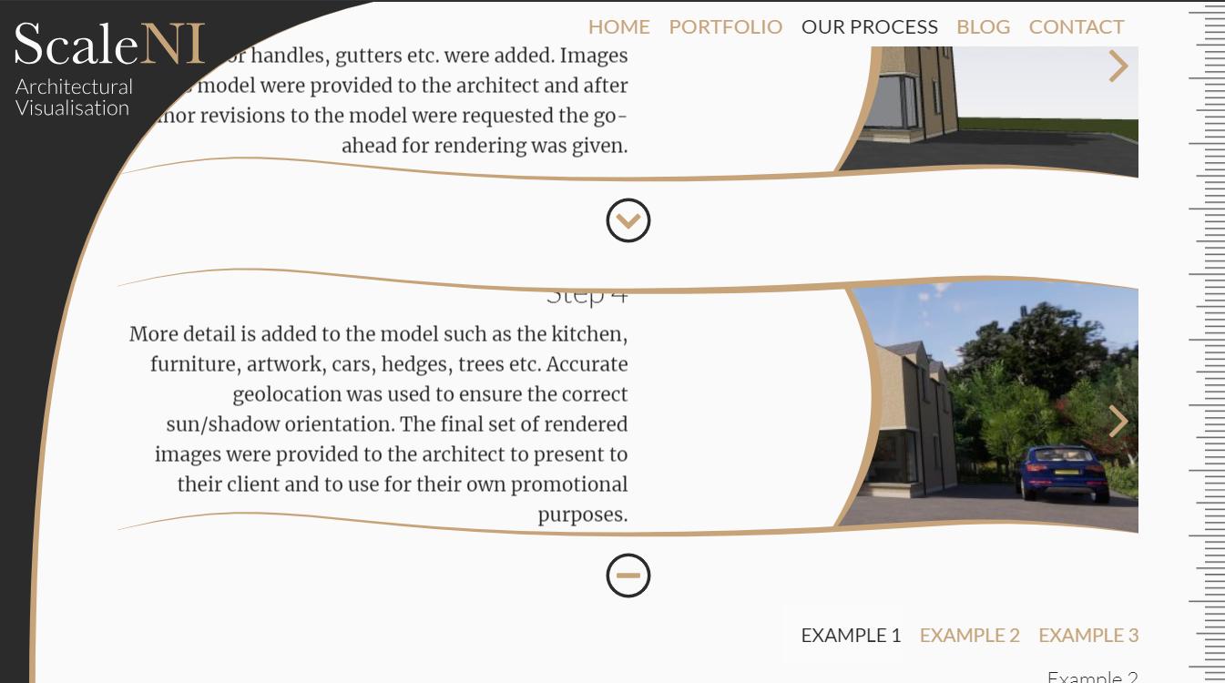
I’m going to edit the test in the one you posted a ss of, its disproportionately long compared to the other steps…
I think the columns with justified right looks good.
In the blog page, it looks like your featured post is on the bottom? Wouldn’t you want it on top? Or, perhaps it is a regular post that just looks like featured one, because it doesn’t have a pair (sixth post)…
Thanks, That’s the TotalCMS blog layout, as there are 5 (dummy) posts the last one fills the width.
Once I get some real ones in there I’ll massage the layout a bit.
@steveb if I could ensure 2 col with equal amount of content in each column I’d go for it but it looked odd with the tittle on the right and then 90% of the content on the left with just a line under the title.
I’ll try again as I’m still quite attracted to the idea.
Header stack.
Sidebar stack set to 50% and shrink aside (equal sizes aside and content)
Scribe stack in each with the text you want.
But you know this!
@jabostick blog buttons are now labelled ‘Older’ and ‘Newer’ … thanks
1 Like
I love your site! As a newbie at building websites I have to say it’s complexing and makes you want to discover and spend time in it. Well done!
Compelling! Not complexing! LOL
On that one the time spent was … far far FAR to long, it’s for myself so instead of doing ‘enough’ like I would for a site for someone else I’ve been continuously fiddling with it for ages.
Only last night I discovered a way to have a random image in the link when someone posts the site’s url to the likes of FB, Twitter etc so… there was another round of editing and republishing.