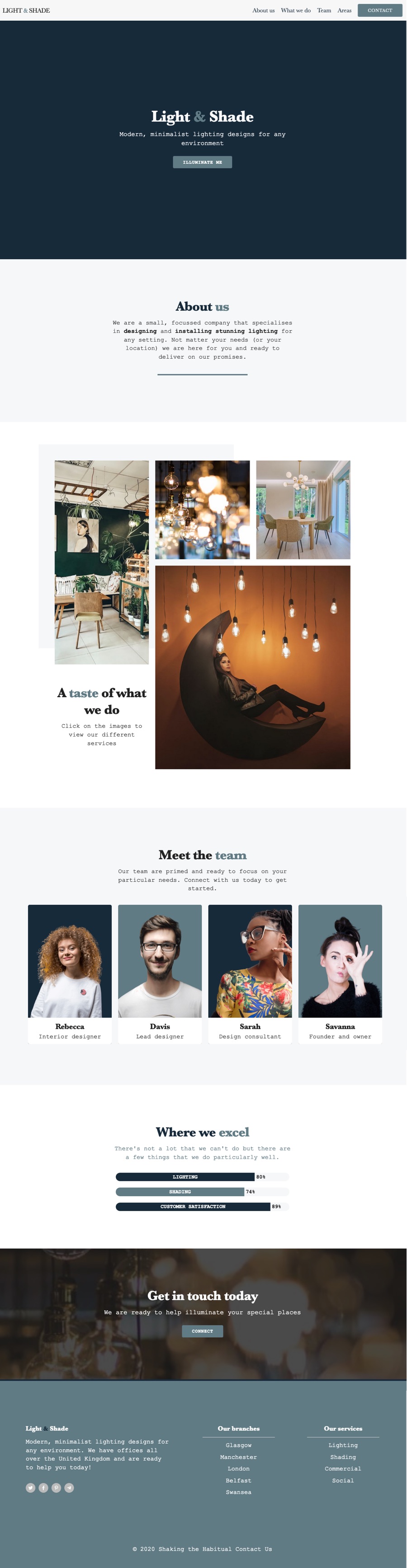
A new 4 page Source project has just been released called ‘Light & Shade’.
It’s a really nice and clean project that showcases all that makes Source great: it’s clean and lightweight, is fast and has some interesting grids! In this project there are also some nice hover effects and other features (e.g. check out the ‘Where we excel’ section for a novel use of Grid Plus!).
The project makes use of Source version 2 (that was released earlier today)! Be sure to check for updates in RW to get hold of this great new (and free!) update.
Until 22nd November - you can get 25% off with the code light25!
All bundle purchasers / active subscribers should have received a download link already.
So I am playing around with this, and I am having trouble to understand how to show/hide things, like the menu, where breakpoint below 900 show the dropdown menu and above the desktop version. But I do not find the setting where the respective menus are choosen to show according to the screen size? Yes, I am still learning, sorry if I am a slow learner.
It is the first setting in the Nav stack settings called Breakpoint. I.e. if you set it to 598px, the “mobile” version of the Nav will show below 598px.
Ok thank you, yes I figured that much out actually, what i am not understanding is how to distinguish the mobile from the desktop nav? I do not find any setting in either one to distinguish them from one another. I can give them a name off course, actually I do not understand how to show/hide things at all in Source.
And sorry for my confused state of mind. I have been doing a project in Foundation for some time, so I forgot many things and are even confusing functions from both the “frameworks”. Which is also leading me to think that I need to decide which framework I should use on a daily basis, at least until i am “fluent” in one of them.
I used this project to demonstrate a way to be able to add links to in-page anchors (as by default the Source Nav stack doesn’t allow for that).
It is done by simply adding the required links into the Nav stack’s CTA drop zones. One set of links (a vertical list) is used in the Mobile CTA zone and a horizontal set are used fo the Desktop set. It’s a grid stack that is used for each of these (partially hidden in Edit mode - use the Stacks show/hide function to expand it).
Yes you should decide on one and stick with it. I switch from Source back to work on old Foundation and Foundry sites and it is a mentally unsettling event every time I do it. You really have to focus on one framework or you can forget the basic stuff.
Source doesn’t have the old fashioned Visibility type of stack, but has that capability built into every stack that might need it. However, you very rarely have to hide or show stuff with Source as you can always cater for every screen size with the layout tools you have.
Thanks to everyone that has picked up this project.
I’ve added a couple of new videos to the Knowledge Base pages to cover a couple of the techniques used in the project (i.e. using a couple of the utility classes to achieve some nice effects).
This is really cool and the missing link in many web sites. You can add an icon or text to show that an item can be clicked on and it smoothly fades away when mouse over it and the hidden content smoothly fades in to become visible.
Thanks @Webdeersign. It does work well. I should point out that there is the option of disabling the effects on touch devices too (where hover obviously doesn’t really work).
I should have added a link to the Light & Shade demo page with the results of this kind of thing. The ‘A taste of what we do’ grid and the ‘Meet the team’ section both use variations of what is shown in the videos.