**NEW VERSION** UIKit3 Tabs Customizer Stack

Today I pushed out v1.1.0 of the UIkit3 Tabs Customizer.

The AXYN Tab Customizer Stacks was developed to add the ability to customize the look of the UIkit3 Tabs.
It provides control of the colors, background, borders, and more, of active and inactive tabs. It also allows changing the color of the horizontal UIkit3 tab line.

Just drop the UIKit3 Tab Stack into the Axyn Tab Customizer, and style it to your liking. Here is a small sample:

These are not pre-sets, you can customize almost every detail. A new sample project is also available, to obtain it, please re-download the Tab Customizer Stack from your Paddle account.

Check it out: https://axyn.com/site/products/Tab-customizer/

Cheers,

Ricardo

5 Likes

I just pushed out v1.1.2 of the Tab Customizer Stacks.

On the previous version you can already style them as buttons, the project file shows how. You can also do a more traditional styling of tabs.

Added to this version:

-Ability to color the text of the active tab.
-Set tabs text to italics
-Responsive font sizing
-Custom padding of the tab and space between tabs

Cheers,

Ricardo

1 Like

Basing the font size on vw means you have really big fonts on wide screens, and tiny fonts on phones!

Hi @steveb,

There is more under the hood than vw. Give it a try and let me know.
If necessary, I can add the under the hood minimum font size as an option as well.

I don’t really understand what you mean. If you select the responsive font size, the only option I can see is set to vw. Which as I say means that on wide screens the font is huge, on phones, it’s tiny and can’t be read. Maybe I’m missing something?

I guess you could, but I just don’t understand why you are linking font size to vw. Maybe this is a standard way to do it and I’ve just never seen it before, but to me it seems entirely the wrong way to manage font sizes.

Edit: I need to explain that a bit more. Obviously I understand that breakpoints are screen widths, but what I’m not getting is why the font size is fluidly linked to the screen width. Being able to define a font size at several breakpoints is to my mind the logical way to do it.

Under the hood there is a minimum size for the small old iPhone SE, which in my test was still readable.
I can give the stack a input entry for you to set the minimum size yet keep the fonts fluid. Also, if you set the vw setting on the largest screen, when the font hits the minimum size it will not get any smaller. I had tested the stack with breakpoints, but I didn’t like the results.
I will upload an updated stack with the minimum font size user setting soon.

1 Like

Fair enough, but I still don’t get it.

27in screens are not uncommon now, so if my understanding of what you are saying is correct, I need to set the font size for this potential max, then set a minimum size. What this means is really I have no finite control over the font size on the most common size, say 13in. Maybe I do, maybe I just need to do the maths, but it seems like a very long way to get what I thought was already a pretty well-sorted system: Font sizes at breakpoints.

As I say though, it’s most likely just me not really understanding the thinking.

Hi @steveb,

Considering the number of devices of difference screen sizes, media queries also have drawbacks (in my humble opinion), as you have to try fitting things, in this case, a font-size that will look good in what could be a big range for each breakpoint.

So, my idea was to avoid media queries (if possible) to make different font sizes depending screen size. In fact, I’ve trying to not make many font-size declarations at all.

So, I decided to use the CSS technique: calc(1em + 1vw) to control font size and responsiveness. We are telling the browser to calculate the result of adding 1em to 1vw.

The theory being, font sizes that respond to the device width should look great on all screens.

Here is the rational of the calculation:

The em value of the equation is the size that the text size bottoms out at. If, for example, the viewport is 0px wide, then vw is 0, but the font-size will still be at least the em (minimal) value.

Screen Shot 2020-11-03 at 12.54.01 AM

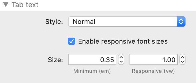
The vw value controls how responsive you’d like the font-size to be to the viewport width (1vw is 1/100th the width of the viewport). Adding a high vw will make it quite responsive — huge text on huge screens, tiny text on tiny screens (as you mentioned before).

But you don’t have to use a high value. Just set the vw value to a number that the font looks good in a very large screen. As you now shrink the viewport, the font should look proportionally good in all screen sizes. At the same time, it will not get any smaller than the em value.

The stack default is .35em and 1.00vw. So, the font will not get super small, but will not also grow super big in the large screen.

I chose these as default values, because the text is still readable in an iPhoneSE and looks proportional in a 27" screen. If you want your bottom out value to be bigger in small screens, you might choose 0.85em as your bottom-out value. And if you don’t want it to grow as big with big screens, you could set a value less than 1vw.

Anyway, give it a spin…

I just pushed out v1.1.3 of the Tab Customizer stack, with the responsive font size controls that I mention here.

Cheers,

Ricardo

If a tab stack is in a column that stacks at 960px, how does the font know this, in case it needs to drop down a touch in size?

I’ve made a very quick project to display the issue I’m talking about when setting the font to vw.

This page uses the default responsive settings.

https://ci-clientservices.com/clientdev/tabcustomiser/

On wide screens the tab headings are too big. Yes, I can reduce down the max font size to better match the text around it, but then it’s too small on “regular” size screens. I can overcome that by increasing the minimum font size, but then it’s too big on small screens. I could tweak things to get close to something acceptable, but it’s always going to be a compromise and feels like your cracking a nut with a sledgehammer.

I know I’m labouring a point here, but on the other thread you did ask my opinion on this. I respect whichever way you decide to go, I’m just giving you the opinion you asked for; In my opinion, the tab font size should work along the same lines as the rest of the text on the page, ie, breakpoints. The way you’ve done it, the tab header sizes are entirely independent and scale differently to the rest of the content on the page, which IMO is wrong.

I don’t use UIKit but this is an interesting topic.

The issues that I see using a calc(1em + 1vw) type of font size calculation, are that such a calculation needs an upper screen max width control, and also it doesn’t work when the width of a tab is set to a maximum width, as it should be IMHO. So if you set a Tab layout to have a max screen width of say 1140px to make it look right, then the growing text will keep growing with the width of the display width, and be too big. I think not setting a max width for Tabs (and all text containers) makes then look wrong in the same way that a navigation bar goes the full width of a screen is not good practice. A nav bar or tab layout going edge to edge on a 27" or bigger display will not look right.

If you set the max width of a tab layout to 1140px, then I think you need something along the lines of:

font-size: calc(16px + (26 - 16) * ((100vw - 320px) / (1140 - 320)))
where the min/max font is 16px/26px, the min/max width of the tab layout would be 320px/1140px.

This isn’t perfect but is going in the right direction.

BTW These type of calculations would make great exam questions

I just did a bit of vw font size scaling testing and I was surprised to find that my Safari doesn’t appear to be recalculating the font size on changing the screen width. Chrome and Firefox are fine. For those altering the orientation of say a tablet, this may be an issue.

Hi @steveb, @Webdeersign ,

I do find the discussion quite interesting… gives me stuff to think about.
As @Webdeersign mentioned, I just did some testing, and Safari does not adjust the size if you change the browser width, but Firefox and Chrome do. And to make things even more confusing, within the same test project for the tabs, some text scales down (or up) with Firefox and some don’t. WTH!!

Out of curiosity, why have you gone the vw route? To me, it seems, as someone else said to me today, re-inventing the wheel but using an octagon instead of a circle.

Heck if I know… when I was looking at modern responsive design, this is one of the topics for a solution to responsively scale fonts without the breakpoint. But this discussion has yielded some issues that have made me re-think my approach. If it wasn’t for the difference of behavior between browsers, I might have continued in that path.

However, I can’t pursue a feature that will create issues between browsers. So breakpoints will be! That is the safe route. I’ll have a new version by the end of the day.

Thanks to both of you for this discussion and for the insights.

BTW, I am finding LOTS of issues with v14 of Safari, this version is a real dog!

Cheers,

Ricardo

For what it’s worth, I think it would be really interesting to have a standalone suite of text stacks that all work based on vw, that might throw up some interesting design options. But Tab Customiser isn’t standalone, it’s built to work inside a framework that respects breakpoints, so to try to step-outside that boundary means the tabs were never going to “feel” right within Uikit.

IMO.

1 Like

So, I am setting 4 customizable breakpoints… the defaults will be the UIKit3 defaults 480,768,960,1200
Just wondering what would be good font size default for those?

v13 too.

At least nobody brought up the topic of vertical rhythm.

The obvious place to start is 1rem.

Do work in rems, please, not px. Uikit uses rems, so it’ll mean not having to reference a rem/px convertor all the time!

Will do

1 Like

Any thoughts on the default font sizes in rem?