This is an introduction to using Coder to build a responsive line of icons that are positioned next to each other. Typically these are created in the older frameworks using columns or by floating fixed width images. That process is very limiting and takes a lot of time and a degree of skill to master. This demo will use just 1 Coder stack to achieve this.
Starting with a Source page, add in the Source settings stack, a Container Base stack (only used to have access to backgrounds and margins and paddings) and a Utility Class stack. The Container Base stack is used for convenience just to load a blue BG colour and some other colours that will be used later on.
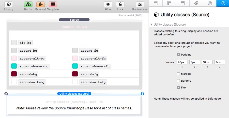
Starting with the Utility stack, 4 paddings are setup and the Flex box is checked. Checking the Flex check box, means that these Classes will be loaded .

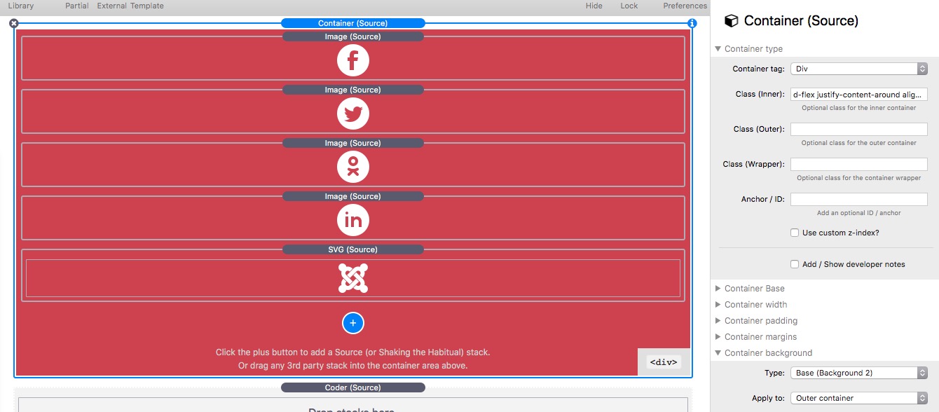
A Container is added to the page with some padding, it uses the Blue BG setup in the Container Base stack and a width of 700px is used. This is just to make the demo layout look more attractive on the page. A Coder stack is added to the Container and the Stacks drop down is selected in the Coder settings.
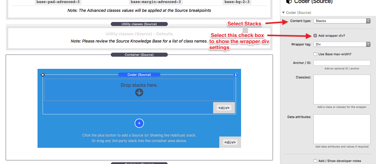
The empty Coder will fill its container and therefore fill the 700px space.
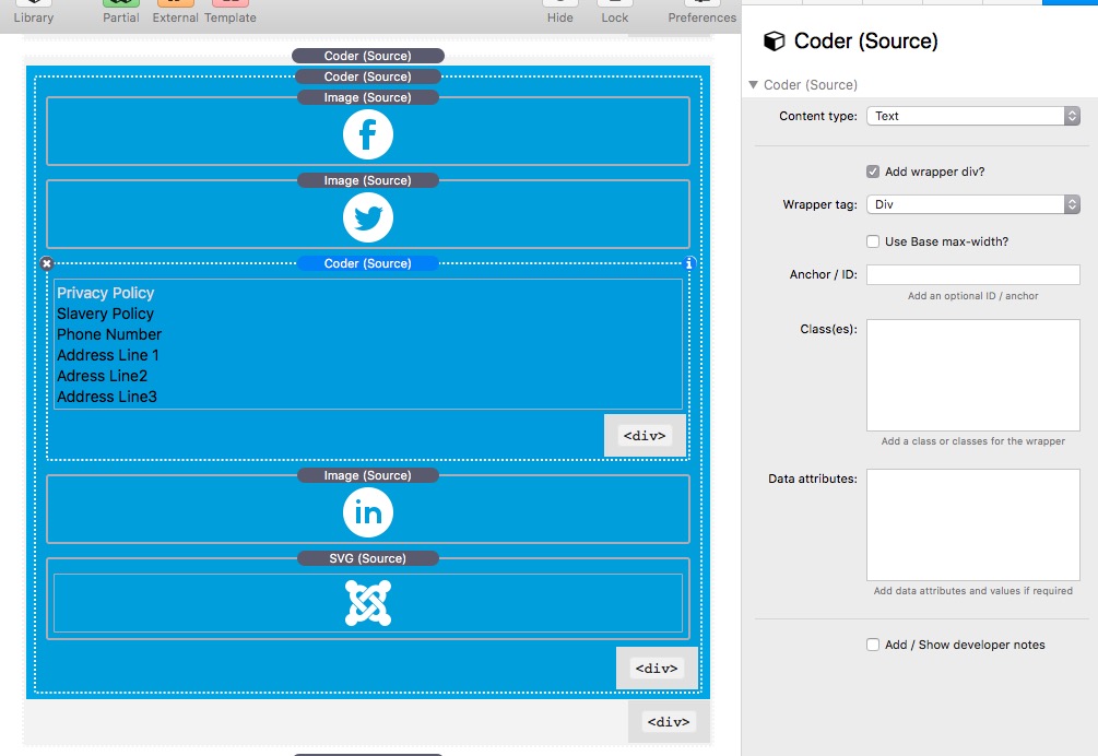
A Source Image stack containing a 50px wide icon image is added to the Coder.
which previews like this:

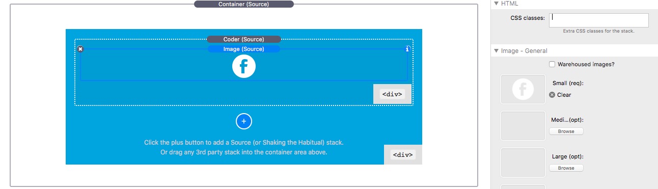
One of the Utility Classes detailed at https://knowledge.shakingthehabitual.com/article/63-utility-classes-addon?preview=true will now be used. To make the layout use some padding, p-1 will be added to the CSS classes box for the Image. In the linked information, p-1 sets a padding on all 4 side set in the padding for padding-1 in the Utility Class stack, which was set to 10px.
The preview will now look like this and note that the Coder height is set by its contents, i.e. the image with a padding of 10px on all side.

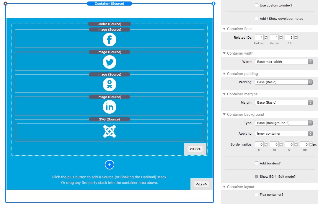
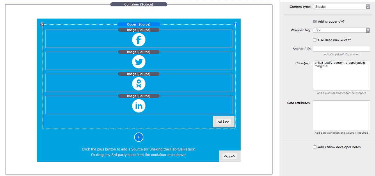
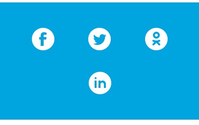
Now the image is copied and pasted 3 more times, so that we now have 4 images inside the Coder. The new 3 images have had their images changed to make this demo more meaningful.

Which previews like
which is exactly what we would expect. I.e. this is normal stacks behaviour where things stack on top of each other.
************** MAGIC ALERT *********************
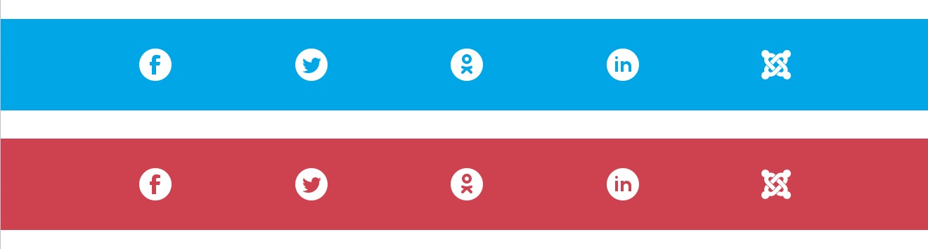
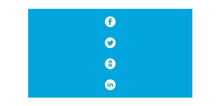
Now add d-flex justify-content-around into the Coder Classes box:
(PS Ignore the stacks-margin-0 used in the image above.)
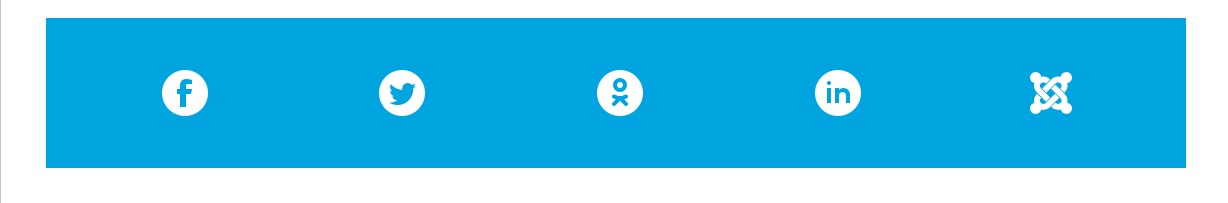
Which will preview like:

So what is going on here. The d-flex enables Flex Alignment of items inside the Coder which becomes the Flexbox container. The justify-content-around “spaces” the icons apart so that the space is evenly shared between the items which in this case are the images. This is one of the areas of Flexbox that is well worth learning and you should become familiar with the other types of spacing which we will use over and over again in these examples.
We can also add align-items-center p-1 flex-wrap which will align the items centred vertically, add a bit more 10px padding to pretty things up and then enable Flex Wrap. The Flex Wrap will allow the icon images to flow onto the next line when the width is too small. the preview will look like this:
So just to recap here. We have now created a fully responsive horizontal line of images that will scale responsively with just 1 stack!