We often have to create a 2 column layout to display text when the amount of text is too much for 1 column to remain the best solution. I.e. there comes a point when text grows to the point where 2 columns just looks better.
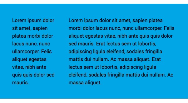
The old fashioned way was to use a 2 Column that could be very inefficient when the amount of text in the columns differed. This example is all about building a 2 column display where the priority of the layout is to vary the width of the columns to try to make the height of the 2 column of text, equalise.
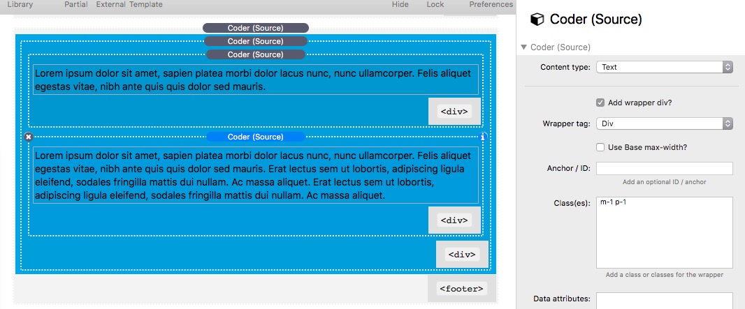
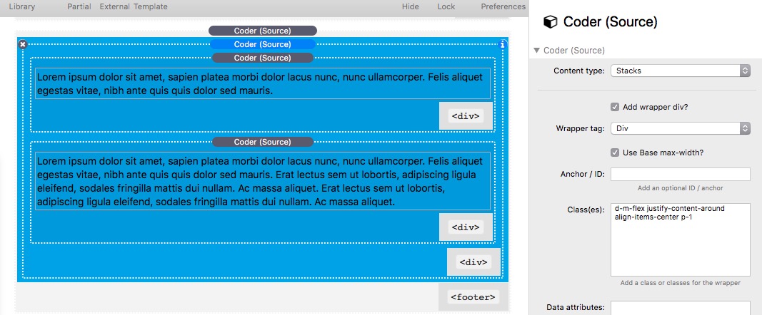
We will use the Coder layout from Example 1 which is:

We need to remove all of the image stacks, and replace with 2 new Coder stacks set to text. One will contain a short amount of text and the second will contain a lot more text. Each text Coder will contain the Classes m-1 p-1 where p-1 is a new margin value set in the utility Class stack to apply 20px margin on all sides.
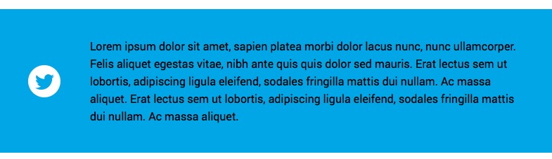
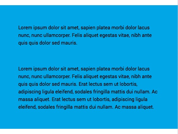
The main Coder acting as the (Flexbox) container has a tiny but easy to miss edit. Previously we had d-flex but now we want to replace this with d-m-flex. This is one of the super powerful aspects of the Utility Class stack. Adding in the m means the the flex (or Flexbox) will be applied at the m breakpoint or above 600px. We need to do this to make the “columns” stack below 600px. So simply by adding the m' we have created a 2 "column" layout that will stack below 600px. Below 600px flex will not be set and the default stacks behaviour of block` will apply - i.e. stuff stacks below the last thing.
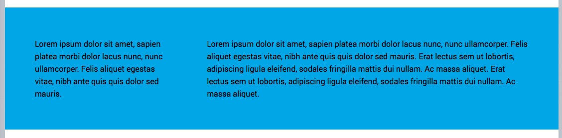
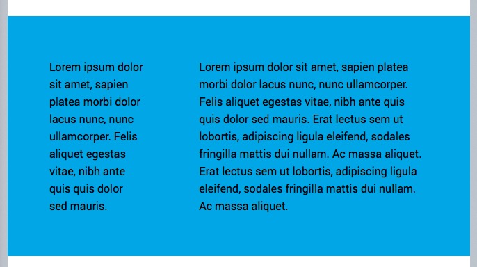
Here is the previewed result at 3 different screen sizes.
So to recap, we have just built the coolest looking most compact 2 column text layout using just 1 stack that behaves perfectly (within the rules of words wrapping to the next line).
Lets also mention that the control that you have over the padding, margin (in px, rem, em, %, etc.) , backgrounds across all 4 breakpoints is achieved just by adding the classes required. Also note that this is not using a bloated framework and multiple stacks with multiple settings and is therefore fast in RW edit and preview mode.
PS the p-1 in the text Coders would not be required in real life as all that would be required is just m-1 to apply a 20px margin: