This tutorial is about using the techniques learnt in the No1 and No2 Coder examples, to build a to navigation similar to a NavBar or TopBar.
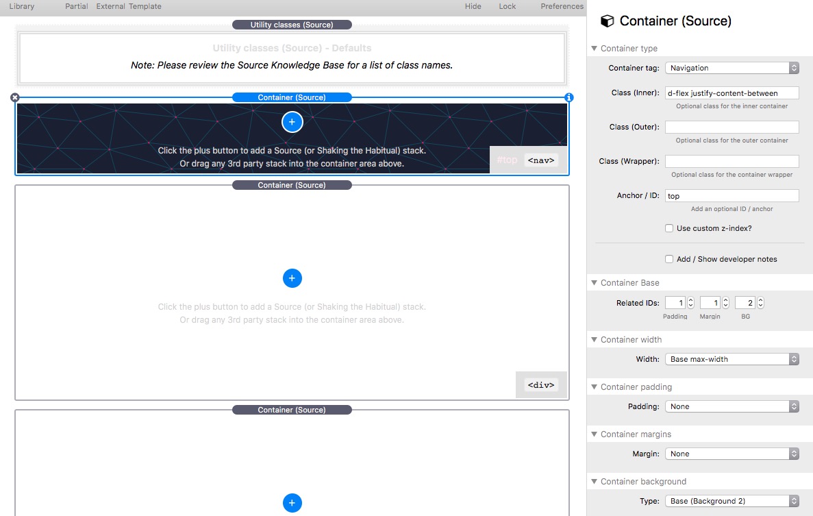
First we need to setup a Container Base with a background so that we can see the navigation. I pasted an SVG BG into Base2 BG 2. Then a Container is added to the page which will act as our navigation container. The following d-flex justify-content-between is added to the Container Class (inner). (You will remember this from No1 and No2.)
No point previewing this yet, because the Container has no content.
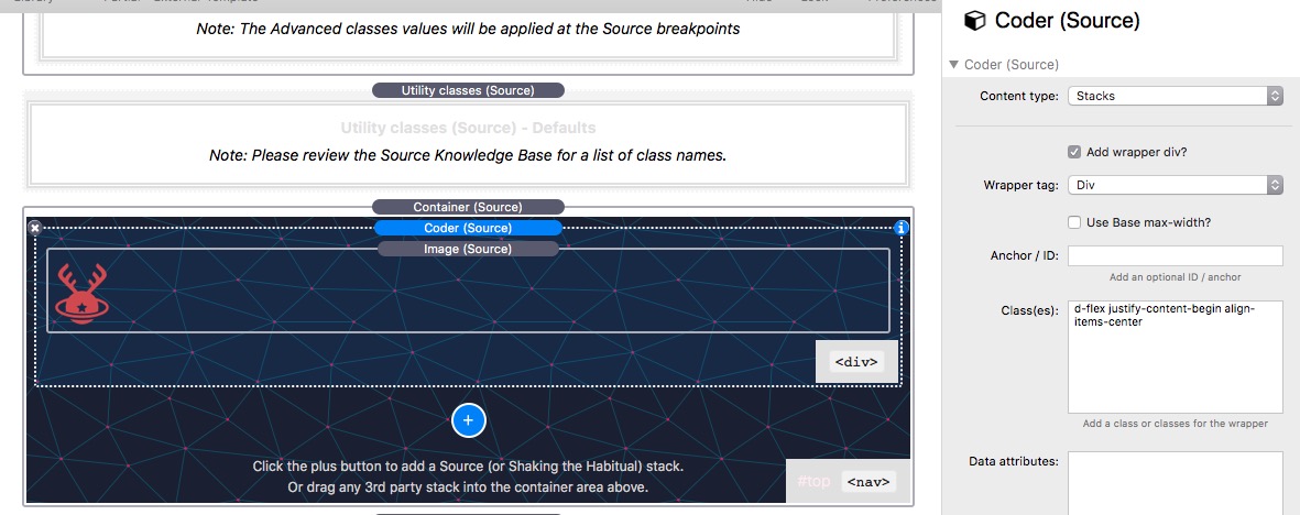
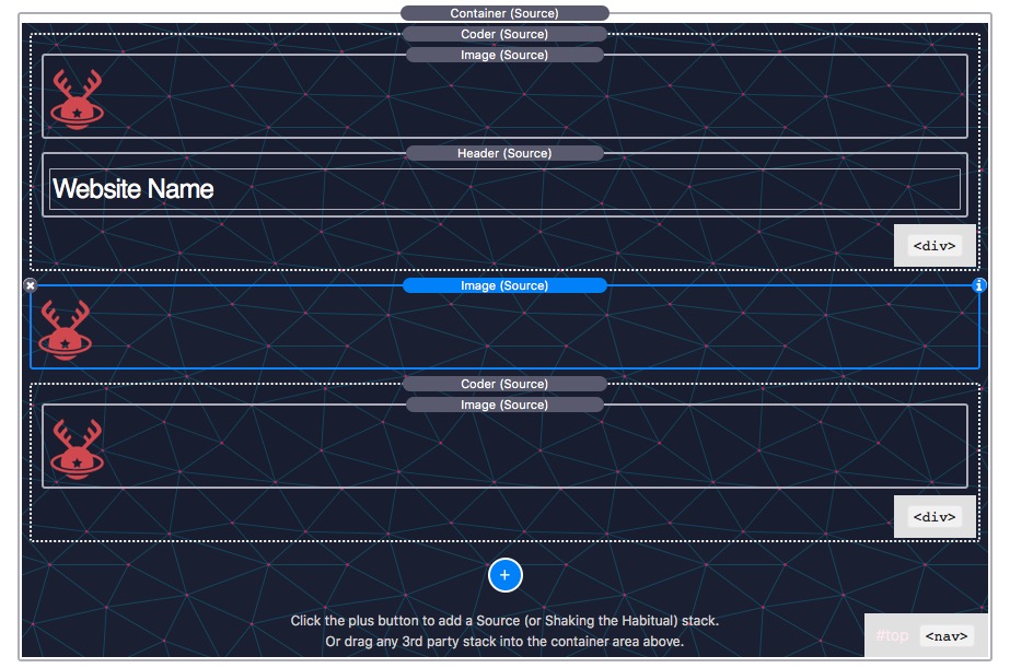
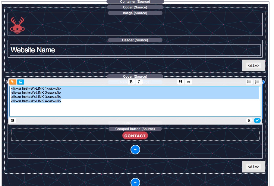
Next we will add a Coder which will act as a Container - more on that later. In the Coder Class we add d-flex justify-content-begin align-items-centerwhich will align this Coder to the left.
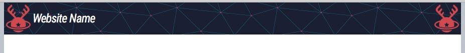
Inside the Coder we will add a Source Image and set the height to 60px, and add 2px to its top and bottom. The total height of this image will be 64px, and this will be the height of the navigation.
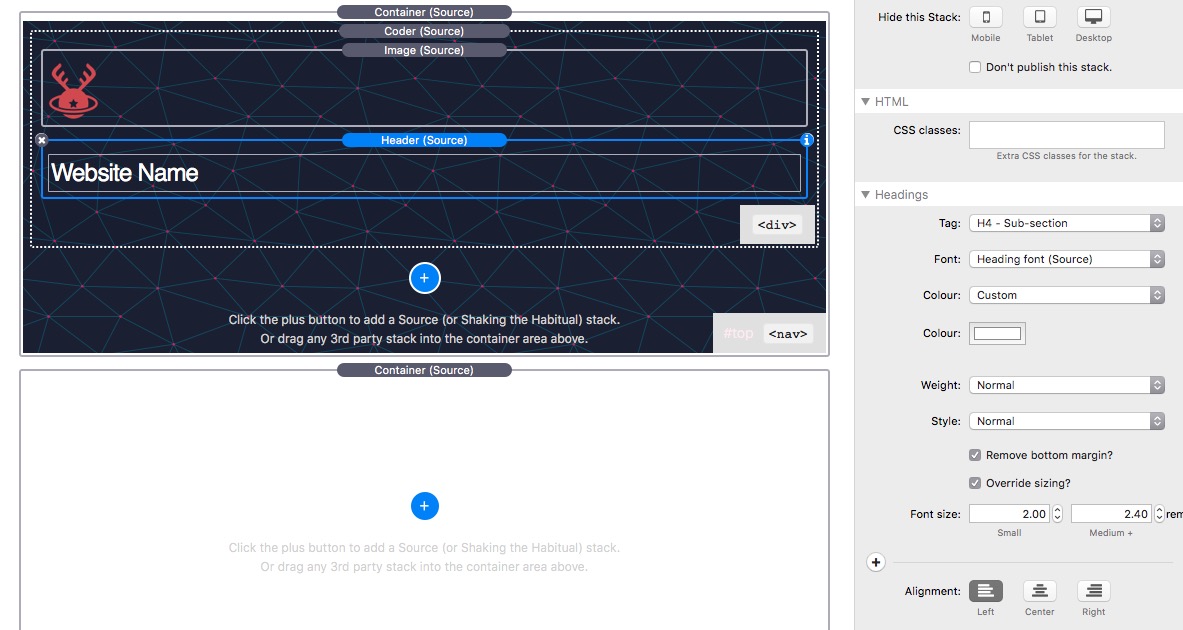
Next we add a Header adjusted to the size we want and remove the bottom margin.
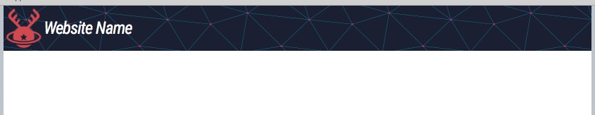
Which previews as:
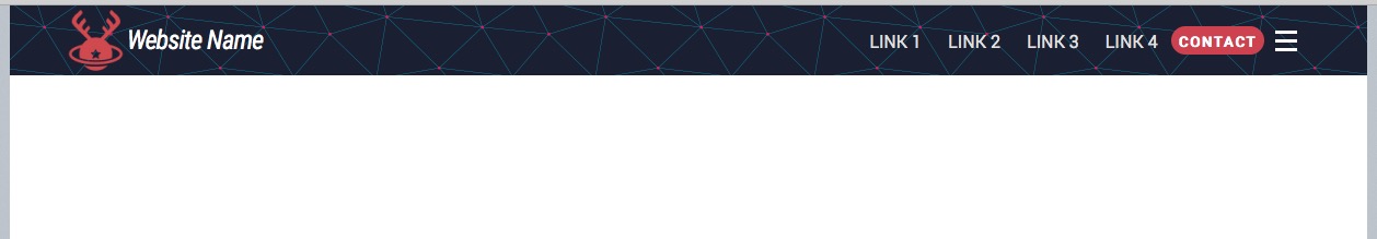
Next we will duplicate the Coder, delete the Header stack and change the Classes to d-flex justify-content-end align-items-center- meaning that this 2nd Coder will be right aligned inside the Parent Container. This is the preview:
Note how the first Coder and its contents are aligned left and the second Coder and its content are aligned to the right.
Let’s now duplicate the image and place between the Coders:
Preview:
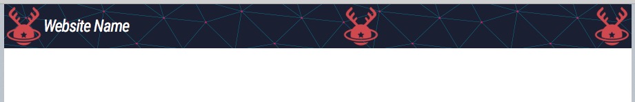
PS If you don’t understand why this previews like this you need to go back through No1 and No2 tutorials.
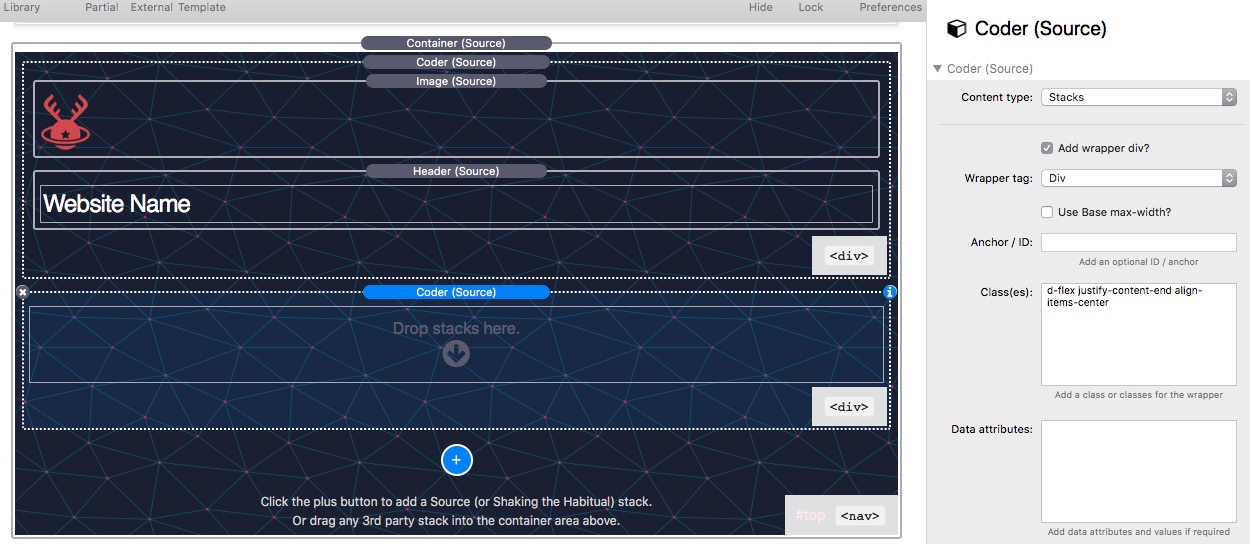
Now let’s, delete the second image and the third image in the second Coder. We will add a Source Markdown stack and add the Class of nav-zoner and also a Source Button styled to the size and colour we want. Inside the Markdown stack we will add the code shown in the image which a list of navigation links that you can edit and alter the nav text and where the link goes to. In this example, a button group is used which will make life easier if you want to add more buttons, but a normal button will do.
The following custom CSS should be added to the page CSSS or in this case I will use a Coder stack set to CSS:
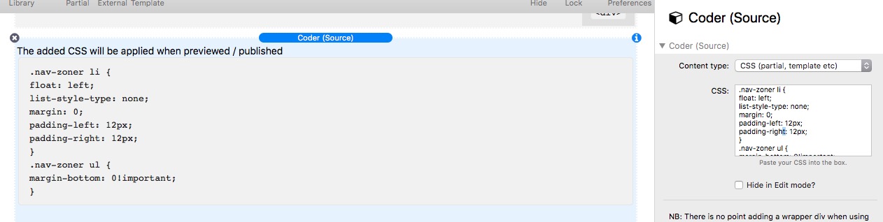
This code removes the bullet point symbols and makes the link code into a horizontal line. It will pick up the Source link styling.
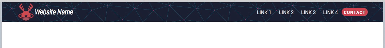
It will preview as:
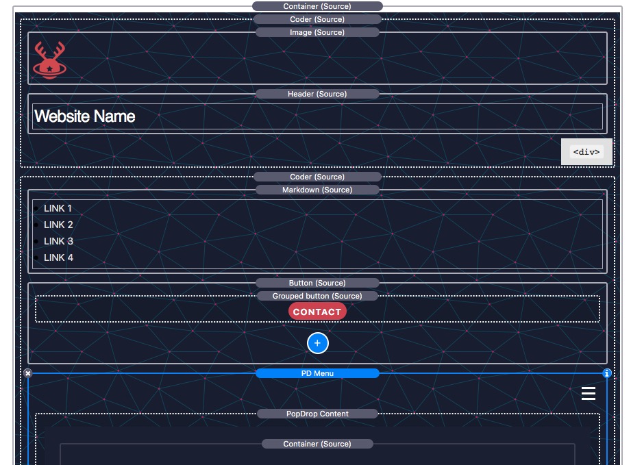
We then add the final piece of this navigation by adding a BWD PopDrop setup to use a white burger and trigger from a burger. All we have to do is add the PopDrop into the second Coder where we want it to appear i.e. after the button.
So how do we make this responsive when the width of the screen makes the contents collide? Easy.
Every Source stack has a built-in hide/show/above/below setting. So we decide which item to hide first and then next, etc… So if we run out of space at 703px, we could chose to hide the Header below 703px, and then when we next run out of space at say 567px, we choose to hide the image logo below567px, etc… The navigation will remain viewable for the maximum amount of space possible at every screen size.