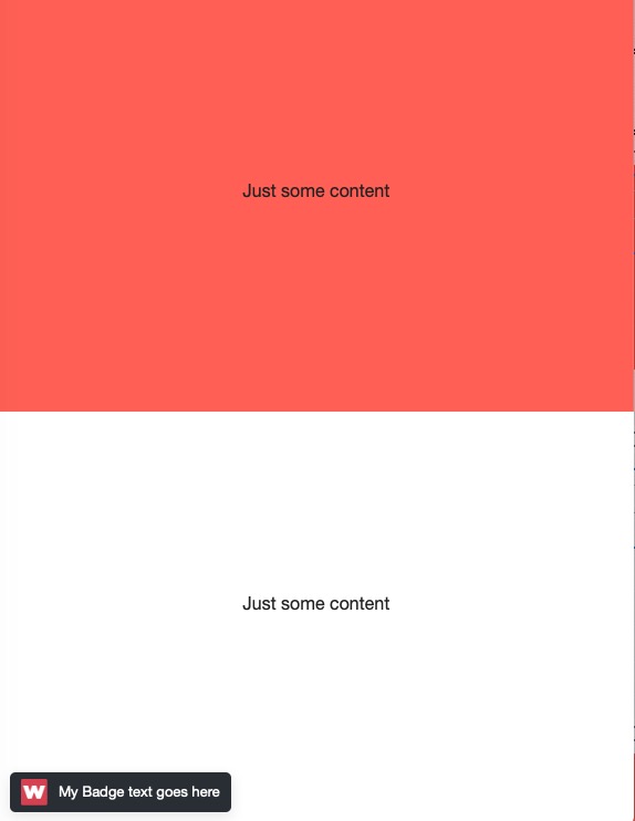
Here’s a useful educational demo showing how to recreate a fully flexible version of the new feature “Badge” that is used in RapidWeaver Classic. Below is a screenshot of the Badge built with RW7 and Stacks.
Although the badge is really just several lines of code, it may not be obvious how to build this layout using just stacks without using any code. Source provides all the options you need and there are several ways of creating a much more configurable version of this badge.
E.g. the badge can be hidden below any width on small screen, resized on small screens, made transparent, be positioned anywhere, be adjusted to work with modal windows, using animated attention grabbing background, etc…
In brief the badge layout is constructed by positioning an image alongside some text in a padded and rounded area. That area is then set to be a fixed to the bottom left of the screen.
bg-1 selects the BG colour set in the Utility Stacks bg-1 m-2 selects the a margin of 20px set in the Utility Stacks m-2 position-fixed pos-bl fixes the badge to the bottom left of the screen shad-2 Adds selects the shadow 1 set in the Utility Stacks shad-1 d-inline-flex align-items-center Aligns the contents of the Coder stack to be inline and entered vertically in the badge rounded selects the rounded corners set in the Utility Stacks border radius
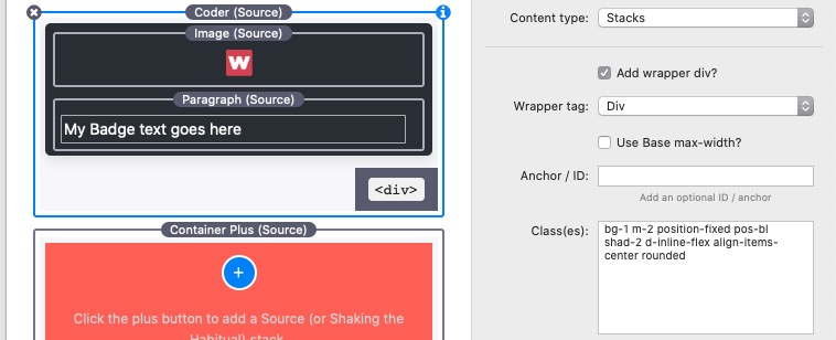
In addition the Source Utility stacks is added to the top of the page with padding setup for margin 2 to be 10px, bg-1 set to the badge BG colour and Flex enabled.
Both the image and the paragraph have padding added to adjust the look of the badge. I have also adjusted the paragraph text to be 1.3rem and remove the bottom margin.
The Source KB has 2 most useful pages that detail all of the available classes that can be simply added to any Source stacks to do pretty much anything. Note that all of this is provided as standard in the Source Addons. The Source Utility stacks is one of Sources best kept secrets that all Source users should become familiar.
The badge can be positioned in any of the corners and more than 1 badge can be used - hey go crazy and one in every corner. E.g. this could be useful to create a navigation system by stacking several badges containing links or even buttons, on top of each other as multiple badges or 1 tall “badge” navigation area.
Remember that you can put any stacks (that make sense) inside the Coder.
Also the content of the badge will adjust to its size which in the demo is the length of the text.
The badge can also be made to look like it is attached to the left edge of the screen by just using a Coder bottom margin and adding larger radius corners just to the right side.
The badge would be a great way to trigger a COVID update or privacy information Limelight modal window.
Use an animation stack if you want to delay its appearance or add further animation effects.
Using an animated BG setup in a Container Base can be used to add an animating BG to the badge. Or try a Blur or Frost BG effect that shows a blurred part of the underlying page.
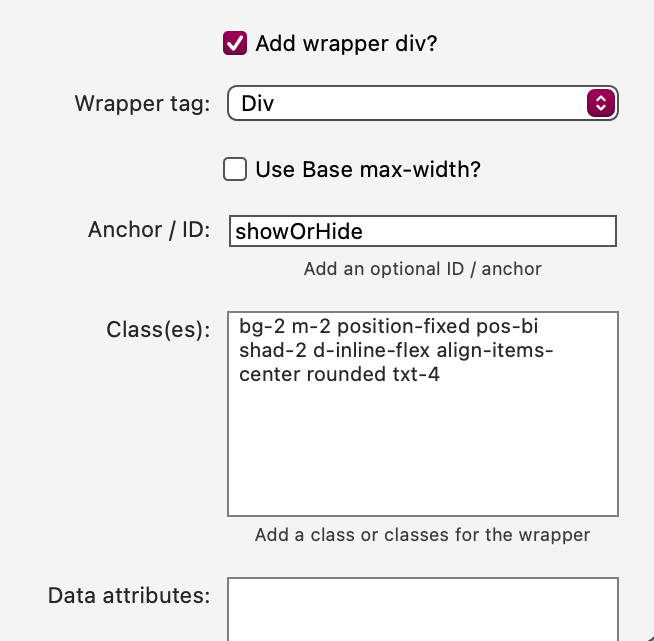
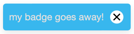
That’s great, Gary! Until this morning, I didn’t know what a ‘badge’ was in this context. But… when it comes to these things, I always seem to be Mr Not-Quite-Satisfied. The kind of badge I can see being useful is one that contains some kind of personalised information. I’m not quite sure what that would be, or how to achieve it, but I’m pretty sure I’d want to make sure the recipient can make it go away. Anyway, after a little bit of experimentation, here is a first stab at a fix to dismiss the badge (until the page loads again, of course).
Javascript, to make it go away:
 function showOrHideDiv() {
      var v = document.getElementById("showOrHide");
      if (v.style.display === "none") {
         v.style.display = "block";
      } else {
         v.style.display = "none";
      }
   }
I’m sure somewhere I’ve got a stack that does all of this with much less fiddling about, but it’s always an interesting learning experience to recreate these things in Source.
And if you don’t want the badge to reappear if someone deletes it, add this Javascript which will deactivate it with local storage (not a cookie). As with a cookie, it can be reinstated by deleting the local storage file in the Storage area of the browser’s dev tools.
var noreturn = document.getElementById('showOrHide');
if (localStorage.getItem('set') === 'set') {
  noreturn.style.display = 'none';
} else {
  localStorage.setItem('set', 'set');
}
(I had this already for something else, and it seems to work fine with some mods for this situation).
I just realised where I had seen the exact same type of badge used elsewhere. The big new (and only) feature in RW Classic is a direct copy of the Blocs App “made with Blocs” badge. Of course, Blocs has a Dark version which RW Classic doesn’t have.
I’ve noticed you are constantly singing the praises of Source. I downloaded it a while back and also purchased the addon’s. Played around with it for a while then went back to Foundry. Do you think it’s worth my time go give it another look? I’ve used Foundry for years and I don’t know a whole about coding. Do you think one is better than the other? Foundry is great but there are some things that are frustrating as well.
I would encourage you to go back to Souce and have another go. There is a great deal of suppport material and also the Source Academy.
You don’t need to know anything about how to code, to use Source. In my example at the start of this thread, I am using the built in documented features to achieve quite complex results. So for example I added m-2 to the layout I am building above. It is very simple and you soon remember the ones you use frequently.
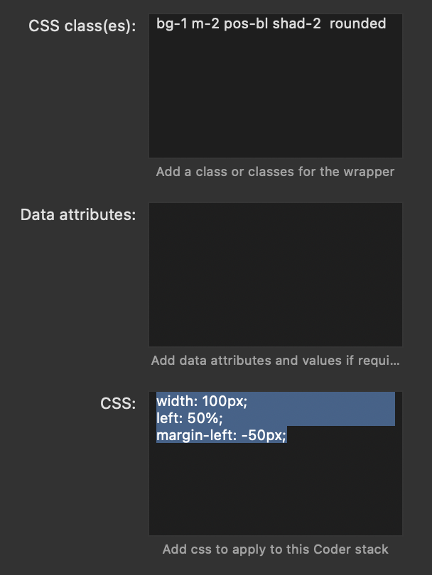
No, sorry again, I meant that I would like to put the Badge at the bottom and center it horizontally on the screen.
pos-bl sends it to the left, pos-br sends it to the right… entering w-100 lengthens the whole badge…
I can’t figure out how to do it.
(it was already discussed, but I can’t find it in the forum)