Following on from this thread How would you build a Timeline layout - #3 by Webdeersign , this is a basic tutorial to show how to build a super flexible Timeline layout that would also be suitable for process or sequence layouts.
In this tutorial, you will see how to control image width, use the GridPlus to position content and and overlay content on top of other content.
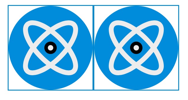
You will need an image and I have prepared a suitable SVG one below. Any suitable appropriate image will do but I am using this one to illustrate how some images need to be controlled.
Add a Source stack to a new Stacks page (You have the Source Addons pack and also the Source Theme selected.)
Add an SVG stack and paste the code from above, into the SVG stack. In the SVG settings, just to demonstrate something, set the width to 9999 for both device settings. Preview, and this SVG image will fill the screen. Adjust the screen size and note that the image will adjust to the width of the screen.
Now add a Container to the page, set the width to Base max-width (Alt) and add some pretty padding to the container, say 20px on all side. This is just to tidy the page up. Now drop the SVG stack inside the Container and Preview. The image will now appear at the width of the Base max-width (Alt) less the 20px padding on each side.
What this demonstrates is how the width of the image is being set by the width of it’s container.
Now set the Accent and also Border colour to the same blue colour in the Source control stack.
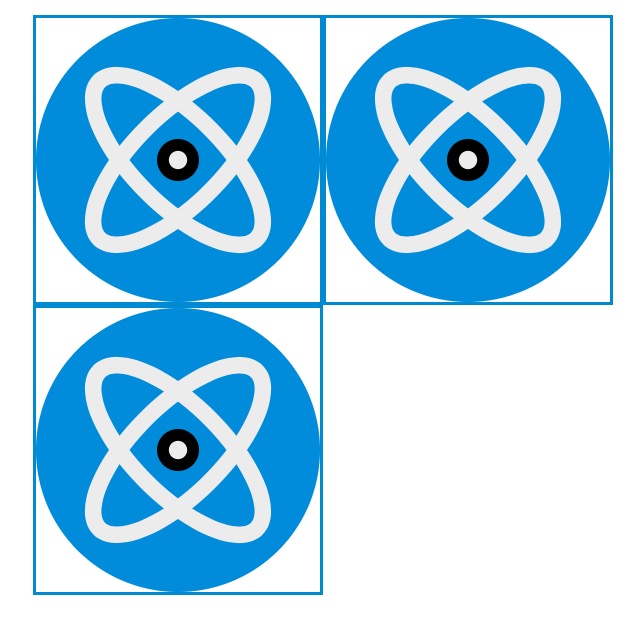
Now add a GridPlus to the page, and place it inside the Container. If you preview it should look the same as above.
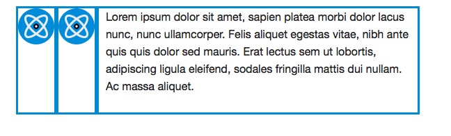
In the GridPlus stack tick Add borders (in Grid Items - Styling), also set the first Col and Row gap to be 0px (in the Grid - Setup area) and preview.
Note - Setting the gaps to 0px is not essential here, but worth adjusting to see the effect. Essentially, this is the space between the grid items and when set to 0px, they will butt up against each other.
You should now see the same image with a blue border around it as shown below:
Now select all 3 GridItems and unselect Enable Span reset (which is selected by default). In this application we don’t want this useful feature, because in our Timeline, we never want the grid to collapse or stack, and we want it to preserve its layout at all screen sizes. So we never need the Grid to reset.
In the GridPlus stack, in Grid Setup, change the Column definition from the default Min Width to Custom (Advanced). If you look further down the settings you will see Grid Setup Breakpoint 1, 2, etc. We don’t need to use these for our layout, but these additional settings would be used at different screen sizes, if you needed to reshape your layout. However, in this layout we can use the same grid layout for all screen sizes.
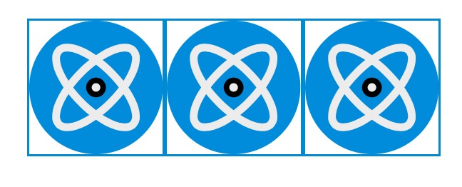
In the Grid Setup, Cols template enter 1fr and preview. 1fr means create a column where each column fills the available space. We could also have entered 100% to get the same thing.
Now enter 1fr 1fr and preview to get the image below:
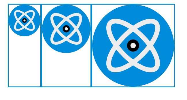
Now change the 1fr 1fr 1fr to 20% 30% 1fr, preview and you should get"
Now the split of the 'columns" is 20%, 30% and 50% because 1fr = 50% (which is the remaining available space).
You can try with values such as 100px 15% 1frwhich would create a first column width at a fixed 100px, a second column that will always be 15% of the width and the 3rd column will be whatever space is left.
Don’t proceed until you understand this. Try out different values to see what happens.
So far we have just been exploring what the Column Template does.
Back to our Timeline tutorial.
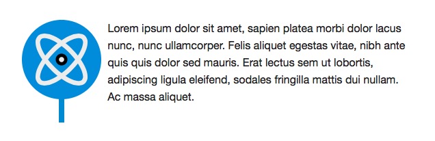
Now drag a Paragraph stack into the 3rd GridItem and delete the SVG Stack in that GridItem, Add 10px padding left and right to the paragraph stack.
Now change the Cols template to 10% 10% 1fr`, Preview and you should get:
Note how the borders have grown in length which is now being set by the height of the paragraph text. This is exactly what we want to happen.
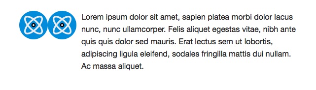
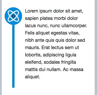
The borders are there at this point just to show the boundaries of the GridItems, so we can now remove them in the GridPlus settings, by un-selecting Add Borders to get:
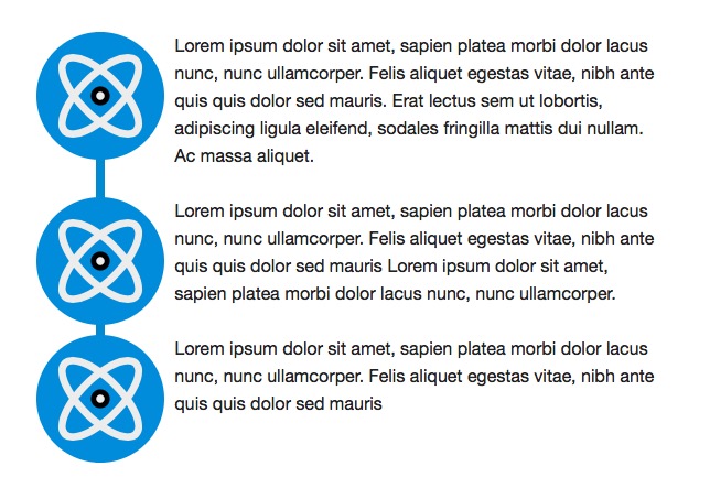
This is now starting to look like the Timeline layout we are trying to create.
Now copy the first GridItem containing one of the SVG images and paste it so that it appears as a new 4thGridItem with an SVG image.
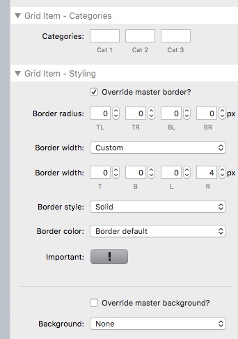
Also, in the first 2 GridItems, delete the 2 SVG stacks so that these GridItem are empty. We will now use these GridItems to create the vertical blue line. A blue line width of 8px looks about right, and we are going to create this by creating a 4px border on the right side of the first GridItem, and a 4px border on the left side of the second GridItem. The 2 will appear side by side and create an 8px vertical blue line that will always match the height of the text content. Remeber that bodres cannot be drawn down the middle of a container, so this is just a way of creating the issusion that we have a border down the middle.
So, in the 1st GridItem, select Overide master border and choose Border Width Custom and set the right border to 4px, rest to 0px.
In the 2nd GridItem, select Overide master border and choose Border Width Custom and set the left border to 4px, rest to 0px.
The final part of this is the magic part and made possible in stacks by how CSS Grid is implemented in Source.
We are now going to do 3 things:
Reposition the image to a different position in the grid
Make the image span more than 1 column
Make the image appear on top of the layout, i.e. over the underlying blue line.
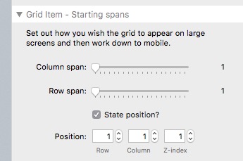
To do this, in the each GridItem we need to select State Position and force each GridItem into the order and position that we want.
So in GridItem 1 select Col 1 - see below:
In GridItem 2 select Col 2
In GridItem 3 select Col 3
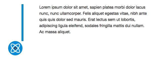
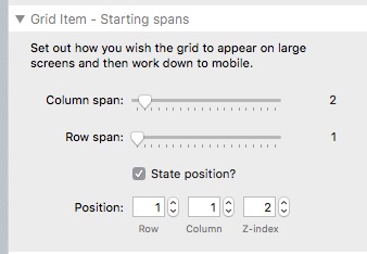
And in GridItem 4 select Col 1, Z-index 2 and Column Span 2 as below:
What’s happening here is we are forcing the 4th GridItem from it’s normal position of the 2nd row, col 1 back up into the first row in the Col 1 position AND making it fill or Span 2 Columns AND increase it’s position on the page to be above whatever is underneath it, so that we can see it.
We get:
which changes as the screen width adjusts to:
Note that the SVG image has increased in size (width) which is because it now spans 2 columns, i.e. 20%. These 2 columns are set to 10% and 10% so they will scale down with the screen width. With this layout no breakpoints need to be set.
At this point you could make this layout into a Stacks Template to use whenever you need this type of layout. Note also that if you remove the timeline you have a powerful stack layout like the Foundry Media stack but one on Steroids.
To create more entries in the Timeline or Process or Sequence layout, just copy and paste the GridPlus layout we just created.
The whole display is adjustable by altering the Paragraph padding, the column widths of the first 2 column (you may prefer 6% 6% 1fr or 8% 8% 1fr) to reduce the size of the icon.
Other things to note:
You can use dotted borders and alter the size of the borders.
Additional images can be added along the timeline by adding below the main SVG images in the same GridItem.
Any content can be used in the Paragraph GridItem such as headers, images or buttons.
Buttons or CTA actions could be used in place of the SVG images to create a sequence or order of events.
The Timeline can be reversed by using 1fr 10% 10% and altering the State Positions. Treat this as homework to figure it out. If you absorbed all of this so far, you will know how to do it in a couple of minutes.
Summary.
This has been a long drawn out for clarity, tutorial and if you are using Source you would benefit from learing how to use the Grid in this way. This tutorial has just scratched the surface in what the Grid can do.
Gary - Thank you for this excellent tutorial. It took me a couple of goes to get it right (me not reading the instructions properly) but I have now managed to get it to work. Good stuff/
It may seem like a lot but the core principles of Source are used over and over in most of these tutorials. Once you grasp them, the light will go on and you will realise that you can build pretty much anything.
AFAIK there is no other way to build such a configurable timeline with any other stacks, so it is impressive that you can do this all from within Source.
I find timeline layouts to be a very efective way to illustrate a series of events or a process and the switch from one side of the page to the other can be used to highlight significant stages.
The Source series of CSS Grid stacks is like using lego bricks when you understand it.