I’m hoping to be building a new client site with Source and they’d like it to be a single page, smooth scrolling site with a standard horizontal menu at the top.
I don’t necessarily want to know how to do this but am I right in thinking the best way to create the menu will be manually using either text or buttons to create the menu?
HOMELINK and CONTACT can me made into local page links such as #home, #contact, etc.
The creates a single space for every occurrence of it, so you can space the nav links.
Turn off the Show in navigation for the home page to stop the home page appearing in the nav. Then add a CTA area for the Source Nav and put the paragraph stack in there. If you need a mobile menu, use a PopDrop with a burger in the mobile nav CTA area.
This will build you a very attractive and well behaved navigation.
When done, save this as a Template for further use when you need such a nav.
Yep - text or buttons is a good way to go when building some in-page anchor links.
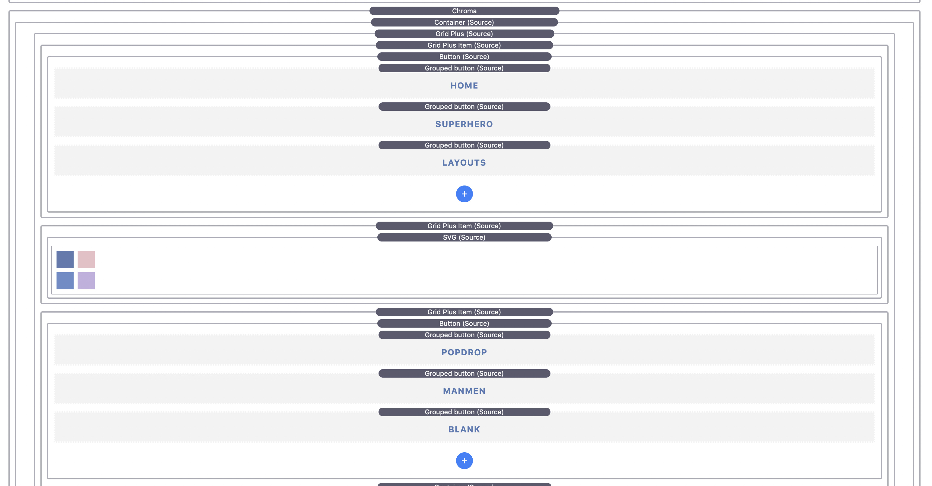
An option is to use a Grid Plus and set it up the grid item to display content in a row so that added content can then use the inbuilt flex alignment options to space it out nicely.
Also - here is an example of a hand built in-page nav i put together a while back. Something like this would work for desktop and then (as Gary says) either PopDrop or LimeLight for a mobile solution.
For smooth scrolling you just need to add the Smooth scroll enabler stack and that will automatically set up smooth scrolling to any anchor links.
Thanks to both. Good to know there are some options. I like the idea of using Grid Plus because it’ll allow me to have the logo ranged left, nav in the middle and a button on the right.
Then I can switch to Limelight, probably, for the mobile nav.
Yes the Grid+ is also perfect for creating nav. The new height control in the image stack makes it a cinch to get the branding image the right size. Also because every element of the nav has it’s own completely configurable hide/show/above/below control, you can make the nav retain as much as you can with this level of controls.
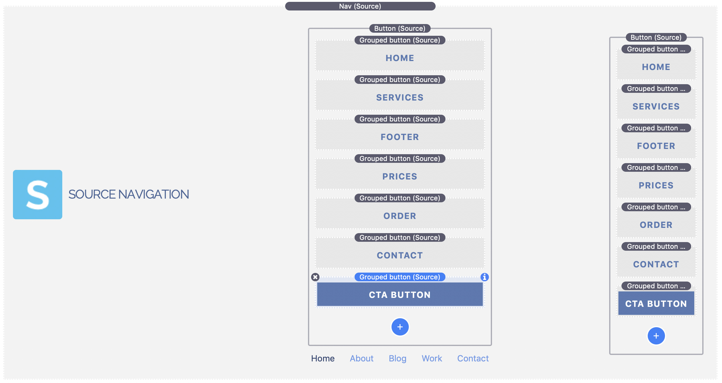
Sorted the mobile menu. Don’t actually need to use PopDrop, or a third party stack, you can just use the regular Source menu (hidden on desktop) and fire some Source buttons into the mobile CTA.
Absolutely right. You don’t have to use a PopDrop because the Source Nav has a desktop CTA area and also a mobile CTA area which is completely configurable when the change occurs.
Also, just because Source makes it easy to put the logo in the middle, that doesn’t mean it has to go in the middle. Having a logo in the middle really compromises the number of links and only works with certain logos and a small number of links on desktop.
D’oh! Id not realised that, so the menu you need Rob is super easy to make using the regular navbar and buttons in the desktop and mobile CTA sections.
Piss easy and just uses a single Nav stack. Just need to fix the close on click thingie with the mobile menu. Source has a manually curated menu option built in: Woo hoo! (I personally hate menus made via the page list).
Also… If you son’t have too many menu items, no need for a mobile menu at all, as the buttons in the CTA box wrap nicely. I’m a fan lately of wrapping menus on mobile. Keeps everything in view with no need to click to see the menu.
Might be an idea in this instance to have the logo, or site name, disappear at a set screen width via a media query.
Indeed. I’d kinda written the native Source menu stack off, as I loathe menus created from the page list. But there’s a lot more to it than you realise once you dig down a bit.
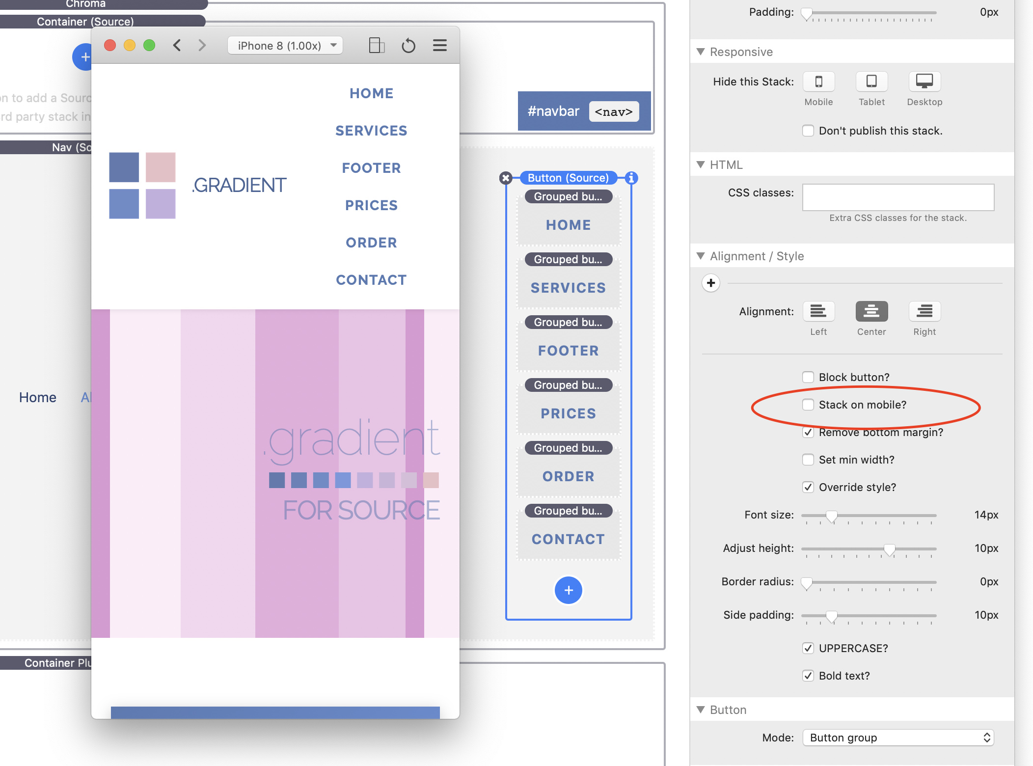
Hmm, hold up… In that final version, with the wrapping buttons, the button group stacks once the screen width gets below a breakpoint (not sure what yet).
Should this be happening @habitualshaker, given the stack on mobile option isn’t ticked?
I can’t remember how this is set up in the CTA - it does override some things. Will have a look tomorrow.
The closing the drop down on click might be trickier- would need some js - that side of the Nav was tav’s domain but can have a look. It may still be worth testing with Popdrop as an alternative as it is more built for this kind of in-page behaviour.
That’s a decent solution too because the links always wrap elegantly. You can set the mobile BP to 320 so it never switches to mobile and lets the button links flow to a new line. In some ways this is probably the most user friendly because the menu links appear the same on all devices delivering a solution to the burger agnostics, all links are always visible and the top part of the web page is not obscured with a dropdown or slide in long menu. Win win win.