PageSpeed Insights - achieving 100% score

If you are reading this tip in the Source section, then you are probably already a Source user and you are on the right path to achieve a 100% result. (I have yet to see a real RW site built with any other framework achieve a 100% Desktop, 99% Mobile result.)

If you are not using SOURCE, then the following will improve your score, but is very unlikely to get you to 100% desktop & 98% or 99% mobile.

I have built many real Source sites that have achieved a 100% Desktop and 98% or 99% Mobile result, using the guidance below. The mobile results simulate a slow mobile data rate delivery of content, so it can penalise many real sites expecially if you have many large BG images (say half a dozen 500Kb images), but if you get 99%, then you have created a super quick site. Also make sure you run the test a few times because it does seem to vary at different times of the day.

PageInsights is often criticised, but I think it is still a valuable web site analysis tool that will give you insights about how you can improve your score or just confirm you are following best practice. Anything that points you in the right direction is a good thing, but the report needs to with an understanding of proportion.

Based on my experience using SOURCE, you can generally ignore any advice in the results below:

  1. Use next gen image formats such as Google’s .webPformat. .webPand other better formats are just not supported widely enough. Only the latest versions of Safari on the latest versions of macOS supports .webP. Why build a site that most visitors won’t see your images? Sites built with correctly sized .jpg or .png images can get 100%.
  2. Ignored advice toAvoid an excessive DOM size.
  3. Ignore advice about Serve static assets with an efficient cache policy.
  4. Ignore Does not use passive listeners to improve scrolling performance.
  5. Generally, ignore 1 instance of Image elements do not have explicit width and height if you can’t define the dimensions.

Run a PageSpeed test on https://webdeersign.com which is a complex site, and you will see that these issues reported above don’t stop getting a 100% result.

Solutions:

  1. Use Source - the most important thing here.
  2. Do not load more than 2 large local fonts. 30Kb-50Kb each is just about OK. Go here to subset your Google fonts and download in woff2 format. Eg OpenSans 400 can be subsetted and converted to a woff2 file with a size of 11k.
  3. Don’t use FontAwesome or any other icons. Use SVG symbols with a Grid soluion to align. Many stacks load FontAwesome icons just to use 1 or 2 icons. The best stacks draw the icons.
  4. Do NOT use any NON Source stack unless the developer makes a big thing about efficiency and size. Generally, stacks such as Splider, Faq, Animate, etc. & any BWD stacks fall into this category (others too). If in doubt, ask the developer. Almost everthing you need is availabe in Source and will already be loaded to your site on the first Home page load.
  5. Don’t load anything else you don’t need, e.g. - don’t add the Source Smooth Scroll, which even though is already tiny, don’t add it unless want to use it.
  6. Important size your images in a graphic app or a resizing app in Google’s free SQUOOSH app to the maximum size that the images will be displayed.
  7. Resize your images, and optimise your images (in one operation) with the free ImageOptim SQUOOSH app or other. Use an App that resizes and optimises in 1 process to avoid an additional SAVE which will degrade your image. Do this individually for each image for best results as a signifiicant extra amount can be saved by adjusting the optimisation in SQUOOSH for each image.
  8. Important define the size of your images using the Source Image stack - Custom Attributes box and enter width="300" height="50" adjusted for your images. Set width to 100%.
  9. Add a loading ="lazy" onto the above Attribute, i.e. width="300" height="50" loading="lazy" to lazy load the image for any images that do not appear in the first fold, i.e. on the first content viewed on a page before you scroll down.
  10. Enable compression on your server.

Edit Addition:
Use of correctly served webP images is absolutely a good thing to do and your site will be reduced in size. If you’resing a SOURCE site, this may get your mobile score to 100%.

Edit Addition 2:
I have included most of the information on this topic with more information into a set of posts on my blog at https://www.webdeersign.com/blog

WARNING. Replacing all images with optimised webP images is not a solution, because there are many Safari users who will not be able to see your images. Use of webP images needs a fallback so that if the page visitors Safari (IOS and macOS) cannot display webP images, then a fallback jpg/png image will be downloaded, and used instead of the invisible webP image.

Feel free to treat yourself to either of the badges below:

pagespeed100
pagespeed100white

5 Likes

Love to see some. Any links?

There is a link above.

The point about building a quick site is that when you figure it out, you build then every site following that same formula and only add in stuff that will slow it down if there is no other option.

Sorry, I meant to any of the real sites you’ve built in Source. Always like seeing your designs.

That is a real site and quite a complex one too.

Thanks for spotting that.

A refresh of all files and it’s now all good.

Not a bother. I just got the impression you have lots of real Source sites out there, and figured be interesting to see them. As I say, I’ve always liked your designs. But no bother.

1 Like

Useful thoughts, as always. After my dive down the .webp rabbit hole a few weeks back, I’m strictly in .jpg and .png, but the fonts idea is very helpful and other ideas too. I’ll drop my font awesome icons

1 Like

If you use the <picture> tag then you can just specify a fall back to a JPG or PNG and thus have everything to gain but nothing to lose.

STH Srcerer and many other modern picture/image stacks allow you to do this. The browser will only load the older formats if webP is not supported. (This works with AVIF as well).

1 Like

The other issue I found with .webP images is the other side of using this image format, which is that there just isn’t enough good image apps for managing a .webP library well or resizing or editing. Photoshop has a .webp export plugin, but generally the developer support is sparse. E.g. I use Catalina and I can’t view a .webp image in Finder, Preview, RW, Pixel (my image manager), Affinity Designer,Graphic App, any or the resize tools I use, my FTP Transmit’s file preview and also Safari. There is a dependancy on the OS that just isn’t there for all of these otherwise perfectly good tools. Surprisingly to Mac users, is the fact that Win10 supports .webP!

My original point though is that you can achieve a 100% desktop result, even if you get the “Insight” to use next gen image formats based on the use of a handful of well sized and optimised, old gen image formats.

Just treat them like fonts. There a plenty of good and free online converters to process your JPG’s into WebP’s when its time for the final publish of your site. You can still do everything as normal but then process the extra format - just like we have done with WOFF2 fonts for years now.

Regardless of the Google PageSpeed number, why not make the experience faster and lighter for the viewers of your webpages.

I’m on a rubbish rural 4G only broadband and I don’t care whether a page has a score 100 or not but if all the images on the page are only 1/2 as big then it makes a real difference to the download time.

If you optimise and correctly size the JPG’s and PNG’s in the first place then fine, the WebP’s will be commensurately smaller as well.

Images are almost always the largest component of a web page and so it makes sense to serve them as small as possible whether you have a few or many.

Absolutely agree.

Fonts don’t degrade every time you save them so it can be different if you care about image quality. If you are working on a new design, then it is just a 1 further step. However, if you are working on updating an existing site, then it can be a lot of work to create a new .webP image to avoid using an already degraded image, i.e. original jpg image - resize - optimise, etc., where each save step loses quality.

If you can’t see a .webP image in your system then you need another system to check each image.

I’m not anti .webP at all, and bring on the day when every browser can display them and we have better tools, but depending on your requirements, system and number of images, it can be a small effort or a pretty big effort.

I wasn’t suggesting creating WebP versions from compressed JPG’s. Merely that images should be sized / cropped appropriately and then from that export the appropriate compressed JPG and the WebP. You would never compress a previously compressed JPG as part of a site update so no need to do it for WebP’s either.

It strikes me, this whole process would be an ideal candidate for a batch processing app, either command line or even on the server.

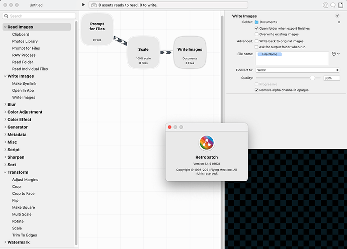
Retrobatch can batch-convert images to WebP (among many other things):


https://flyingmeat.com/retrobatch/

1 Like

Good call @wolf - Retrobatch is ideal.

1 Like

The last time I looked at Retrobatch it didn’t do Image Optimisation. The RB site is not clear about this, but do you know if Retrobatch or Retrobatch Pro now does Optimisation?

Unfortunately, the bulk image processor Xconvert doesn’t seem to do Optimisation.

Regarding .webP images, has anyone here tried and had success using the htaccess method of automatically serving .webP images on Apache servers, if a .webP image version exists alongside a jpg or png?

What exactly do you mean with “Optimization”? Sharpening, Exposure Adjustments, Downsizing, Handling Meta-Data? I think Retrobatch can do all that. But you can simply download it and try for yourself…: :-)
https://flyingmeat.com/download/Retrobatch.zip

The main features are listed here: Retrobatch 2, from Flying Meat
And a comparison between the normal and the pro version can be found here:
Retrobatch Pro vs. Regular - Retrobatch Documentation

I mean reduce the File size of a jpg image and maintain perceived image quality. Just like imagOptim, etc…

The ideal batch process would be to load a folder of jpg or png large images, resize all to a width, optimise, and then save images as jpg or png and also create a webP version. All in 1 open save function.

In Retrobatch you can do all the scaling and creating different formats etc. At the end of the Workflow you can send all (e.g.) jpegs to ImageOptim (via Open in App node) and it will take the files and do its thing with them.