Here is my newest Project for SOURCE. I can’t believe this is the 23rd Project. As with all of my other other Source Projects, SOURCE is just a joy to work with.
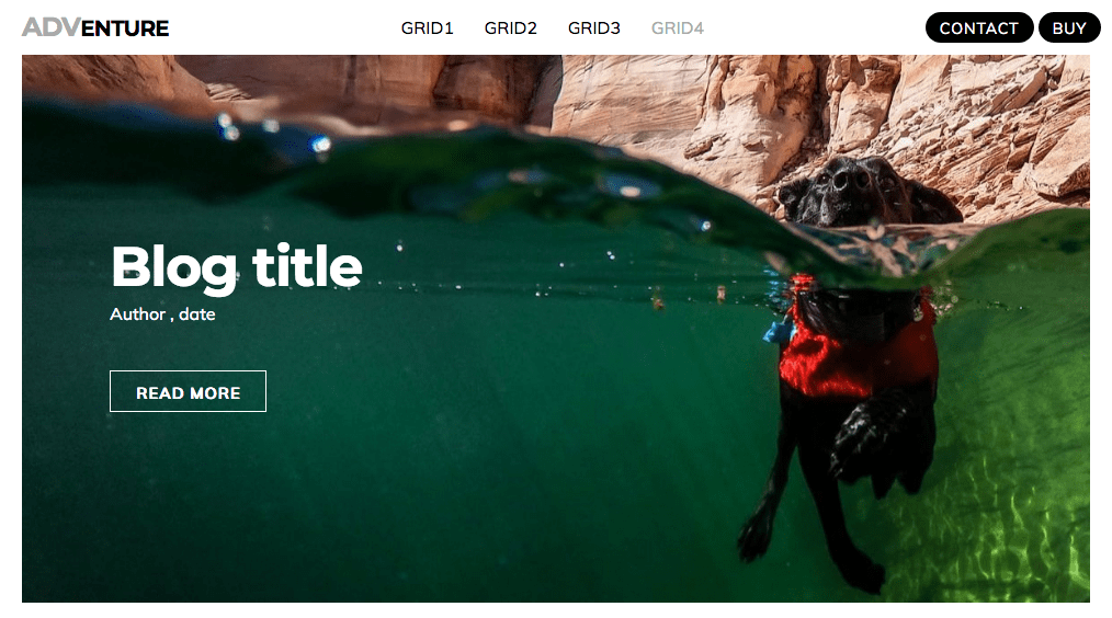
This Project is all about recreating the best blog layouts that are out there. The SOURCE grid is easy to scale and add more 'blog" items and like all SOURCE Projects, adds a tiny amount of code to your page.
I also created a new custom page divider for this Project.
Really nice use of Limelight there. And as always looks stunning.
I think it’s really good that the both of us are now producing projects for Source (I’ve another in the works, be a while yet though), and while mine tend towards function, yours are always visually stunning, thus giving the user plenty of choice.
Yes. The point at which the navbar converts to mobile is fully configurable. Set it to a 1px and it will be mobile all the time.
Yes. Just add a text-align by adding u-align-center to the nav class box.
Not sure about this. However, CTA buttons first is the way to go. The Contact and Buy buttons are the 2 most important buttons and it would be wrong to add them to the bottom. If the menu is long they could be off the screen. CTA buttons at the top is best practice.
Yes. Just pop them in a Container set to 110px in this case and you are done.
The Source nav is about the easiest and simplest navbars to configure and as demonstrated it’s really powerful.
PS I overlooked doing this and it’s such a simple fix I have now added it and the demo site is updated.
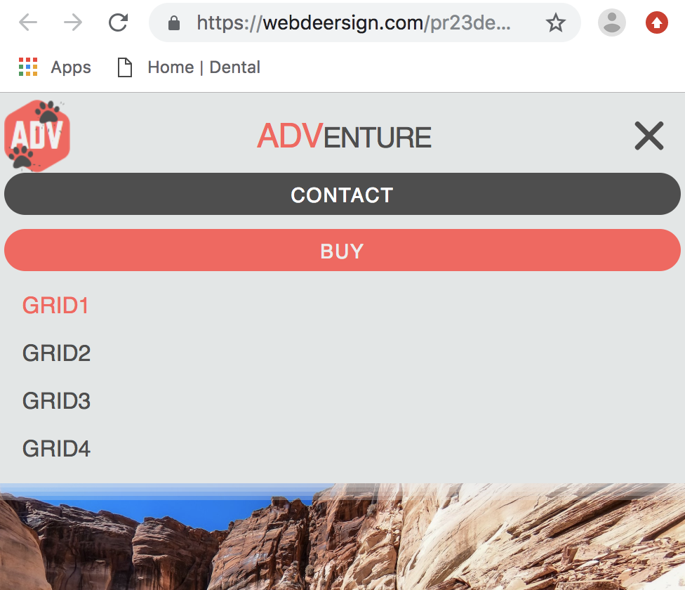
Another example is the previous 2 Source Projects I did that show another alternative solution to building a very acceptable mobile menu. Have a look at the mobile menu at Webdeersign Project 22 for SOURCE
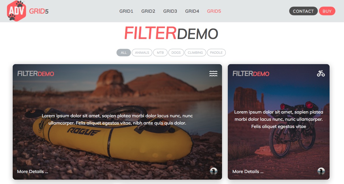
I have added a new page to the project that uses the inbuilt Filter feature in the Source Grid Plus stack. This can be really useful for filtering large bog type layouts.