Pros & cons of a manually made navigation bar?

This is a discussion that started on the Foundry Forum as a side-step to another discussion, but I’m continuing it here as it’s not really Foundry-centric. It does use some Foundry stacks, although it could easily use any other.

I started a new project this week which had a very sepecific requirement for the nav bar. I’m building the project in Foundry as I need to use Alloy, but Foundry didn’t really have the menu setup I needed, so I figured I’d make my own.

This is a demo of it: Pre-built projects for Rapidweaver

The version I’m making for the project is a little more complex, in terms of items in the nav bar, but for the purpose of this discussion the simpler one will suffice.

How it’s made…

  • Elixirs Flux CSS grid stack does the column stuff. With a grid item each for the logo, header, links in the middle, the button and finally the mobile menu.
  • The Logo is just a Foundry Icon stack.
  • The header is just a regular header stack.
  • The links are Foundry Button Group stack.
  • The button is a Foundry Button stack.
  • The mobile menu is Tav’s PopDrop Menu with another Foundry Button Group inside the dropdown.

It’s really all simple stuff. The hardest bit was getting the grid items in Flux set to the right widths for each breakpoint. But that was just a few minutes trail and error session.

In terms of layout, content and how it behaves at various screen widths it all works perfectly. And in terms of code weight, it’s actually the same as many navbar stacks, give or take 20kbs. (I tested it against quite a few).

The pros… Well, they are pretty obvious: You have complete and utter control over what to put in the menu and how it works at different breakpoints. Nice! But what about the cons?

I’ve seen it written on many a forum post that making using a homemade navbar is a bad idea. And so despite me making a load of them over the years (I’m a bit obsessed with navbars!) I’ve never used one on a live site. But I don’t really know why!

I did ask over on the Foundry forum if using this sort of homemade nav bar was a bad idea, and Adam said…

This is definitely a generalization, but navigation is nothing more than linked unordered lists, often in a columnized layout of some sort. The thing some might cringe at is making sure the markup is correct. Generally you want to have a
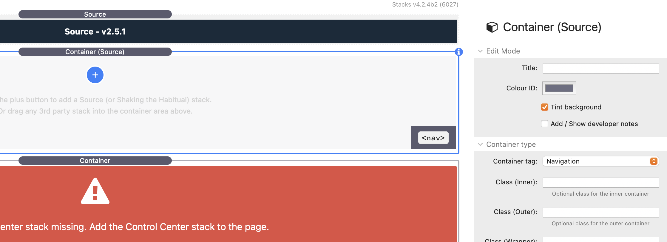
 <nav> element surrounding the navigation as a whole indicating that the content within is some sort of site navigation. Is this 100% necessary though? No.

This was an interesting point, and one I’d never considered. Clearly, given the elements the homemade navbar is made of, there are going to be no <nav> tags. So to keep things right I’m guessing they need to be added, somehow.

So really, I’d like to get the views of some of the folk here about this idea. Not so much whether to use <nav> tags or not, but if there are any other cons to this idea? I can see none. But perhaps I’m missing something?

And on the subject of the <nav>, if they are going to be added, to what elements? To the whole thing? Or just the navigation elements (buttons etc.)?

Have a look at this code example where the <nav> tag should be.

OK, so you need to wrap the whole thing is <nav>. (By the way, I didn’t read that page entirely, just scanned it!).

Interestingly, I decided to make a version in Source, a framework I use… Criminally never! And I see that you can add the tags to a container, which is handy!

1 Like

A more detailed description:

It’s Friday night. I don’t do detailed on Friday night.

(I’ll read it tomorrow)

:-)

1 Like

I’ve updated that little project to include a Source derived menu, replacing Foundry with Source stacks, and Flux with Grid Plus.

https://www.templaterepo.com/demos/flux-menu/page/

As Source seems to have the facility to apply the tags to a container, I’d have to say it seems to be the more suited tool for this job.

Still very interested to hear the views of the great and the good as to the cons of doing things this way.

1 Like

The Source menu looks better 👍

LOL. It’s just cus I put a tiny bit more styling into it. Really, they are both so basic there is nothing in it, “design” wise. I guess I maybe also spent a nano-second longer setting up Grid Plus than I did Flux, as I’m not overly familiar with Grid Plus, so had to pay more attention. The end result might be a bit more fluid.

1 Like

You can add tags to every main Source stack (where it maked sense.

I can’t help thinking that you are over thinking the Source Nav bar. You can build a much simpler one with Coders inside a parent Coder with a tag of NAV. Just use Flexbox to align and peep under the hood of teh Source/Bwd Navbar if you need assistance for teh Flexbox alignment.

I created a few tutorials in the Source Examples page here that were spefic to creating navigation type layouts.

Other things to note are that you can also add the Source Navbar inside a Coder stack and to make use of the Container Bases and Utillity stack. Check out Utility classes (Addon stack) & Utility classes (Base) | Shaking the Habitual Knowledge Base.

There are no dissadvantages to doing it this way if you do it properly, and there are many advantages.

Regarding using Foundry so that you can build a blog with a non Foundry disabled blog, why not come screaming into 2022 and build the whole thing in Source and add a Foundry page with the Alloy blog. Yes you will add a ton of code to the blog page, but you were going to do that on every page anyway.

Even better, try Alloy in a Source page and see what happens. I bet Alloy just uses the Bootstrap4 styling which you can just replicate, or even better use the Source CSS Variables to match the rest of the Source sites styling. Add any missing code if required.

1 Like

Elements in a nav bar tend to have various aspects like ‘roles’ and/or ‘aria-labels’ etc to aid with accessibility. You’ll be missing these things if you build one yourself but the nav wrapper is the main thing.

As a side note, if you are only needing a wrapper where you can state the tag then the Source Coder stack is the best option. And it can be used in any framework if you were needing that option elsewhere.

1 Like

Good such workarounds won’t be needed any more in the future 😄

1 Like

Alloy is way more than a just blogging page.

I think you are misunderstanding what I’m trying to achieve. Or I’m misunderstanding what you are saying.

That’s very good to know. Thanks.

Yes. You don’t need to use CSS Grid to build a navigation system.

What you created can be make with just the standard Source Navbar, by using the built in CTA features. Just add the CTA stacks, setup and you are done. The CTA area is the key to a whole new dimension.

If you need something beyond that, then the next least complicated solution would be to use Coders I would say from experience. You can build an entire web site with just Coders.

PS I had a look at the Navigation here at Foundry 3 Documentation and guess what? There is no NAV tag or any Aria labels I can see.

So ya, you misunderstood me. The demo menu is just a very simple version of the idea. I appreciate that layout is standard in many navbar stacks.

I’m not familiar with Coder, but will give it a look.

I’m back playing with the homemade menus again this evening. With the focus on using Source Grid Plus. Got a couple of questions for those in the know… @Webdeersign @habitualshaker and anyone else.

https://www.templaterepo.com/demos/flux-menu/core/

I’m trying to work out the best way to handle the jump to a toggle on smaller screens. I see that Grid Plus has a “Hide Below Breakpoint” option for a grid item, but what about above?

Around 650px width the three menu items in the middle disappear, and I want a mobile toggle to appear at the end.

I’ve tried a few methods but nothing is really working out. What would the experts suggest?

The obvious one is to just use a visibility stack, but I’m wondering if there is a more elegant way?

EDIT: Ignore: It’s there right in front of me: Change to devices over!

I think you found the answer but there is no Source visibility stack. That functionality is built into nearly all of the stacks and can hide above or below any breakpoint you like.

Ya, took a while but then spotted the hide below or above option.

OK, one final question before I pack in for the evening.

I see each Grid Plus item can have a different tag applied…

  • Div
  • Section
  • Article
  • Aside
  • Navigation
  • Main
  • Header
  • Footer

I’ve added the whole Grid to a Coder stack and set it to Nav. So I’m wondering if I should also set a tag to each grid item?

The grid items are…

  • Logo
  • Header
  • Middle button navigation
  • Right social icons/buttons
  • Toggle (below 700px0

I’d welcome advice, opinions and comments.

No. Nav on the whole navigation layout once is all you need.

2 Likes

Ta.

So the final question on this is how much is too much?

This one: Core | My Website weights in at about 440kb’s. That’s the whole page.

If I pull my homemade menu and fire in a Source navbar, with no items added it’s about 230kbs. If I replace the homade navbar with the UIkit one, fire in some links and buttons etc. and add in the UIkit Off Canvas stack, for hte mobile menu, it’s about 280kbs.

So (roughly) like for like, the homemade navbar adds about 200kbs over various other out-of-the-box solutions.

Given the level of control you get, I’m thinking that’s OK. What you others think?