I’m just about finished recreating a Wix site into a Rapidweaver site (and making responsive) - any suggestions on what I might have missed or what might make it better? He didn’t ask for improvements, but I’ll pass them along.
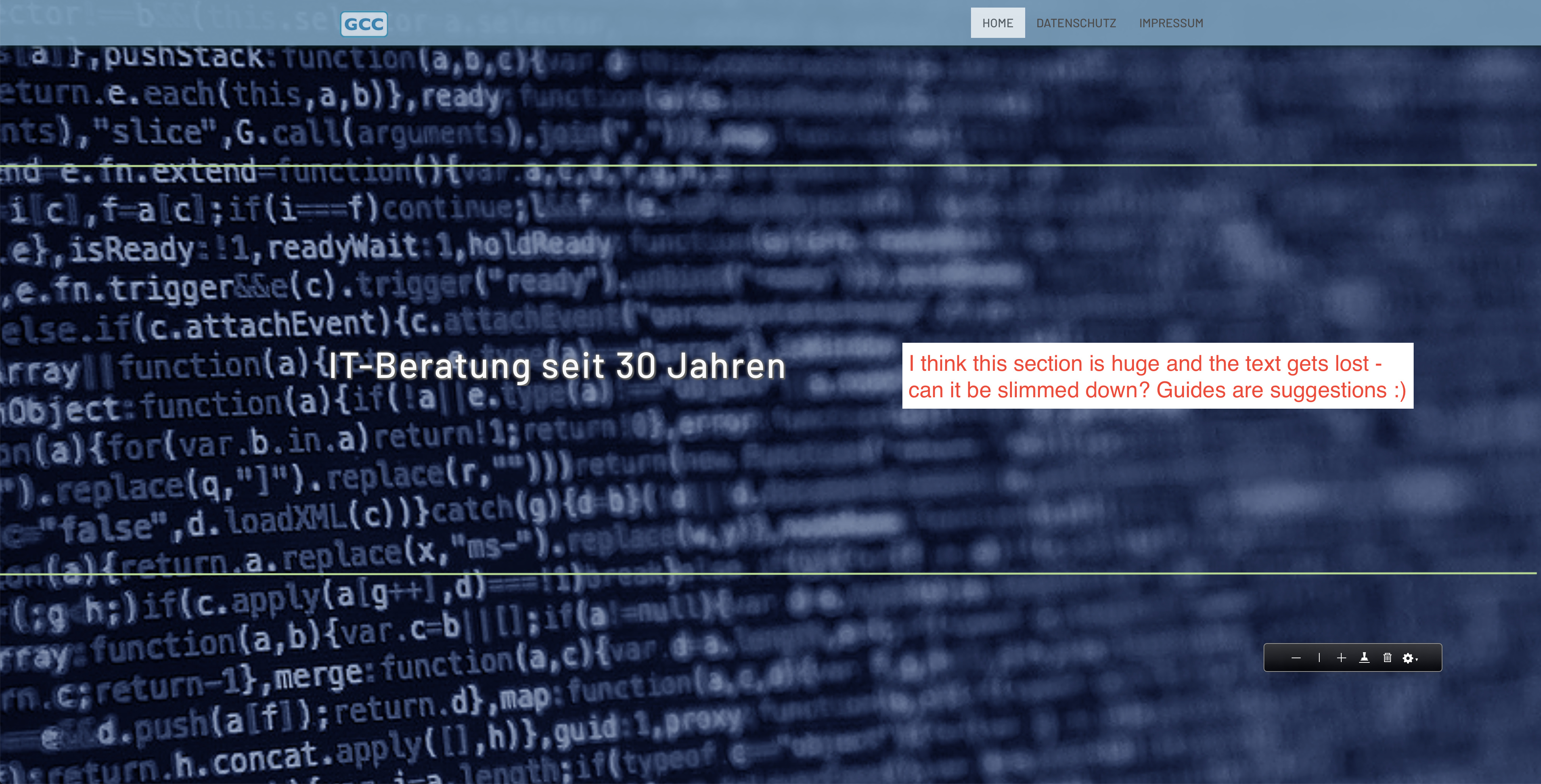
The only thing that bothers me is the sticky menu bar. I know they are all the rage these days, but I’m not a big fan. It always bothers me when I lose a lot of the screen height because of one. I think it also distracts from the main content on a website.
On my MBP, the menu bar is 110px tall. If you stay with a sticky menu bar, I’d really try to get that down to about 50px.
Thanks, Don - I agree, it looks much better at approximately half the height. I also changed the opacity so that less of the underlying content shows through.
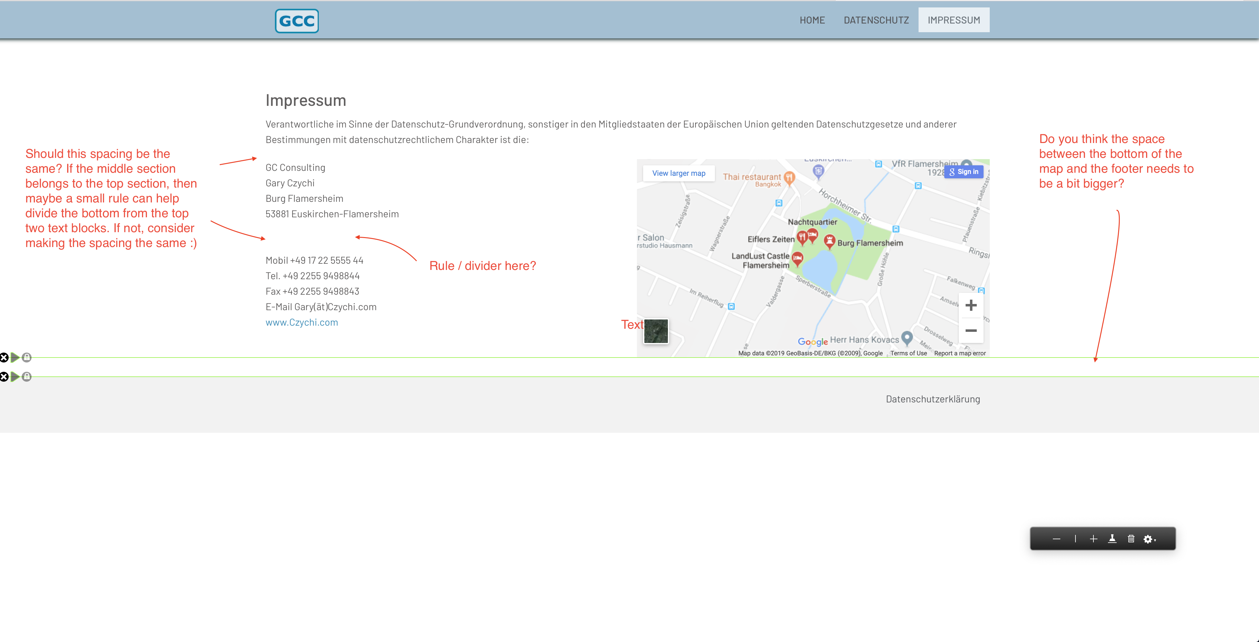
One other question for someone… On this page < https://czychi.mediapressions.com/datenschutz/ > I’m using a Blueprint stack to move the right-hand content down so that it lines up with the bottom of Gary’s photo. I tried using Target, but had no success. Other than some of the table stacks that offer bottom alignment, can someone tell me a better way to accomplish this? Thanks!
Thanks, Jason. I’ve never done that before, but I’ll try it in the morning. I appreciate it!
EDIT: I can’t believe I’ve been using Foundation since the very beginning, and never knew about Sidebar/Flex/align bottom! Thank, you, thank you, thank you, @jabostick! That works perfectly.
Hi Dave -
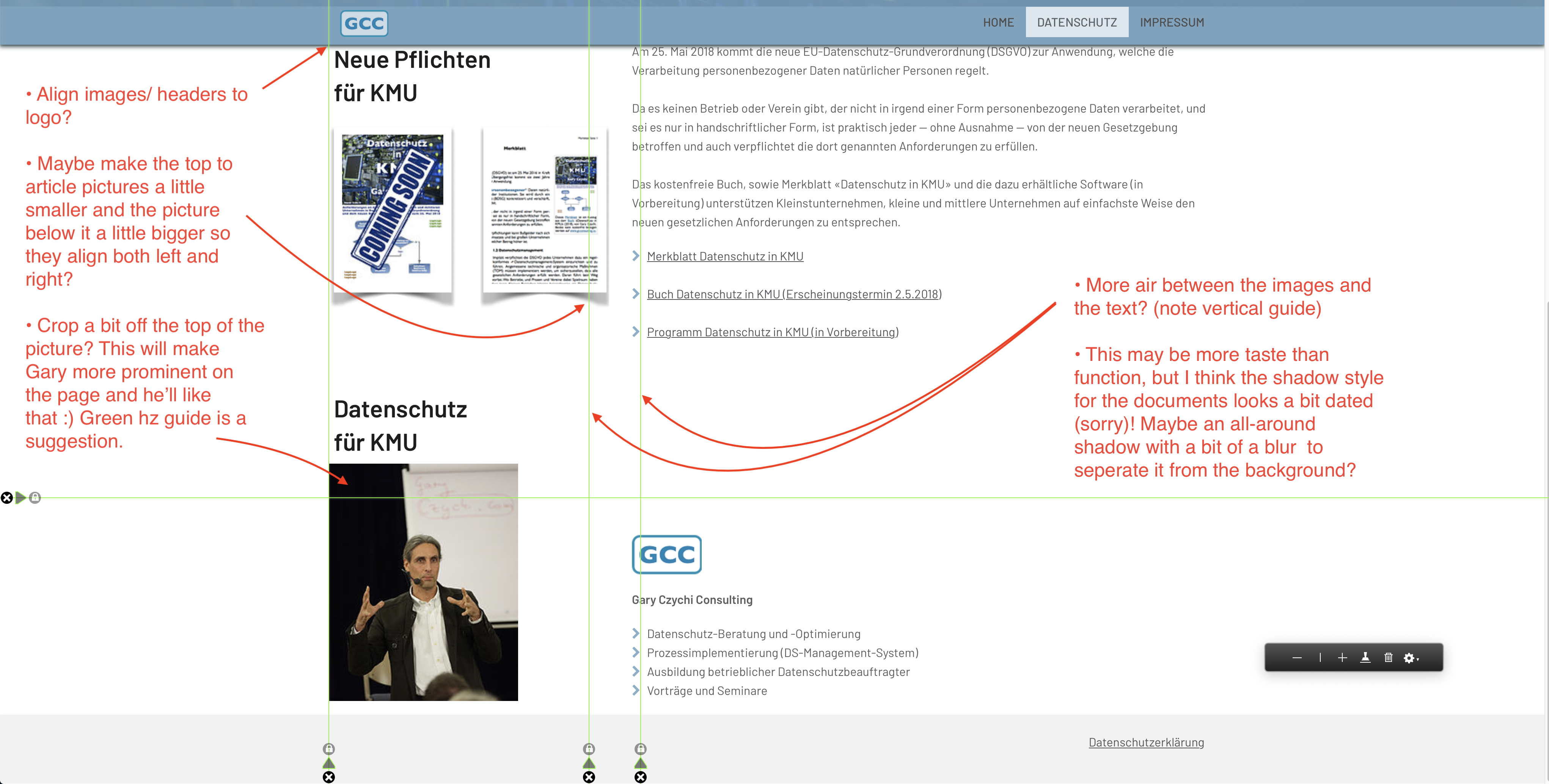
I hope it’s safe to assume that you are mostly moving things away from Wix to RapidWeaver and wanted to keep the same general website intact. I went through and saw a few little things that you may want to think about adjusting. I teach this stuff (27 years and counting)! and at this point it’s really the only way I can contribute back to the forums as I’m still fairly wet around the ears with regards to using RapidWeaver. My apologies if you think my comments are nitpicky - that usually means everything is working pretty well!
Before I drop the pictures in, someone commented on the the sticky header taking up a lot of room - I think InStacks makes a stack called ‘Headless’ which hides the menu until you go to scroll or if you move the mouse - your navigation is there when you need it but fades away when you don’t. I haven’t tried it yet, but the man does quality work :)
Good luck! Let me know if you have any questions about my comments.
I was actually trying to make the site resemble, as close as possible, Gary’s existing site. However, I agree with all of your points. So, I made them, published them, and then sent Gary the revised project file.
I actually design all of my sites in Rapidweaver (but, have been considering other options, too). Here’s a link to a more involved site I finished not too long ago. Thanks again for your recommendations - they were spot-on. :)
You’re welcome! I just looked at the SC Diagnostic site you did, it’s great - flawless even! Your design and color choices are a really good fit for your client - professional, test friendly, warm, and accessible. I hope they paid you well :)
BTW, a belated thanks for fleshing out the process for setting up a developers account so I can get Google maps working. You gave me enough info in a way that I could understand - thanks for taking the time!