After what has been the most frustrating 2 weeks I’ve had on RW , my son said stop and rethink how you work and do it in a completely different way. Pah , I said but went away thinking hmmm thats really a good way of looking at this. I don’t know about you but i kinda just dive in without a plan and see what happens , not the best way to work I know , it wouldn’t work in my sign making and van lettering, so why it work on RW! But I start with good intentions BUT then I get side tracked.
OHH a new stack, Ill try that …or owwwww Big White Duck , I’m sure i could use that , then a week later and frustration at spending a 7 days trying to learn new stuff and no work at all done .
So if you can relate to this - heres my new plan, it might help .
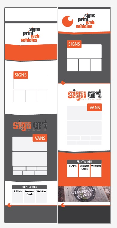
Pre work it out in illustrator ! FFS i use it everyday . Its so simple i cant believe i never did it. But sometimes if you do it wrong for long enough it becomes a habit.!
Still, I told my son to stop being a dick, and the idea was rubbish. He’ll get over it as he’s only 5. ( He’s not really )
So do you pre plan, run wild or spend your time going off track into the land of stacks ?
I’m guilty of just throwing stacks at a page and seeing what sticks but I realize that it’s not a productive way to go and wouldn’t recommend it (though it does help me learn the ins and outs of a stack, at least).
I’ll often look around for sites I like and will end up picking out a central feature or two that I like and work towards building, and then fit things in around that design or function. There’s definitely a downside to that but it helps me focus a bit at least.
@Justin did a talk at the last RW conference (which I’ve only caught part of) but he laid it all out in Photoshop (I think) and then replicated in RW, which makes a lot of sense to me
Hi, Yes, thats right. I never build out a website (professionally) without a solid understanding of how the site is going to look AND function. Trying to design and build at the same time is using 2 different parts of the brains, the creative and the analytical. They should never meet at this stage ;-) for me anyway - to be creative I need to be free from any restraints. And for that the tool is Ps, I’ve been using it for so long now, its like a canvas on screen, with the mouse being the brush. But of course whatever tools works best for you… my two cense.
Ps is also really handy to then convert into flat jpegs so I can quickly build a presentation for the client.
Really interesting, how we approach things. I’m no designer and not overly creative, but I know what works from a users POV and I’m a good problem solver. So, when I start a site I have an idea, but mostly I create and design on the fly, then problem solve how to make things work.
It is more time consuming, in theory, as I have to back track a lot, but I’ve tried to work other ways and it just doesn’t work for me as I end up going round in circles and getting nowhere.
Interesting about the creative and analytical being separate . Yea and don’t they both tear into each other! I get to a point where the fight becomes a physical feeling . What I’ve learnt from a sudden change in how to approach , is that with illustrator there’s nothing to distract from the visual way of working. No rw problems , the usual stuff , waiting for preview to work , and my new personal favourite previewing one page and seeing another . Yes that does stop all creative flow. I work visually I guess so being able to create a page of shapes is easier for me personally. Like yourself I guess in ps. Interesting points thank you.
Going around in circles , yes exactly but I’ve been getting that from working on the fly , a lot more recently . Hence the stop look and listen to what’s going on . Interesting how the approaches are taken by people. I guess that’s why I mentioned it here. The frustration caused , I’ve really learnt this week , is not cos I’m really bad at it , but I’m working against my natural patterns. Change how you approach it . Work with it not against it. I,ve been a sign maker for 40 years mostly, I like doing sites , the challenges keep my mind working hard. A a change in approach can be like sitting on a bad chair for ten years and then realise how much more comfy the sofa is. :)
Initially image driven. I’ve got 2 commissions at the moment which is new to me as I’m not really a commercial web designer. Here’s how I’m working on them.
I get the best images available from the client and look for a theme, something which connects them. I also look for a common dominant color that is in the photos.
I then look at the name of the company and try and find a font that makes the name stand out and seem relevant.
Then using the best images with a few keyword titles using the font it’s “throw it on the page and see what works” time. And then let it flow.
@Justin is obviously a very technical designer but I’m more of a creative, I was never good at graphic design but I did go to art school. If there’s any connection to be made there.
I was very much in the same camp (some would argue I still am) - I have been extremely fortunate in having had @Marten guide and mentor me over the past year during his weekly sessions and challenging my thought processes and protocols when designing a page - its been tough at times, as web design is not my mainstay, but I must honestly say I have learnt a great deal from Martin and all the other attendees during these sessions without which I would still be floundering in the dark.
I find these to be a great aid for designing responsive page layouts.
A client can say “I need 5 webpages for my holiday cottage website, 1, 2, 3, 4 and 5”. I can then browse through UX Web Tiles and pick the page layouts I think are most appropriate for each page of the website.
Then it is simply a matter of coding the pages (the fun part) and receiving the content from the client, to slot into each place. Pretty-much all these layouts can be built with Bootstrap or another framework.
UX Web Tiles have not been updated for a while. Development seems to have stopped at volume 3. But there are other web design wireframing templates (some are free) to download or signup for online. A lot are for mobile or apps, but there are some decent ones for responsive webpages.
The layout wireframing it what I typically most struggle with. The fonts and the colours I find I can visualise more easily and fall into place more quickly.
This how the ideal web creation app would work. You choose the layout blocks (or blocs), show the client and then fill in the content once the layout is agreed on. These type of tools exist in the UI creation world with Sketch Plugins AFAIK.
I was with you til you got to the “and receiving the content from the client” lol …
Then it all went dark and i passed out.
So these are basically wire frame drawings of website page designs covering desk top and mobiles. Thats got to help a lot really. So from that plan you make the sites. From my preplan today it took about 3 hours to sort the home page and virtually no weeping into my keyboard. That was a dramatic difference both in time and frustration.