Hello @tav,
Here are my website: https://www.filmañas.com
In small desktop displays, when the text scrolls I want to keep the bevel fixed.
How could I make this possible?
Thanks in advance.
Hello @tav,
Here are my website: https://www.filmañas.com
In small desktop displays, when the text scrolls I want to keep the bevel fixed.
How could I make this possible?
Thanks in advance.
The easiest way to do this is with some CSS. It is possible with the advanced position child stack but this is much less hassle.
Add a custom class of fix-mob to the sections box stack (in the advanced part of the settings) and then add the following CSS. (You can do this via a CSS swatch if you want given that you are using F6 or you could just add it to the custom CSS code site wide or in the page inspector). Just bear in mind that fixing things on touch devices is often not a great idea and can lead to jumps or janky scrolling.
	.fix-mob{
		position: fixed!important;
		top: 0!important;
		left: 0!important;
		width:100%!important;
		height: 100vh!important;
	}
}
Here is my little test of your page showing it in action:
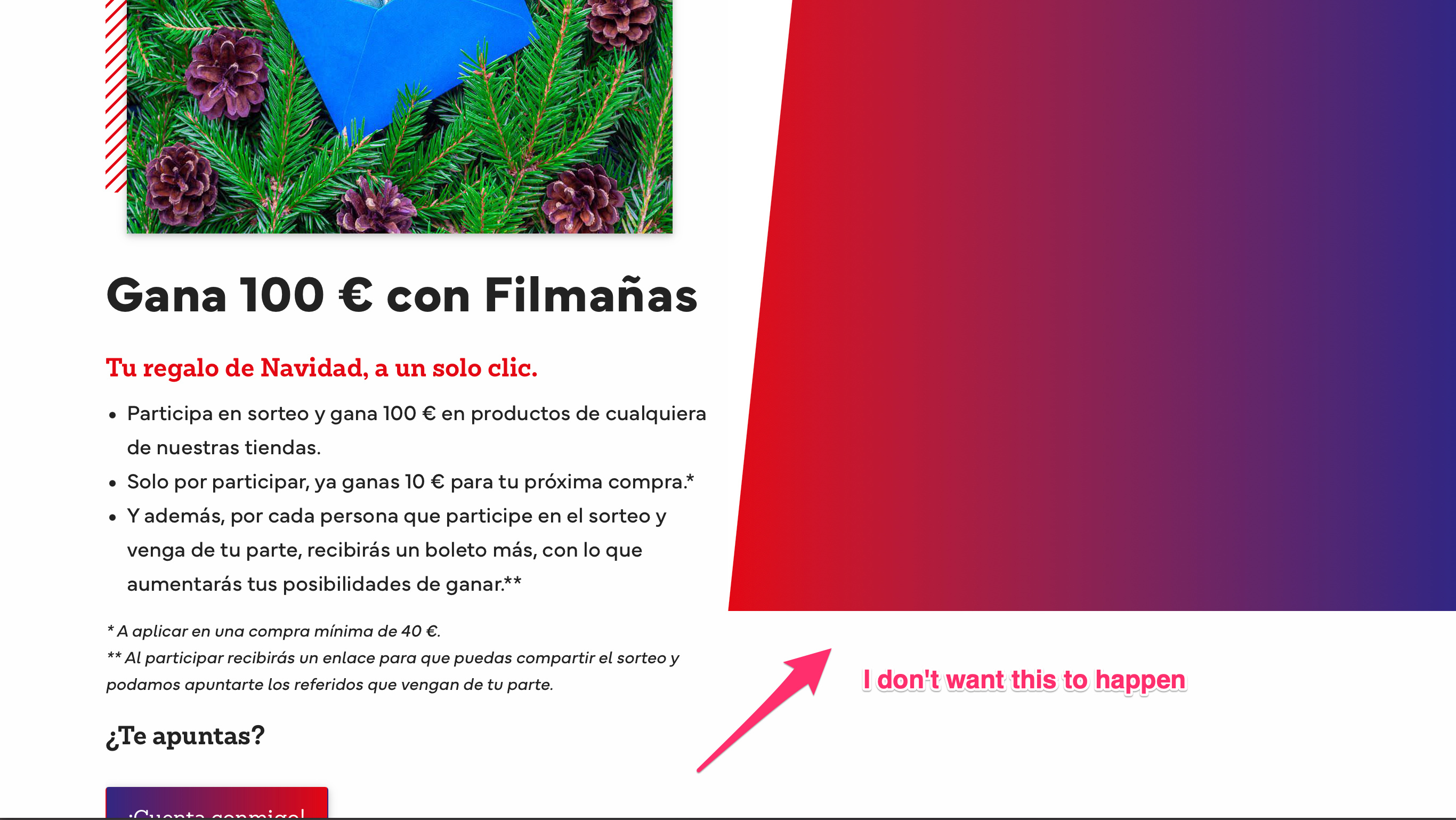
Sorry, I don’t think I have explained my problem correctly.
I was referring to a 1366 x 768 resolution (typical for laptop PCs), for example. Here the text height is bigger than the browser’s, and need to be scrolled to be read. I want the part in the right (with the gradient) not scrolling.
Please see the screenshot, maybe it could help to explain better.
@tav gave you the correct solution that works if you have built your page correctly. It will give you what you want at any screen size and orientation. Laptop, desktop, tablet, whatever.
If you can’t rebuild your page correctly, the following might help…
You have a line of css on the gradient Sections Box:
.altb100 {height: 100%;}
I think this is making it 100% of the parent stack height - not the browser height.
If you use this css for viewport height, it may work for you:
.altb100 {height: 100vh;}
However this is a work-around - you should to consider changing the way you’ve constructed the page by using a base Sections Pro at full browser height with your gradient as the background.
Then you can add your content stacks inside this base SP. You’ll have a lot more control that way.
@miguelximenez I have a question for you:
Why are you taking up a very large proportion of your page with a gradient? Are you going to add content to it?
I agree with @Geoff. You could even use a BluePrint sidebar which has the ability to stretch itself to full browser height and allow one or other of the columns to scroll.
The Bevel could then be stretched to the height of its column using a basic height:100%.
I’ve been disconnected from the computer for a few days.
Thanks @Geoff and @tav for pointing me in the right direction. I’m going to use BluePrint.
The reason for the big gradient is to be similar to the final design of the website (the gradient will include content as well). My client’s brand colors are blue and red.