So, in my inimitable fashion, I seem to be stuck right at the beginning. I am wondering how to center the header vertically in a Sections Pro stack. Do I need to mess around with margins, or is there a setting that is simple and elegant?
Basic file is here: https://app.box.com/s/tgiuqnaiz2lbvspnvsqlpvycn0ua8477
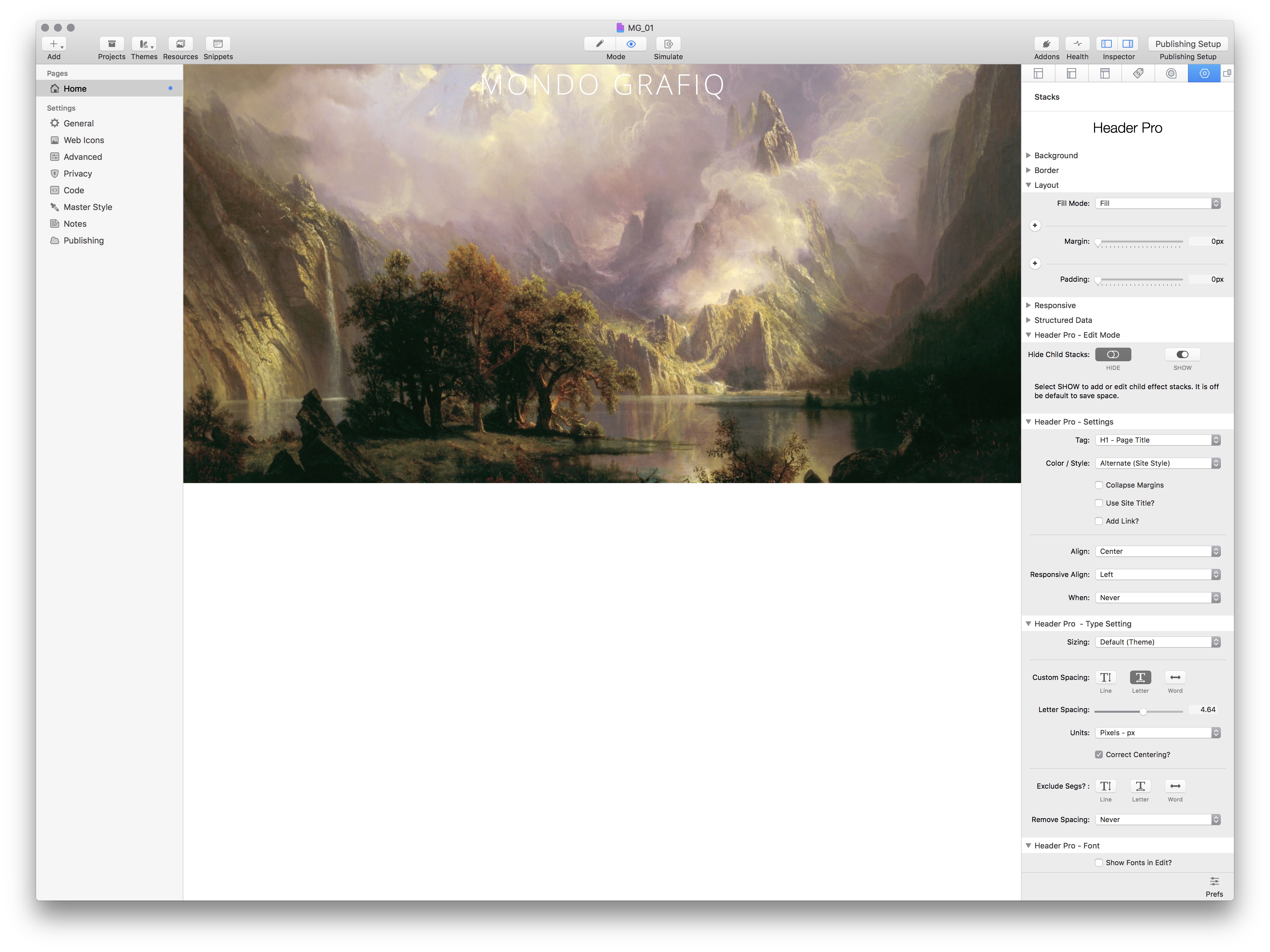
And this is the test image:
I’m on mobile so can’t see rhst inage too well, but to vertically align content in an SP stack add a Section Pro Fix stack to the SP content drop zone, select Centre for alignment in setti g of the Fix stack and add your content to the Section Pro Fix stack content drop zone.
Alternatively, wrap the Header Pro in a Sections Box, set the SB Position Mode to Floating Caption, give it a height and then center it horizontally and vertically in the alignment settings below.
Both of the above are options, a third option is to use the vertical centering in the Sections Pro height settings. I’m only on my phone so I can’t look at your project file yet but if you are using either the Proportional or Flexible Responsive height settings then there are options for vertical centering.
If you are not using a specified height and Sections is just being sized by its content then either a Sections Fix or a Sections Box set to centred is the way to go as described above.
Next question: I understand that Blueprint allows positioning flexibility, but is there any other qualitative difference between Sections Pro and Blueprint where you would opt for one over the other? Or is Blueprint merely the next logical step up from SP?
Loads of difference. Short answer: SP is an incredible adaptable container that do can more or less anything. Blueprint is a really good “simple” content container that gives you the most basic features of SP.
The xperts will be along soon to tell you I’m wrong and explain things in more depth :-)
FWIW I use BP by default as a content container, where I want to control things like margin and padding at breakpoints, backgrounds and the best feature of all “pull-up” the content. I switch to SP if I want to do something a bit more advanced, like video backgrounds, align content, size content to screen size etc.
BP and it’s sidekick Sidebar are (IMO) an absolute must for any RW user. Collectively they are leaps and bounds over any other container stack. If I need more than two columns and I don’t want to go down the Sidebar within a Sidebar route I use @doobox Reflow which (again, IMO) is about the best column stack out there.
One thing to add: And I only realised this recently after @Marten kindly worked on a project file for me: Most SP child stacks and lots of the Section Pro stacks (Box, Fix, etc.) work in BP. I’m pretty sure @tav has told me this a hundred times, but it never sunk in until I saw it in action in the project that Marten worked on for me.
Looks like I had it backwards. But thanks for the really comprehensive explanation.
As for Reflow, does it function like InDesign, can you actually input the total amount of text, and have it “reflow” from one column to another? Or do you still need to do that manually?