I’m lost,
I’m in Source, how can I place the button in the middle and at the bottom of the stack image.
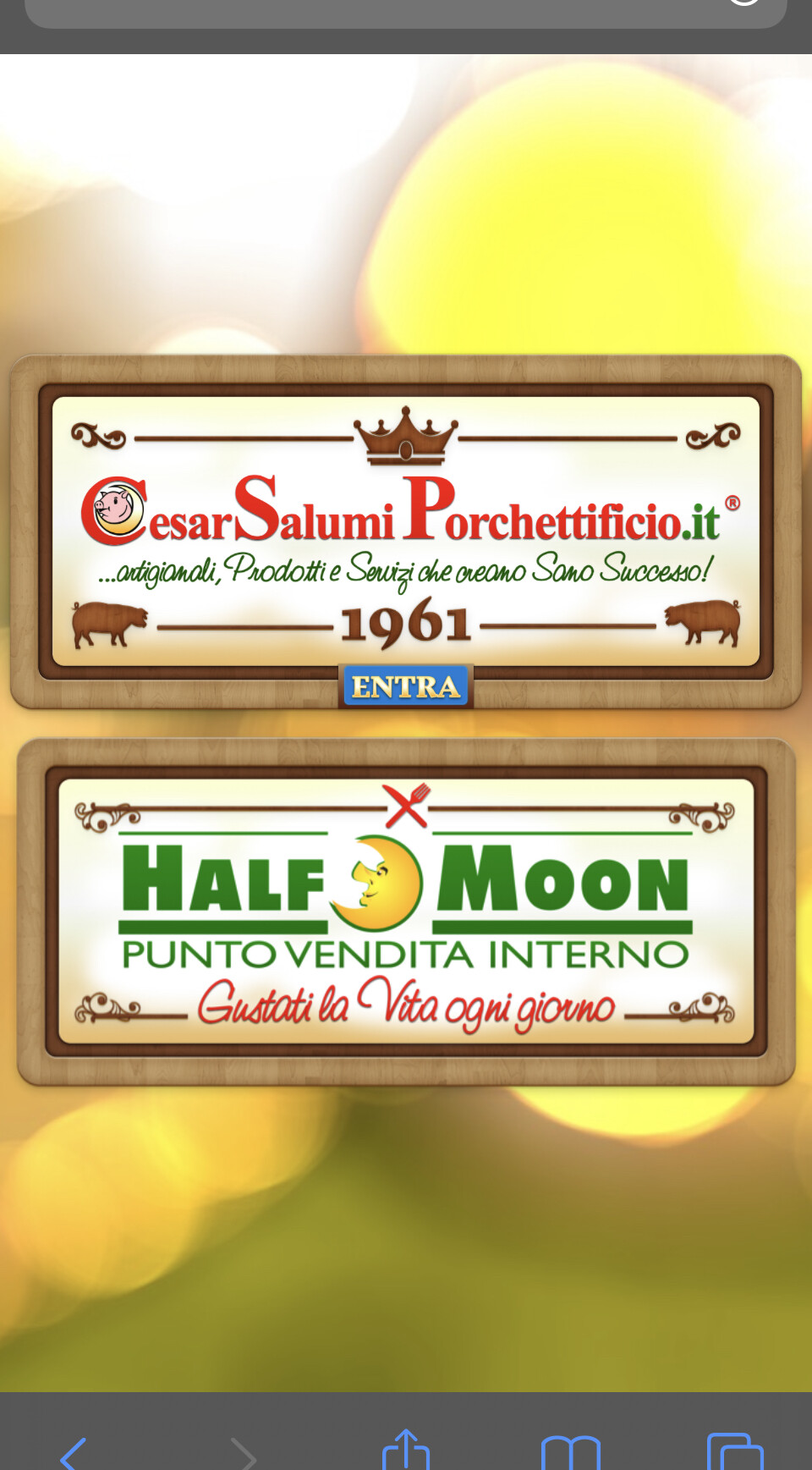
As in the image below:
I’m lost,
I’m in Source, how can I place the button in the middle and at the bottom of the stack image.
As in the image below:
Add the Utillity Stack to your page if you haven’t already. In your example above, add w-100 pos-bl to the image class.
I’d put the button in a Coder stack and add those classes to that. w-100 pos-bl (as Gary says you need to add the Utility Classes stack to the page for this to work).
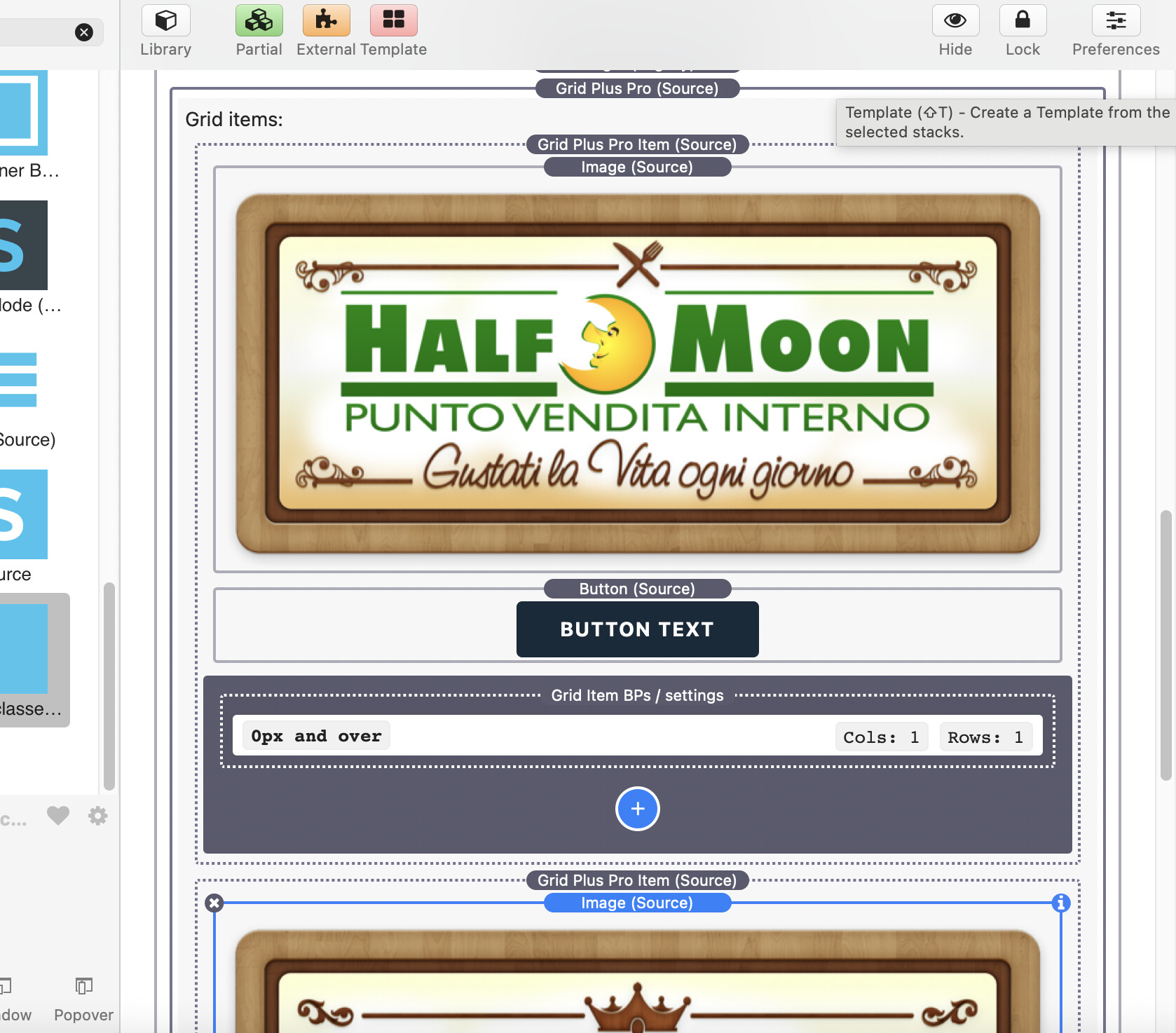
Or if you are using Grid Plus then you can just add another grid item and then state the position of the 2 items to be the same. i.e. set the grid item with the Image and the item with the Button to both be in col 1 row 1.
The grid item with the button you can then set to position the content at the bottom of the item.
It’s really refreshing to know there are so many different ways of doing this.
Perfect thanks
Great thanks
With utility classes the button is positioned well, then I have some problems depending on the screen where it is displayed, on the desktop it is excellent, on a smartphone or ipad, the button remains too large or small for the image (I should create a better image, also thinking about the size of the button on all devices).
Out of curiosity, I also wanted to try with Grid Plus Pro, but I couldn’t do it. Can you give me an example of how to do it?
(In practice I try to reproduce this entry page with Source, the two images are 2 links that lead to different pages).
I would like to rebuild, as I have done for other sites of my friends, the whole site with the fantastic Source.
Sure. Here you go.
You will struggle to get that type of approach looking good on all devices. In the example project the button will sit below the image. That is probably a better way of handling this kind of thing on small devices.
Hope this helps.
Your current site uses the entire image as a “button” so clicking anywhere on the image will act as a “button”, anf the word ENTRA is just part of that image. If you want to continue using this layout, then a better approach would be to continue to use the image as a link, but add one of the Source utillity classes to add a hover effect such as darkening the image, etc., to indicate to the visitor that they will wait forever unless they click the image.
You could use some of the Source features to show on hover and hide on hover to make it more obvious that usere must click to proceed.
However, the risk of using your current approach is that users with poor eyesight, or attention span, slow mobile connection speed, will not visit the main home page. I would suggest losing the initial page with animation and also lose the second QuickFlip page, and go straight to the home page. Looks like you are loading at least 1.2Mb of image just on those 2 initial screen.
Thanks, I understand perfectly now following your example / project. You recreated the two situations, with Grid and with Classes.
You were very clear, thanks again.
Excellent advice, they made me think.
I’ll do some testing following what you said.
Come to think of it, I really think I’ll follow your advice.
Thanks again to you too.