Hi - I have a Source grid that shows square images of products. The images have a border and all look nice above 600px. However, when the grid goes to one column (under 600px). The images are still square but the grid border becomes rectangular. I can’t seem to fathom out how I make the grid borders appear square around the products at this lower responsive level (under 600px). Any help appreciated.

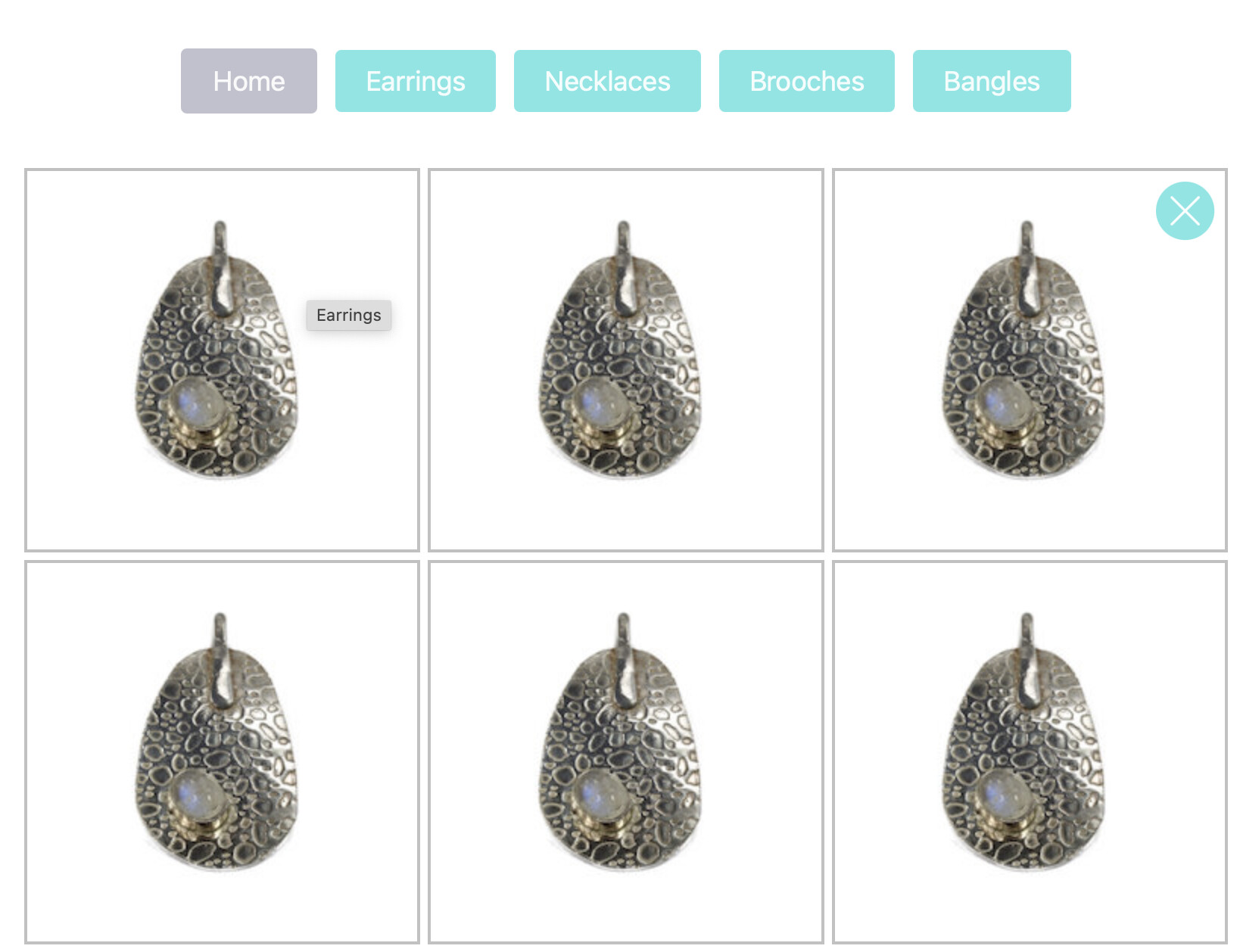
The borders are drawn around the edges of the grid item which appears to look square in the 3x2 layout. However, when you use 1 grid item per row the grid item fills the available space which is wider than the height.
1 way to achieve what you are trying to achieve is to put the grid into a Container Plus and set the width to be the same px as the height of the images below 600px in Container Width Custom Advanced settings. Leave the Medium, Large, etc to be set at 100% width.
1 Like
You could also change the breakpoint for where it goes to 1 column down to something like 320px so that you would have 2 columns at the width you show in your image.
All sorted. Thank you both for your help.
1 Like