Also… I’m not precious about any of this… Building with RW is a hobby for me, not my profession. I mainly do it for friends for enjoyment…
I think designers and the like worry about things like adding the icons to indicate a menu item is a drop down not a link, I’m betting 99% of users don’t make that connection. They just stab at menu items and wait to see what happens.
I don’t think that carat down icon is universally understood to mean a drop down, outside the web dev world. I never use it given the choice, i just don’t like it. Although I do tend to put something in place to indicate a dropdown, so I’m just as guilty as anyone else! tend to use chevron down, angle down or on a recent build a down arrow.
We as people who make websites tend to get hung up on things whereas users don’t.
I’m prepared for a telling off, so bring it on ;-)
1 Like
I’ve got your back!
1 Like
On your mobile menu they don’t point down but to the left. That’s kinda confusing to me as the standard is to point down.
There not there on an iPad horizontally and hover doesn’t work.
OK thanks. That’s a good point about iPads. I might have to fiddle.
I’m not fussed about the left pointing ones though.
cheers!
Agreed. They should point down like the Source ones. Also it’s beat to be consistent so if you are not going to use dropdown indicators in the desktop menu, then you shouldn’t use them in the mobile menu either.
A great deal of thought, experience and effort has gone into the Source navigation. It’s a cracking navigation stack and when you consider that it is part of a whole building system that is FREE, it’s amazing.
The left pointing chevrons are part of UIKit so not changeable.
Edit… Actually I can fix it in CSS so will do that now
I love the Source menu… Nothing wrong with it. I’m not criticising it at all, I just asked a question…
Well, I’ve just got home and tested the mobile phone coffee shop JS and it worked - I’ve now repasted it above without the iPhone curly quotes.
Great. Thanks @tav, I’ll keep it handy in case I need it. At the moment I haven’t built a site in Source. I’m still playing.
In other news, I’ve taken some suggestions on-board and replaced the UIKit lefty chevrons with my own Downward ones (drawn with a pen in photoshop!) using CSS. Seems to work.
I’m leaving the main menu without though. I had my non-techy wife look at it and she also thinks its pretty obvious people are going to tap the menu at some point and find the dropdowns :-)
This case is closed I reckon… Thanks for the help guys!
2 Likes
I’d never say never but it’s not something that is on my radar currently. Am ever hopeful that @tav will make some menu goodness available to us all at some point.
2 Likes
I have been working on the new menu stacks this week - Source will get the first one.
8 Likes
oooh - loving the sound of that!!!
1 Like
Can you make a Pinegrow block version too please?
;-)
Actually I can because it is just vanilla JS and you can add the HTML markup but if you are using Bootstrap 5 you can use their lovely 1990’s styled menu.
1 Like
I would definitely echo Stuart’s recommendation of Pop Drop — it makes great menus, with Andrew’s hallmark quality and efficiency of coding.
Any suggestions for a Central Logo in Source Nav?
Ideally the Logo with a line of menu items underneath… or am I missing something again ?
I am pretty sure that I covered this in one of several Source tutorials in the examples section, numbered 1 to 5.
While this is possible and not to difficult to do, I would question why you want a central logo with the additional new devices using a camera notch.
1 Like
Hi Gary, I agree with you on the central logo, it has been a long time since I used one, hence the Question. Suffice to say it is a ‘traditional’ website and non-Apple users. Like most, I suspect the traffic will 50% mobile, so notch is not such a consideration as the hamburger will prevail. I may push that for desktop too, but I’ll show what they have asked for first.
Thanks for the heads-up - I have dug out my Source Handbook, lost on the old laptop (embarrassed) and working through it again - this is my issue with only doing web stuff in bursts, I really enjoy it, but struggle to remember everything when I’m filming or guiding for a month or two between.
As always, I really appreciate the help!
Tonight is quiet, no family, just a log fire, a clear head, good music, no whisky, and I have sorted out a lot of RW stuff that I really have not had time to dig into. So thanks again for the heads-up @Webdeersign ; problem solved and more - I’m even starting to understand the Grid Plus Pro stack… I said starting, but it is impressive.
Thanks to @habitualshaker for the brilliant, essential Source Workbook and for help when stuck.
What an amazing community - We can’t forget @Jannis or @tav Can we?
4 Likes
Dear Friends and Colleagues…
The dreaded centre logo Nav has reared its ugly head again and they will not be swerved, so may I ask some advice?
I have a working Nav Bar, with central logo, looking good on mobile too. The setup is a container stack containing a logo (image) above the nav bar. I tried all sort of permutations with CTAs and Drop zones, using the site title with custom fonts, but lost hours, achieved nothing but broken navigation…
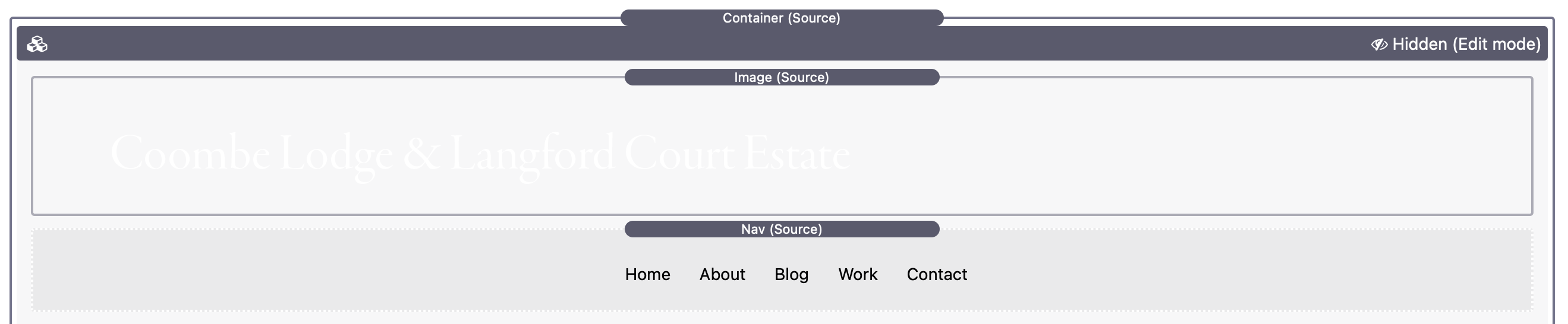

So the question - Is it possible to fix the container stack? ( as a menu would be fixed?)
If I fix the NavBar currently, the picture goes awry, z indexes fail and we’re into an horrible mess.
Thanks!