Which stack(s) that can do full size color changing links like at the very bottom of this site (eg Send us a Message):
http://www.blackbeltacademy.info/
Also wondering if any of the stacks in Platform can do this…?
Which stack(s) that can do full size color changing links like at the very bottom of this site (eg Send us a Message):
http://www.blackbeltacademy.info/
Also wondering if any of the stacks in Platform can do this…?
Use Platform’s button stack set to full width in a one col stack, and style accordingly.
EDIT: Scratch that, for some reason Platform buttons don’t have an option to change colour on hover. And I’ve tried adding custom css via the classes option and that’s not working either.
Also noticed that clicking outline doesn’t change the style of the button.
@juergenbarth Am I going wrong somewhere with the button stack?
I’ve added the following css to the css bit in inspector, then added the class buttHover to the button, but nothing is changing the default button colour.
.buttHover {
background-color: #999999;
border: none;
color: white;
padding: 0px 10px;
text-align: center;
text-decoration: none;
display: inline-block;
margin: 0px 0px;
cursor: pointer;
font-size: 16px;
}
.buttHover {
-webkit-transition-duration: 0.4s; /* Safari */
transition-duration: 0.4s;
}
.buttHover:hover {
background-color: #666666; /* Green */
color: 666666;
}
Oops, ingore that, for the custom class to work the button colour needs to be set to “default”.
So ya, using a regular Platform button set to full width and using that custom css above will do what you want.
A button. That simple, huh??
I always choose the most complicated solutions!
(I wonder why)
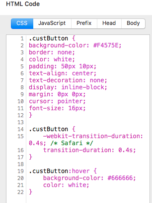
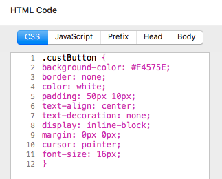
OK Kroy, here you go, better-formated css that also makes the button a bit deeper (adding some padding).
Just change the colours in the CSS to suit and add the class custButton to the custom class section of the Platform button.
.custButton {
background-color: #F4575E;
border: none;
color: white;
padding: 50px 10px;
text-align: center;
text-decoration: none;
display: inline-block;
margin: 0px 0px;
cursor: pointer;
font-size: 16px;
}
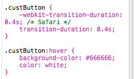
.custButton {
-webkit-transition-duration: 0.4s; /* Safari */
transition-duration: 0.4s;
}
.custButton:hover {
background-color: #666666;
color: white;
}Thank you Steveb!
I’m not sure what to do here:
‘add the class custButton to the custom class section of the Platform button.’
I’ve put all this in the CSS section but I suspect I’m doing something wrong:
I think something’s supposed to go here, but I’m not sure what:
I did try adding this bit:
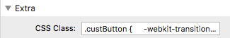
Leaving just this in the CSS section:
But no dice.
Sorry…
Hi rob, can you repost your original suggestion, as I’d like to take a look at it.
And thank you!
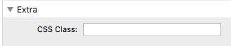
It looks from the screenshots that you might not have added the custom class name to the button.
Under “extra”
CSS Class CustButton
No . in front or anything else in the field.
As Teefers said, put custButton in the CSS Class box under Extras, not the actual css code you added, make sure to put that back in the original place you put it.
Hi Tim,
As Steve pointed out, any button stack that can be set to ‘Full width’ and allows you to remove the round corners (e.g. BWD’s button stack) will do the trick.
For a more complicated solution, you can use BWD’s Sections Pro and Sections Box stacks…
https://rw-ninja.news/gsk
The sections suite of stacks is amazing, easily the most powerful set of stacks out there, but as Rob intimated, totally overkill for this task.
Many thanks to all of you for helping with this. I’m going to use BWD’s Button Plus 2 stack. It seems pretty straightforward to get the results I’m looking for and has all the neccessary ingredients, including the little letter icon via fontawesome icons. I’m afraid I couldn’t get the CSS example to work - I guess I just didn’t input the CSS correctly, but to start adding icons etc using this method might get a bit confusing.
Here’s what I achieved with Button Plus 2:
The Platform Button does change its color on hover. This is however currently limited to the default effects delivered by the Bulma Framework. It is very subtle if the button color is set to default (only the outline changes) but more obvious if you change the color to “Link” or “Info” for example.
Also, the “Outlined” option works perfectly fine. As before, it is not obvious if the color is set to “Default” because it is outlined anyway. If you set the color to something else, you will see the effect.
In the current release, all these options are turned off as soon as you select custom colors. More color options are coming, though!
Looks like the maintenance release of Platform will now do what you want it to, if you select custom colours there is an option to pick separate hover colours for the background and text/icon

