Besides the plan to work with overlapping content (see other post here: Overlap - best practice?) I am trying to figure out if I can use my own custom made shapes from e.g. affinity designer to mask background-images?
I found several stacks that allow masking images with GIVEN shapes or come with some kind of online-editor (BWDs clipper stack and 1LDs sector stack) – but that is not what I want
I also tried the target stack from joe workman to overlay an image with my own SVG code, but the results were all crap.
interesting article explaining the difference between clipping and masking - but I still do not see where to start in the rapidweaver stacks world. as said before: the stacks that aim in the right direction don’t allow custom shapes…
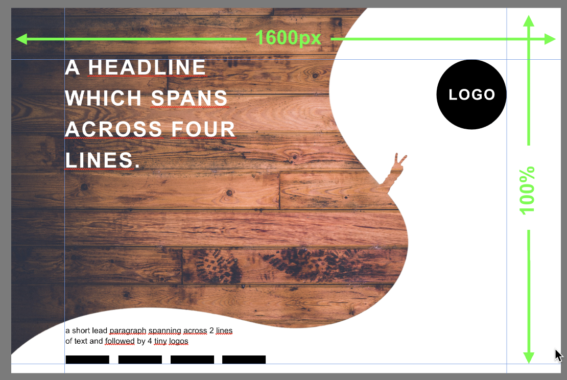
You can do this with any two layered backgrounds - an image of the wood and the SVG on top of it.
To get the responsive behaviour to work I think it is mainly just a case of making your white SVG a suitable width so that it doesn’t collide with the headline.
Everything else on the page can in front of the image and SVG so there is no complex layering or overlapping to worry about.
The only real question is the behaviour on small screens when the content stacks - I would just use a different SVG image for that and swap it in at a breakpoint.
Here is a very simple way to do it with just a SectionsPro with a background (image) and overlay (SVG) - The image is from unsplash and the SVG is a crude copy of your example made in Affinity designer in about 2 minutes. I’m sure there are tons of other stacks that you could use to layer two images if you prefer.
You just need to add a column stack to contain your text on the left and logo on the right.
Again, in this instance, the key is drawing the SVG to be a shape that works. Keep the web side of things simple.
Remember - nothing will show in this example until you add some content to the section, there background has no height without content.
Thank you, Tav!
I took your sample as a starting point and succeeded in setting up everything the way I want - with one exception: I would like to get rid of the shape at a certain breakpoint (783pixel). this is when all contents stack and get centered.
I selected the overlay child stack in section pro and chose “use color instead on mobile” (with 0% opacity) to turn off the shape. unfortunately this happens at 656pixel width.
Is there a better way to accomplish the task or a way to define the exact width at which the overlay is substituted by color?
This is an easy thing to do with the new upcoming version of Sections but just for the moment, the simplest approach is to add a little CSS to hide the overlay. If you enter mask-section as the Section ID setting then the following CSS will hide the SVG below 783px. I’ve made a revised example with the code in site wide CSS so that it will work if you want to use it on more than one page.
@media screen and (max-width:783px){
   .mask-section .shear-inner::after{
	   display:none
   }
}
Hi Tav, I don’t want to bother you, but may I add another question regarding the css code you provided for the overlay / shape…?
I added a 2nd (color) overlay to Section Pro in order to achieve better contrast between the text and the background image.
while the shape should still disappear on smaller devices, I would like to keep the color though…
Of course I could edit the image in affinity to make it darker, but it is far more comfortable to play arround with the color and opacity in section pro.
if it is possible to tweak the css to distinguish between my 2 overlays (keep the color, cancel the shape) that would be really nice.