Hi Andrew is this stack still available?
I’m trying to solve this problem for small iPhones and other mobile devices - If I can get the logo to scale to 200px for mobile devices, or move above the menu, issues will be resolved.
Thanks!
Hi Andrew is this stack still available?
I’m trying to solve this problem for small iPhones and other mobile devices - If I can get the logo to scale to 200px for mobile devices, or move above the menu, issues will be resolved.
Thanks!
To define the size of the logo at different screen sizes just use this…
@media screen and (max-width: 550px){
	.uk-logo {
		max-width: 250px !important;
			}}

			@media screen and (max-width: 450px){
	.uk-logo {
		max-width: 200px !important;
			}}

			@media screen and (max-width: 400px){
	.uk-logo {
		max-width: 130px !important;
			}}
Change the .uk-logobit to match whatever class the logo in Foundation is given.
Play around with the numbers and eventually, you’ll get what you want.
EDIT: Somewhere in the back of my messy head something is telling me that with Topbar, the best way to reduce the logo on mobile is to add padding… Not sure, might be wrong… So maybe try this too.
@media screen and (max-width: 400px){

     .top-bar .name img{

         padding: 10px 0!important

    }

}Brilliant! I’ll give this a try Steve, thanks. I wish I could get a handle on CSS
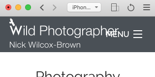
PS On this site, I used the padding CSS and this is the iPhone SE
You’ll get there with css. I’d worked with it in a limited capacity for years before having to really get to grips with it for RW. I’m still a trillion miles from expert, but I can actually remember some of it off by heart now.
Not much. But some.
Media queries are still a bollox for me though, I always get them wrong first time round.
As my alter-ego, Template Repo, I’m slowly building up a knowledge base for RW users: https://www.templaterepo.com/knowledgebase/ It’s early days, but with the right help it’ll hopefully build into a solid repo of css hacks for us all.
That is incredibly generous and will certainly be appreciated!
Thank you!
Top Bar is a little more tricky unfortunately as it sets the height to 100% (of the bar) and the width to auto. If you apply just a max-width to this then it will distort you logo (as it will still be stuck at 100% high)
You will therefore need to force the height back to auto (to preserve the aspect ratio). This will mean that the logo no longer fills the height of the bar and so you will either need to add some padding to the top of the image to vertically centralise it or in some cases it may be possible to alter the height of the bar to coincide with the aspect ratio of your image.
Here it is with some padding - play around with the width to get it the size you want and then adjust the padding until it is vertically centred.
@media screen and (max-width: 640px){
   .top-bar .name img{
       max-width: 120px;
       height: auto!important;
       padding-top:8px
   }
}
Very helpful insight Andrew, thank you. I’ll do some experimenting
If you want to let me have a url (privately if you’d rather) then I can sort it out for you. You certainly don’t need to do anything convoluted or complicated - just a little CSS will sort it out.
The back of your head does not disappoint, you a right - by padding the image down then you will use up some of that 100% height and thus the auto width will get less. It is just easier to set the max-width to the desired value and then pad to centralise rather than having to guess when using the padding only method.
That’s cus most of the shite back there has been planted by you.
The vaguely useful stuff anyway.