I read somewhere that’s not a good thing ( set wise ) to use a redirected home page for a phone . Its better to use the original Home Page and set it up for a mobile and not directing to a special , simplified version using this plugin.
What is the downside of using this second page ?If there is actually one.
Is it better to hide some the content stacks and redesign different stacks to only show on a phone?
Thank you
A single webpage that devices of any size or shape can access is always better. It is easier to manage. This would be a responsive web design. You do not have to worry about trying to detect and redirect different devices. Everyone sees the same with this method.
As tempting as it may be, it’s not always wise to load things and then hide them on smaller screens. It wastes bandwidth both client side and server side. It may only be a few KBs but it soon adds-up and makes for a very inefficient, messy and slow website. If a user is looking at the same webpage on different devices, it could be confusing as to why things are shown or hidden.
The reality is that it’s not always possible to build a website everyone can access. There might be speciality components in a website that simply are not optimised for mobile or of little value to that particular demographic. So therefore an addon like Mobilize does still carry some benefit.
Of note, the main Facebook website is https://facebook.com
However they have a mobile website: https://m.facebook.com
Clearly when they were building Facebook, the main website was too heavy. And so they created a separate mobile version. It is still common practice with many websites (especially in social media and the corporate world). And this is something Mobilize can help you do.
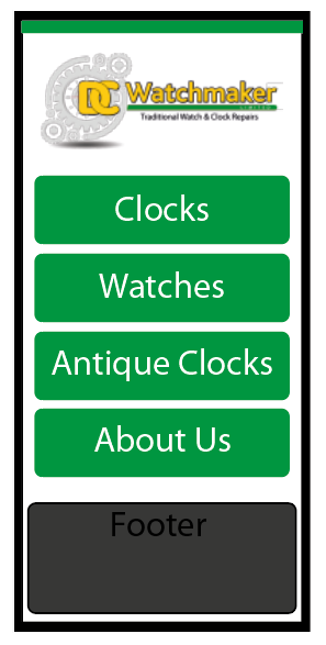
Ok Will thanks, I guess my reasoning for the question was an easy way, for the visitor to direct themselves to the section of information required, with big easy to use buttons. Rather than going through content they don’t want. ( once they’re in to the site it’s the same pages on mobile or desktop ) Kinda like the example mobile home page picture shown. It’s based upon my wifes website philosophy of " I just want to get to what I want’ her tolerance is quite low on phone browsing!
But yes, it’s a very different visual experience between phone and desk top. But I supposed that using a phone compared to a desktop, is a actually a different experience too and the needs of the visitor change.
Interesting though - thanks for your input. Basically I just turn off stuff that is of no use on a phone screen, to keep a slicker appearance. Or just use mobilise to make a simple phone home page like this.