I can’t figure it out. I don’t think it’s a Foundry problem per sé but has plagued me forever.
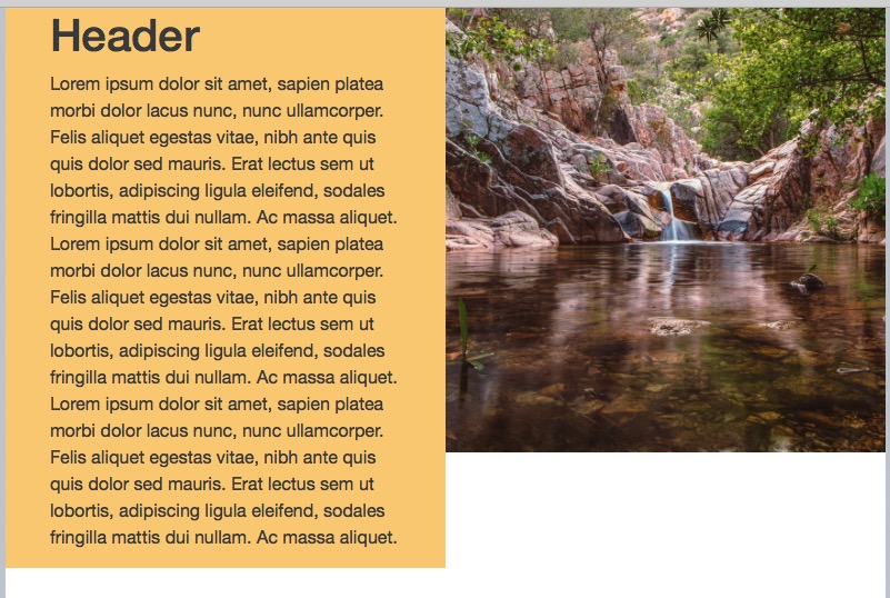
I have a two column stack. On one side I have text, on the other, a photograph. In the full screen preview, It looks fine. As I scale down my web browser, everything transitions nicely except the photo. It stays complete and shrinks in size proportionately. I want the photo to fill the frame it’s in, no matter the window size. Because proportions are changing, the photo needs to be cropped.
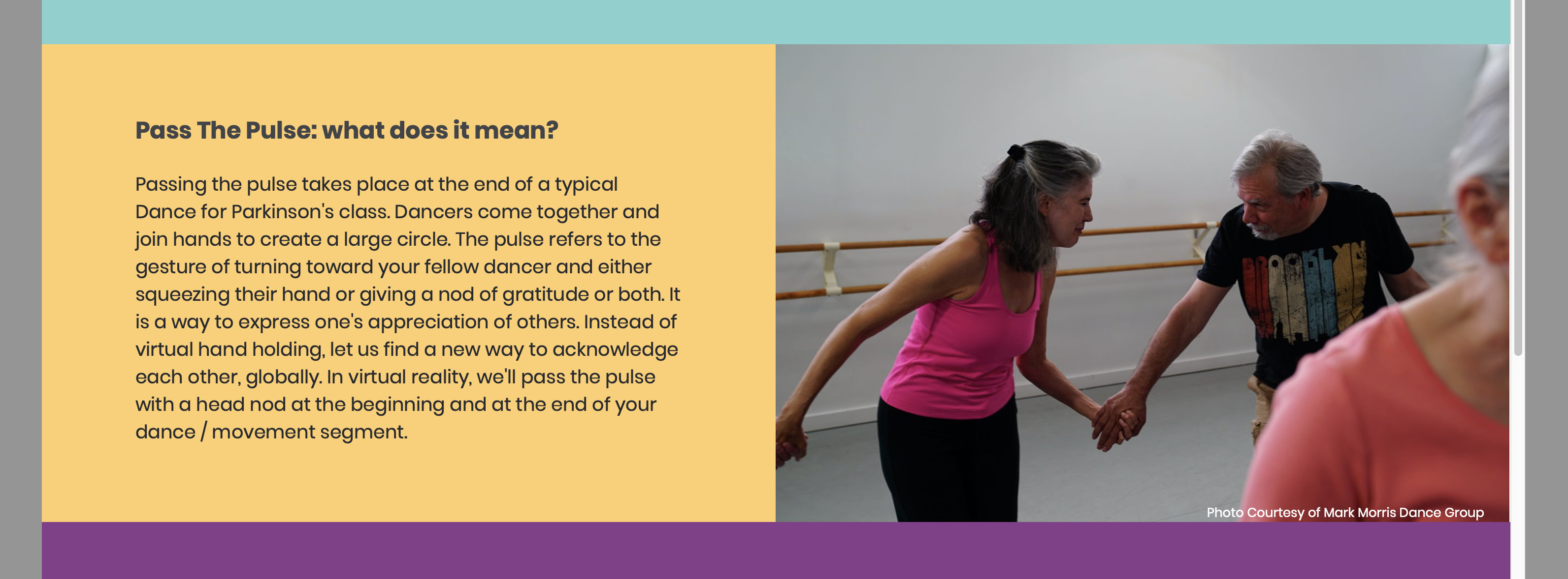
I can lead you to a website that does exactly what I’m talking about, but a picture is worth a 1000 words…
Hi Steve - thanks! I went through both yours (and Adams) advice and I’m almost there. Things are definitely better. As it transitions into mobile, I still get a bit of extra space at the bottom. I think it may have to do with my margins / padding around my text. The text column gets substantially taller as it transitions into mobile and I guess it’s more than what the picture is able to scale at. I have an email out to Adam - I’ll let you know how it goes. Thank you kindly for your help!
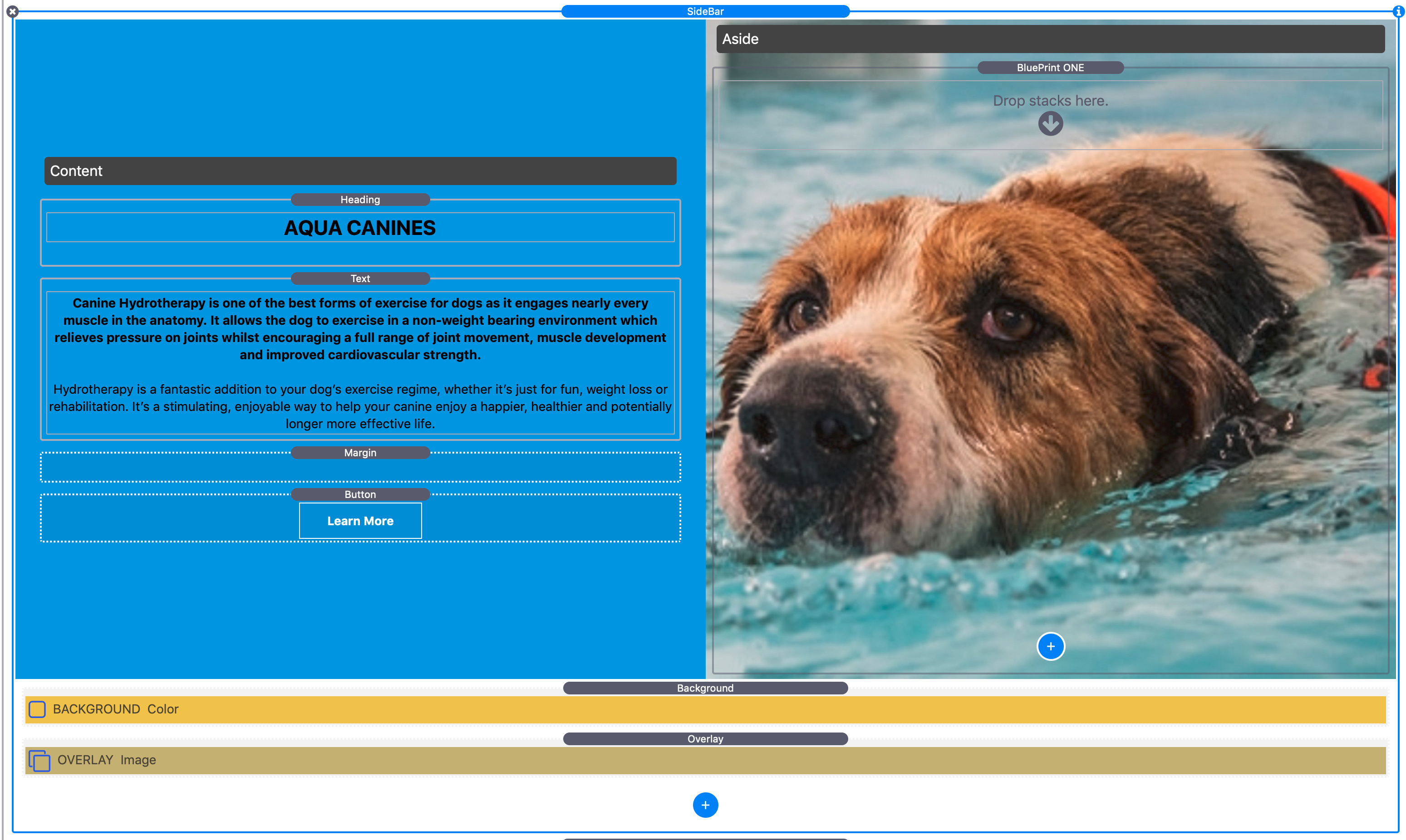
Now I’m on my desktop, not mobile, I can see better what you need, and all you need is the brilliant Sidebar stack, which is part of the FREE Blueprint suite from @tav at Big White Duck. https://www.bigwhiteduck.com/stacks/blueprint/
In that project you can define the breakpoint, whether the image stacks top or bottom of the text and the depth(height) of the image once stacked.
Tav makes loads of free stacks for Rapidweaver, all are about the best there are at doing what they do, so it’s worth getting a few of his stacks from the Big White Duck site.
You are right. It should be easy and it is easy in most frameworks, but not in Foundry.
Normally you would add a background image to the second column and that would be it, but unfortunately that’s not a feature of Foundry. Or add a Container to set the height and padding with a BG image, but unfortunately that’s not a feature of Foundry.
Having to add a stack to set the BG image, then another to set the height, is adding a lot of settings.
If your problem is margins or padding then you should investigate this and find out where it is being set and remove it. Foundry does an inconsistent thing in that it adds a margin (or padding - I can’t remember which) at the bottom of many stacks, but not all stacks. I suspect that is the issue.
Steve solution will build an excellent solution and it will be completely adjustable and look best at all screen sizes.
Actually I just remember how I used to deal with this issue. When you have a lot of text as you have, this layout can’t cope well. The problem is that if you use the Vert Centre stack in a Foundry 2 Col with Equalise Columns, then the columns equalisation is cancelled. The Foundry solution is to make the height of the Vert Centre stack much taller, but that uses up a lot of valuable screen space.
You can however, do this using the Joe Workman Match Height stack which works great in Foundry. Then as the long column of text grows, the image column will match it’s height. Then cancel the match height at the same breakpoint when the columns collapse
Match Height is a great set of stacks, I use them a lot, but really this isn’t the place for it (IMO). I do recommend anyone to get it, as it can make cards etc. look far more professional, but in this instance, I’d say it’s not the best, or even right, tool for the job.
Any type of column stack that can do equalised heights and allow an image as a background will always be the simplest solution. If the height of the background collapses when it stacks all the better, as you can re-define the stacked height using a spacer stack.
I’d use Sidebar as it’s my go-to 2 col stack, but there are others. I’m pretty sure Doobox Reflow will work too.
Not sure where the vert height solution is coming from, but to my mind, it’s wrong way to go, as you are always going to have to set the height to the max needed, ie. the point just before the cols stack. This means a LOT of space top and bottom on widescreen.
I had this exact same problem when I first started with Rapidweaver. I never could solve it in Foundry and ended up buying UIKit, but that’s another story. The way I finally did it that works perfectly is Sidebar from BWD (as Steve says above). You have to bung a blueprint stack over the background image to stop it collapsing on mobile but the control you get is awesome. I used it for this homepage:https://lechladek9centre.com/
Since building this site I have found it’s even easier to do in Source, from Habitual Shaker. I can’t be bothered to rebuild the whole site but Source has amazing grid control and it was a doddle to set this up. It’s free too so worth a go! (although thinking about it I may have used advanced grid, which isn’t free but very cheap).
Agree totally. The Blueprint/sidebar stack was a lifesaver to me in a similar situation where I had a logo and sub text on the right with a slideshow on the left. Could not get the logo and subtext to scale down equally with the slideshow. Sidebar made a perfect job of it with minimal fuss. Don’t know how it works in Foundry but assume it’s ok.
Hey Everyone - Thank you all for your help! Sorry for the delay - a new semester started and I had a lot to prepare for as my students transition to remote learning. I solved (eventually) solved the problem within Foundry, but will have a look at the BWD stack combo that most of you have suggested. The solution I used was a bit fiddly - could be me as I still have a lot of learning to do.
Sorry again for the delay. Thanks for having my back. I hope to publish tonight or tomorrow - I’ll post a link. I would welcome any input and criticism :)