For the first time in ages, I’m building a site with TopBar - and am sticking it inside a Chroma that changes the logo on scroll. I would just use a third party menu system, but I’m building the site for someone else, and he doesn’t own Navigation or Gator. So, three questions:
Is there an easy way to get the content to start immediately below the Chroma stack, regardless of the device being used? I I could use a Blueprint stack and set the margins according to mobile/tablet/larger, but I’m hoping there’s a more precise way. I tried checking the float over content button, but that didn’t seem to be the right solution
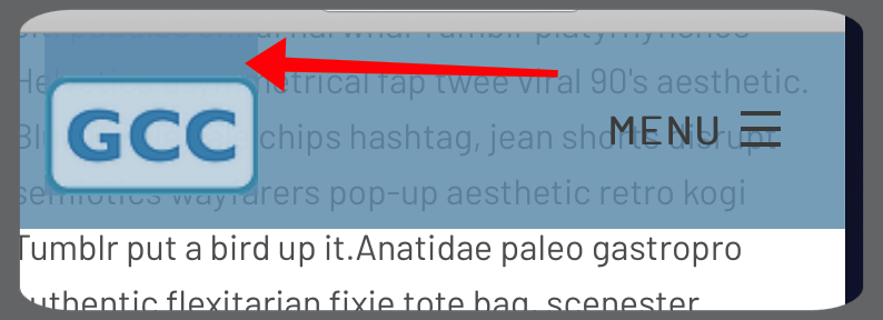
In the site above, any idea why the area above the logo is darker on mobile devices, once scrolled (screenshot below)?
How can I constrain the logo on mobile devices, before scrolling begins? The size after scroll is perfect, but (imo) it’s too large when first seen.
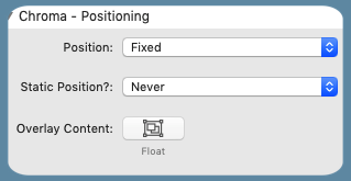
In default mode this is what should happen. The published page has it set to float over content.
The title area is getting the chroma “when scrolled” background color and because they are both semi transparent it is showing through. I can’t remember why this was necessary if it is a setting but until I can get to a computer to check this should fix it:
That is just TopBar - the icon is the same size for desktop and mobile. It will need some custom CSS to change the size for mobile - again when I’m back at the computer.
Looking at your site it is now not floating over the image - i.e. the change has been effective. I’m not convinced it is the right thing to do but it is definitely behaving as expected. Personally, I would float it as before but have a transparent background until scrolled but that is not my decision.
To make the TopBar logo smaller on mobile (adjust the breakpoint to your mobile settings - 700px seems to work though)