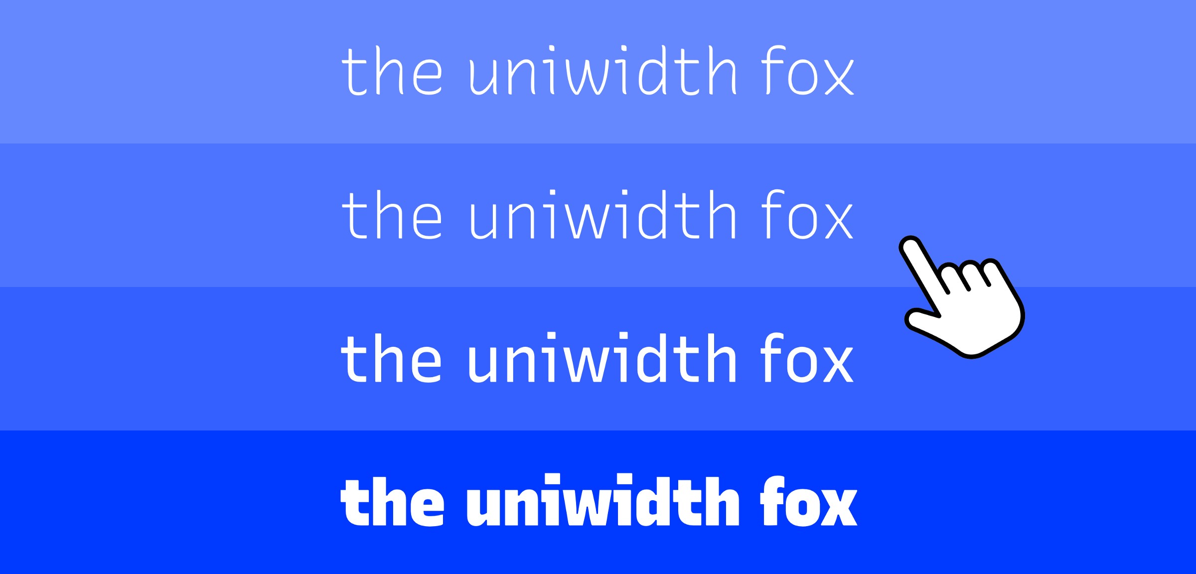
Here is an interesting article about uniwidth typefaces. These overcome the problem of text becomming longer in width as the weight of a font increases. These would be idea for hover effects.
Just a note of caution, remember that these fonts are designed ONLY to be used on labels and buttons etc. Do not use them for prose text.
They essentially have deliberately broken kerning and so are difficult and unpleasant to read for normal paragraph text.
Unless you are prepared to load a uniwidth font in addition to the site typography then it would be prudent to avoid a “bold when hovered” effect and instead use a change in colour, a hover underline or some other indicator.
Absolutely. These type of fonts are a bad fit for normal paragraph text but can be used to add a new and interesting effect for navigation items, buttons and isolated text links.
I have been trying out some ideas with these and will definately use these for the right application.