Hi all
I made a website for someone and the previous site maker has come back to the customer telling him the new homepage is massive and that it takes two minutes to load on a mobile! ( which it doesn’t - 5 seconds on wifi )This will also harm his Google results.
I took this seriously and checked the site , the home had one image , that yes I did not optimise fully . I take that on the chin.
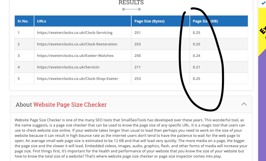
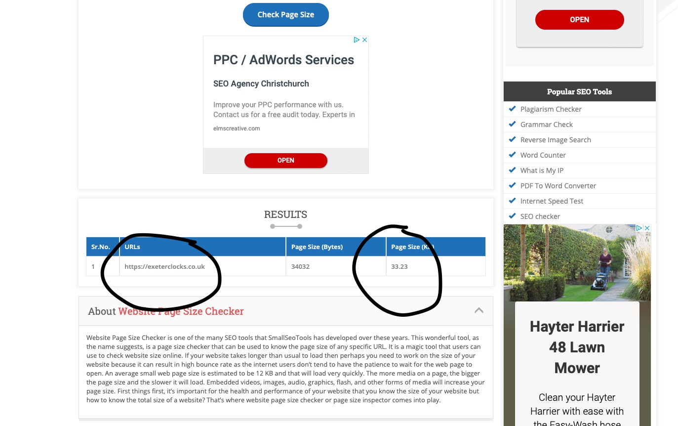
I ran a page weight check and they come back as these - see attached.
It seemed to me as a little unprofessional really , sending emails with warnings of unbridled horrors.
But as they are a "proper " website company it has unsettled me a little.
Then right at the end of their email they hit them with this one
"There are public links to administration panels which raises a security risk. “
One Armadillo blog and one wepyep page. Really is this such a massive concern ? I thought both were long enough in the tooth for them to be accepted as reasonably safe ?
Anyway I’d like to hear your views on this and are my page weights that horrific?
Yours
Sobbing in locked room, hugging a blanket, hoping never to cross a ‘proper web company again’
I wouldn’t take it personally. They’ve lost a client and they want to be able to win back the client in the future, so they’re pointing out what they can. I’m guessing that you’re a fair bit less expensive than the ‘proper web company’ so they may be trying to retroactively justify things with the client. A bit unprofessional? Yeah, probably.
There’ll likely be cold calls in the future from people saying they can improve page speed, google ranking, security, etc and will need to knock your site in order to get the business.
If there’s any of the criticism that you can address, then do it - your sites will be better for it - and try to view it without any emotion or defensiveness. If it is unfounded and you can answer it (like providing test results as you have), it’ll put your client at ease and they’ll ignore the previous company and label them jilted. It’s important to stand behind your product.
Thank you , yes that’s exactly what I did . so that’s good.
The customer had a website for 11 years at £50 per month that was not responsive and should have been updated at least 5 years ago. When they cancelled the site , the web co phoned them up and said they just about to email that very day, offering an updated responsive site for the same money !!.
It’s a nice little site with page one goggle ranking across quite a lot of search terms . I guess Im just leaning on here to cushion the blows :)
Ok thank you for that , how did you test the home page ? I’d like to know for future reference , obviously the tester I used was nonsense 🙄 Yea I agree the home page is too high I’ll go through it tomorrow and reduce it down again . The images are still too big . Thank you for letting me know.
That’s been a huge help thank you. I’ve been looking for a while and most pages are 5 to 10 meg for the sign makers around here. So other than loading time , how big an impact on Google is this ? Very little regionally it seems as they’ll all on the front page . Although on a national level I’m sure it has a much bigger impact. Very interesting
For anyone else in this situation which I’m sure some one will be. Heres how I resolved this.
I use an app called Batch Image Resizer set to no scaling and dpi to 72
This reduced 1.5 meg images to about 200 kb or less.
The advantage is also that you can add seo friendly times to the images , which can be done in bulk.
I found this quite useful.
As I said, this may help those who are stuck with resizing images . I guess I got abit sidetracked and allowed some images to get by me which were a little high in size. Slap on the wrist . The page weight is now way down to what it was.
Part 2 Edit
Ok at risk of harping on about this , and I apologise if I am ( im really trying to understand this ) , so the first site issues are resolved and its down to 1.5 meg which whilst still above the 1 meg mark , its ok for now .
I’m doing another site which is coming in at 4.7 meg , now I changed all the images so most are below 2kb (which isn’t terrible ) and the page weight only went down to about 4.4 meg .
I removed the header completely and republished again , still above 4meg. Started to remove sections one at a time , nothing really shifted the weight downwards.
Where does a lot of the extra chubbiness hide away , I’m presuming its in the build of the site , but a 2 or 3 meg extra ( and its not images ) is quite a lot of fat , isn’t it ?
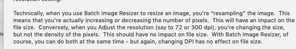
Whilst reducing the dpi measurements of an image may help to reduce the image size (I never used Batch Image Resizer, so I have no idea how its algorithms work), it is mainly irrelevant for the web as dpi (Dots Per Inch) is a PRINT size. What IS important for the web are the image PIXEL dimensions. https://rw-ninja.news/myth
All this 72dpi crap is a myth!
if I reduce the dpi to 72 and the size goes from 1.5 meg to, for example, 185 kb , the actual weight is not reduced?
Thank you Ill read your article now
Obviously, if the kb size (weight) is being reduced, then Batch Image Resizer is doing something that I’m unaware of — As I wrote (edited) above, I’m unaware of what the app does.
Fact remains that Pixel Dimensions are relative to web display (don’t forget Retina display if it’s important to your client) while DPI is purely of relevance for print shops/printing.
Have you tried looking at the network settings in chrome browser developer tools? It should really help when trying to figure out what exactly is so large and slow on a page.
If you’re not familiar with the tool have a look at this YouTube:
If you’re in the “anti Google” crowd this applies to any of the chrome based browsers like Opera.
great thank you I will certainly view it. Ive been on this since 7am , the first site is kinda ok size wise now. But the second site has been a bit of a problem. so after many variations and repeated testing and uploads , one stack at a time on new pages and duplicated home pages, it’s down to the facebook stack. Now I know probably everyone on here knows that already, but I didn’t !! The FB stack was adding 4 - 5 meg to the home page because it’s in the footer I was dealing with the footer as a single entity - stupidly . So anyway the load speed has doubled and the home page is down to 1.4meg. Its now 2 o’clock and I better go earn some wages today !!
PS for Rob BatchImage Resizer says this about this about , so im guessing it does what you suggest ref PPI
Thanks Chaps - I’d like to say it’s been a pleasure. But I have a headache now :)
PPI
Is there a URL to the page/site you’re talking about? Trying to get help to improve scores without letting people see the page is like baking a cake blindfolded.
Apologies if the link is above, but couldn’t see it.
EDIT…
Is it Exeter Clocks?
Just had a look, not sure if your problems are now fixed, not read all your posts above, but the page looks and performs fine. Page size is about 1.5mg and load time more than acceptable. Some of your images could be better optimised, and a few images that consists of text on white background could be changed to just be the image with actual text along side it, in a column, this would help SEO, but other than that, seems fine.
If you’re fairly new to this lark, you’ll soon realise you should ignore pretty everything Google tells you, it’s all mostly bollox. Almost none of the “rules” Google put out there are actually used in the real world, most are utter nonsense made up by people with nothing else to do. Most Google pages fail the “Google Test”.
If you have a client who is quoting Google test results at you and demanding improvements, politely (or not, your call) tell them to f**k off and find another developer, cus I guarantee you they are a PITA and will make your life hell. Let them be someone elses problem.
Unless you have a specific issue, your site if fine.
Sorry Steve got delayed eating that cake I made yesterday - tastes like s**t though
the first site is live the second is under way
I have reduced both down to 1.5meg now on the home page, which is acceptable I think.
I learnt a lot yesterday - which is what this is all about.
Thanks Steve for taking the time to look. Yes I spent many hours on this yesterday , but it wasn’t wasted , and I feel more confident in what ive done now. Actually it wasn’t the client it was the previous web company that - felt they must tell their ex client that there were these problems ! Although the site is hitting first page on Google for several search terms, they just had to soil the water. Im glad though really because they obviously looked hard and all they could come up with was the weight issue on the home page, the fact the client had written a few random letters on the news page , and that Webyep/armadillo had a public password and was there fore a security risk ( still not sure what they mean by that )
PS do you want some cake ?
PPS is it really all bollox ? I’m completely not new to this and I get good results on ranking generally. So where is the right place to get the best info on ranking and speed etc. I do undertstand what you’re saying though. My home page comes in at 13 meg LOL - although that’s a temporary situation obviously BUT its on first page and beats most of the competition. One even comes in at about 500kb.
This makes my site the biggest doughnut eater in the playground but it still gets the girls :)
One comment on the clocks site: The menu (IMO) needs a rethink. You’ve too much in there. It breaks to two lines before it stacks to mobile, the contrast between the font and the background is poor and the font is too light.
What framework/theme you using?
Looking at the pages, there feels to be a lot of repetition.
Lets imagine I’m a user, and I want to get my watch serviced. I land on your page, where do I go?
The watch page? The service page? The repairs and restoration page?
Same for clock repairs.
Most of those pages seem to be more or less the same, with slightly different content.
And the blog and news page: What’s the difference?
It feels to me like a site put together in the way the web dev or the business owner thinks, not as a user will use the site.
Personally, in my opinion, a total rethink should take place of the required pages and the content on each, cus at the moment it’s confusing for users and will I suspect result in a high bounce rate.
That’s fair comment - it was a case of virtually no input on content from the customer - again ! .
So I had to completely wing it. I made a customer form that led the customer through the site page by page with each section requesting content. Very clear and concise.
I got back 3 lines of text! and I did ask over and over. But ultimately I just have to fill in the gaps.
Depth by Nick Cates - I use it all the time but there is an issue with the navigation menu styling , I believe there is an update coming out this summer to improve it.
The customer wanted to replicate the original content so I followed the request for several pages.
But ill take that on board and discuss with them.
News and blog page - hmmmm yes - I know , im dealing with someone who cannot use a computer at all , I mean not at all, not even a browser. So I felt the blog was too bigga chunk to swallow straight away. I wanted to encourage some confidence to build by using web yep, which is really easy and a very small learning curve.
I think it’s easy to forget there are still people out there that cannot use a computer.
Yes sadly I am a business owner lol - it seems that has more obvious impact on my whole, than I realised. Worked for myself since 19 hundred and 86 …
I will def look at your suggestions and adjust accordingly. It does get good regular enquires - but that’s just my final attempt of regaining my dignity LOL
Thanks again , its appreciated and certainly helpful
Pretty much standard that one! You either get that, or PDF’s of marketing literature they had made 18 years ago that you are expected to transcribe for them!
Wow, speedy development. Honestly, if there is a known issue with something as fundamental as the navigation menu, and you are talking months for a fix, move on. If that menu is the standard, and a dev released it like that, they haven’t really thought things thru.
Then assuming they will be the ones to add posts to the news and blog section, why are you even going there? Personally, the first thing I’d do is pull both from the main menu, and fire them as links into the footer. No one is ever going to read them, they exist purely for seo.
So now I’m confused. Are you developing the site for a client, or is it your own site?
Most of all though, I would say don’t sweat it. The site is getting good results, so clearly, something is being done right. Unless you are still surviving on the old sites SEO, in which case you possibly have a big problem heading your way in a few weeks!
Whenever building a site, always, ALWAYS approach the design and layout as if you were a user with zero knowledge of the business who wants to avail of one of the services the business offers. If the info you, as the user, wants is easy to find, bingo. if not, rethink. Do this process for every service the business offers.
I have not heard of Depth so can’t really comment from experience on what it load up. Also you have a mix of stacks that I am not familiar with so don’t know what some of them are loading up.
However, I see it does load at least 3 fonts, so I would question whether the design needs 3 fonts when 2 would be fine IMHO. Fonts are often quite big and can be compared to large images.
Also your biggest image being loaded is a Grand Canyon stock image that is 208k. I suspect that is part of the theme.
Generally the site loaded perfectly acceptably quickly for me with a good broadband service. People interested in vintage clocks are usually the least impatient customers, so don’t worry about performance.
thanks for that , interesting about the font sizes.
I will double check about the 3 fonts , I think Depth uses one and then Header Pro uses another plus a general site text will make up the third. Not familiar with the Grand Canyon Image so you could be right.
Cheers for that - that and Steveb’s comments should result in a cleaner more user friendly site.