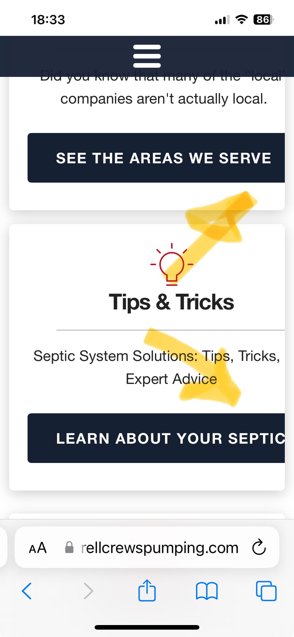
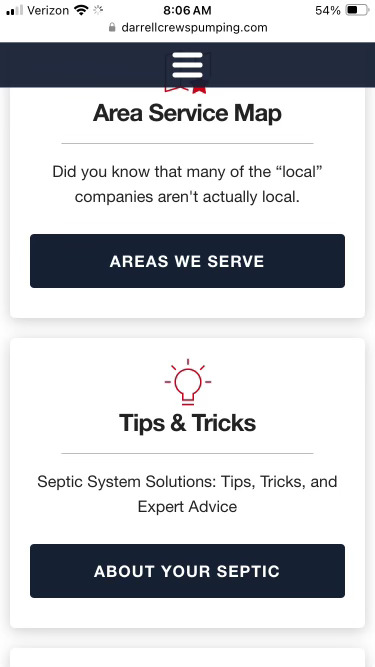
I’m really enjoying the Source framework. I just published my 2nd website using the framework and I’m pretty happy how it turned out. The site was originally built with another framework many years ago so it was long over due for a redesign. I kept the overall theme of the site but updated some elements, and added some new ones. It’s not a fancy or complicated site with a bunch of stuff going on, it’s geared toward helping a local business rank well on google in there serving area. I would love to have an extra set of eye’s on the site, if you see something I missed or see any errors please let me know. Thanks
1 Like
Thank you, I will take a look at that.
Looks great! Thanks for sharing.
That looks quite a bit smaller than an iphone 13. I am not seeing any issues like that.
1 Like
Thanks, glad you approve…lol
smallest iphone should be 375px wide, I ran a simulation and it looks fine. Not sure why it’s showing like that for you.
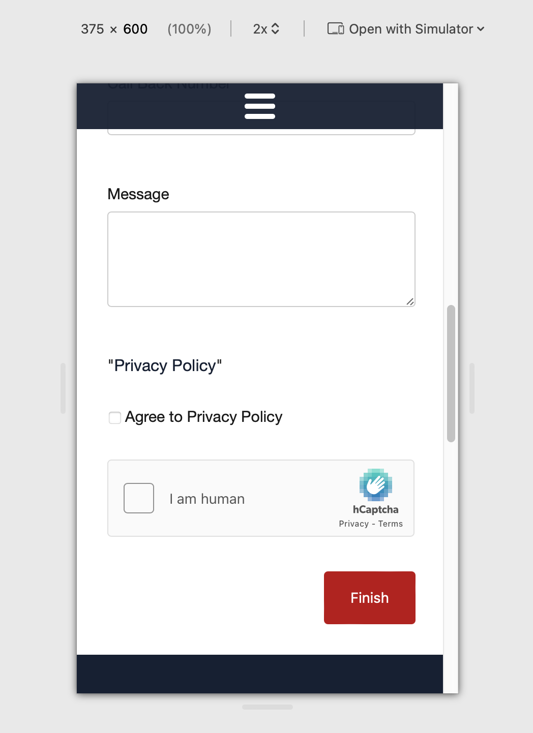
In addition to an iPhone 14, I also have an SE for testing purposes. Here’s a screenshot…as you can see, it looks great!
1 Like
I’m not seeing any issues on my iPhone 12.
No issues on iPhone 14.
Or on an SE.
Could it possibly be the iPhone 13 itself is the problem, as it includes lucky number 13?
What browser were you using?
Personally, I’m very, very, very impressed with how clean and beautiful the website is, especially given the subject matter, cleaning out septic tanks.
Almost makes me wish I had a septic tank.
Beautiful work.
2 Likes
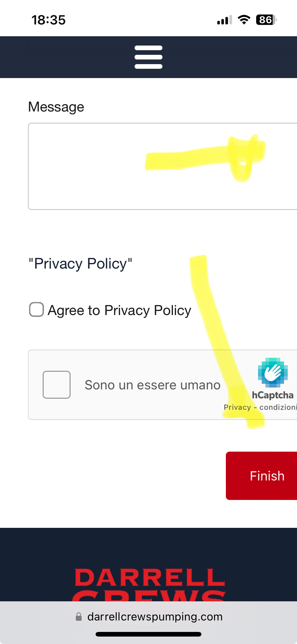
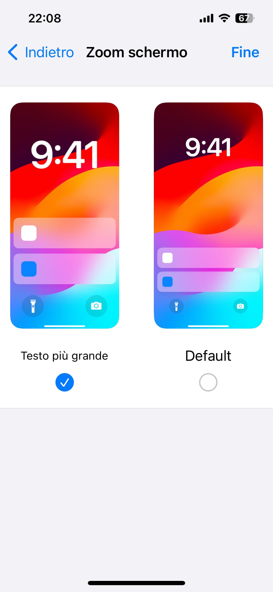
I use screen zoom on the iPhone, but now it’s fine because the text in the buttons, as you can see on the site, has been reduced.
It is always good to evaluate the zoom view because many people use this function, especially if you are over fifty and your vision starts to cause problems up close.


“details make perfection, and perfection is not a detail”
1 Like
It’s perfect on a 12 Mini.
BTW, the smallest iPhone display width is 320px (iPhones 4S, etc.).
Ignore that dumb RW iPhone simulation, which is probably the single biggest cause of poorly laid out web sites created in RW.
1 Like
Wow, People still rocking iPhone 4. lol
There seem to be people also still using Firefox 😉
hahaha, hey now, I use Firefox :)
1 Like
I’m using an iPhone 13 in “50+ mode” too: no problems in displaying (nor reading) 👍 😂
1 Like
Great site!
A little text heavy. You lost me half way through first page. Perhaps a read more stack would fit somewhere? I understand it is for SEO but it is possible to design it in a way so you keep the text.
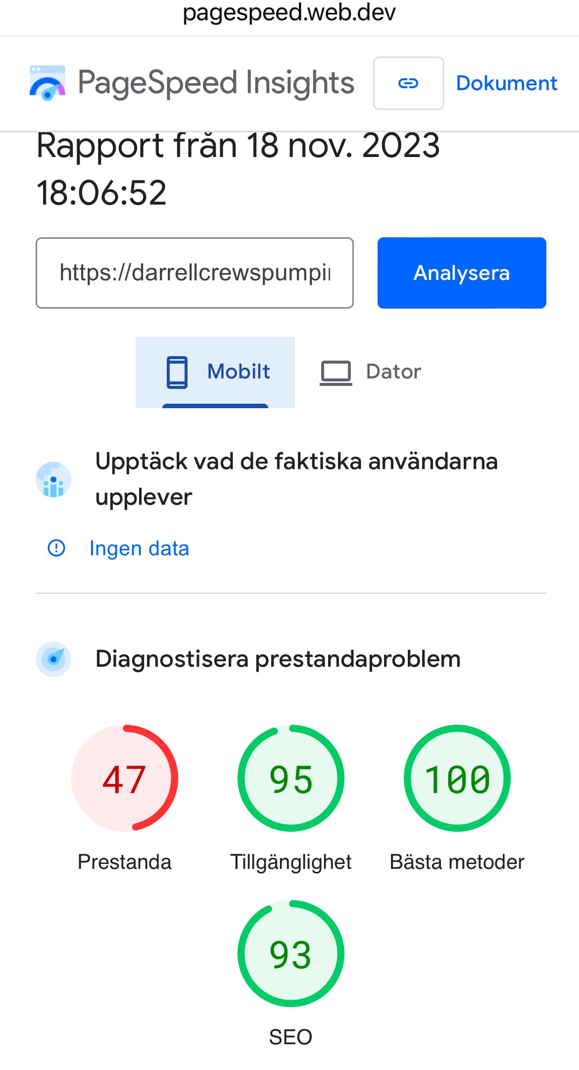
Take a look at optimisation of images. First contentful Paint is 4,7 seconds.
Run your images in Google Sqoosh or similar.