Any recommendations which universal stacks to use when switching a website to SOURCE in order to substitute these FOUNDRY stacks:
- reveal stack (animating elements when in view)
- animated divider
- mega menu
Any recommendations which universal stacks to use when switching a website to SOURCE in order to substitute these FOUNDRY stacks:
To my knowledge, there isn’t really a simple drag and drop replacement for Mega Menu. It’s a great menu stack, it was the only reason i stuck with Foundry as long as I did.
Depending on how you configured it and what you want going forward, my advise would be to make your own.
When Source first launched I played around with a new home made menus, as in, made using existing stacks: http://ci-clientservices.com/clientdev/source/
I didn’t get round to making a mega menu but it would be simple enough to do using Source stacks, maybe Button Pro & PopDrop from Big White Duck, and maybe Limelight too, also from BWD.
IMO, once you get the hang of making your own menus you will never go back to using the “one-size-fits-all” approach of most menu stacks.
There is a product coming alone at some point in the future called Menu lab that will make everything else redundant, but until then you just need to get creative with the stacks already out there.
may I ask where Menu lab will come from (developer?)
I googled a bit and found a mega menu stack by onelittledesigner:
not sure yet if I will give it a try…
besides that I really liked to use the reveal stack and the animated divider.
I am pretty sure I used to have another „reveal when scrolled in view" stack in my library - but I am not able to find it (too many unused stacks in there…haha…)
and I am pretty sure I read something about a non-foundry animated divider stack somewhere when I was all happy with what foundry offered me. can not find that stack either…
Here you go, just really quickly fired a very rough “mega-menu” into that demo project: http://ci-clientservices.com/clientdev/source/mega/
Click the blue “Button” button and a drop down opens, into which there is a two col Grid and some content. It’s rough, but is a starting point.
The blue “Button” is a BWD ButonPlus2 stack, only used it as it’s easy to add attributes to. Source buttons might allow the same, can’t recall.
This blue button launches a PopDrop set to “megamenu”. Then the content is added to it.
It’s rough, but really simple to make.
I’m not party to such info as who will be launching Menu Lab, I’ve just heard about it in passing, but I’m sure you’ll hear about it when it comes along.
I have Mega Menu from 1LD. Not a fan myself, I found it didn’t work too well and couldn’t be styled in . the way I wanted. BUT… I’m totally anal about menus, so you might be super happy with it.
I can’t recall what the reveal and animate stacks do, so can’t help on that one.
nice approach. very flexible. definitely will play arround with a similar setup… thank you!
agree with @steveb that there are good ways (mainly via BWD stacks) to build up your own menus.
I have seen quite a few Source sites using 1LD’s Clean Menu for some customised menus - it is a nice looking menu stack.
As for animations…Scrollmate2. I built this demo a while back and it used Scrollmate for all the animations.
That’s me and there is no definite date yet - it is in later stages of development though.
That was it! I haven´t used “scroll” as a search keyword :)
Hah - who else! …Stupid me!
You can create a far more versatile version of the Foundry Mega Menu type nav in Source without the drawbacks such as no control over when the Mega Menu collapses to mobile and limits to styling.
The process is to use Source’s clever extra CTA area in the nav, to display your links, icons and burger. There are a couple of approaches but the easiest way is to see all pages to not show in navigation. I.e. in each pages general settings, uncheck Show in Navigation. This will stop any page links appearing in the nav and create the room needed to add in your links.
Then add a Source Paragraph containing text labels set to be links to what ever you want. The links could be to other pages, #anchors on the same page or to trigger modals or dropdowns. So you could have for example the following text HOME PAGE1 SUBMENU CONTACT in the Paragraph text. You will need to add for every single space you want between the links. So if you want 5 spaces between HOME and PAGE1 you would use HOME PAGE1 - looks messy in Edit but works in preview.
You can use an icon such as <i class='fa fa-bars'></i>for a burger.
The dropdown menu can be created using BWD’s excellent PopDrop or for a full screen menu then use Limelight and both PopDrop and Limelight also include their own burger options. In the example above the SUBMENU link could trigger a PopDrop mega menu. You can use paragraph text with links as the links in the dropdown.
Depending on the width of your nav text, the Nav layout will need to change to a “mobile” version when the available room in the nav is too small. Once you are happy with the links in the nav, you will need to work out this page width by trial and error by dragging the sides of the preview window to this point - e.g. let’s say 600px. Then duplicate the nav layout, and set the first nav to show above 600px and the second to hide below 600px. Remove the paragraph from the second nav layout and just leave the burger icon to trigger a PopDrop or Limelight.
That will build you a super powerful Mega Menu with so may layout possibilities beyond the Foundry version.
I forgot to add this site - https://www.boxagogo.com
This was a Foundry site with a Mega Menu, but is now redone in Source. The Source nav uses exactly the method outlined above and the nav links for SERVICES TENDERING FAQ CONTACT are in a paragraph and all link to #anchors on the page. At 700px the main nav is hidden and then a new version without the paragraph text is shown that has a Limelight Launcher burger that opens the full screen menu.
Clear your cache. You must have looked at that site in the last few days.
Nope, first time hitting it today. Cache on phone cleared, still doing it.
EDIT: Yep, now getting the fixed version, I must have hit it before, although don’t ever recall doing so!
besides any possible cache issue - well done! Thanks for sharing!
I have built a tailor made mega menu for desktop today (my first attempts in source - I really like it!!!) I used a source grid stack (which I do not fully understand yet, but it worked out fine somehow) + Button Plus2 + PopDrop containing a couple of stacks building the mega part of the menu…
For smaller screens I will go for the burger opening a full page navigation I guess… so still some work to do, but its fun!
One thing though that I might get in trouble with:
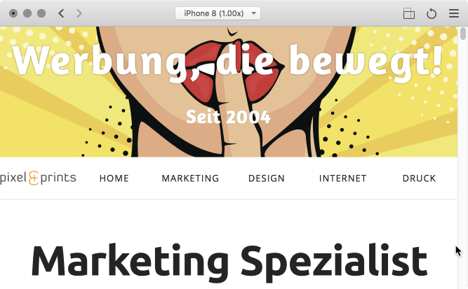
I have a full width nav bar (the source grid) containing 6 grid cells. The first contains the logo, the other the main nav links. see screenshot below from the iPhone 8 Preview in Landscape mode. You see that the logo is getting really tiny…
Is there any chance to let the logo disappear (the first grid cell) when width is getting narrower, in order to give more space for the main nav? I don’t want to end up with 3 version of the navigation for desktop / mobile AND a tablet (mobile landscape) version…
For differing sizes you’ll need the Source Grid Plus stack, and use the advanced settings to make the first column a bit larger than the rest
That is really the best way to do it though, IMO.
So many people using RW to make sites (and a tonne of devs too!) completely overlook the menu, it’s almost like an after-though, yet the menu is the single most important part of your site: Without it, no one will ever land on the pages they want!
In my opinion, most need to put way less effort into pointless effects and a lot more into navigation. The notion that one menu can work for all sites at all screen sizes is nuts.
Building three individual menus for different screen sizes isn’t wrong, or excessive, it’s attention to detail and the user interface.
Some of my more complex sites have four, or even five menu systems. My main business site has six! My basic sites tend to have tow or three as a matter of course.
Even when I was using Foundry Mega Menu my sites had at least two. This site still uses Mega Menu, but from memory it’s three instances of it, with a different one display at different screen widths using @Webdeersign Paddy Vis stack. https://www.mailshotmonkey.co.uk/
Agreed. Use Grid Plus and set Advanced settings to use a template which would be 200px 1fr 1fr 1fr 1fr 1fr if you wanted your logo to be 200px wide. What this means is that the first row col 1 is always 200px and the other 5 columns have the available space shared between them.
I haven’t tried this but you could possibly set the 200px to be 0px using one of the Grid Plus breakpoints.
Then hide that nav and show a different version without the logo below the critical screen width.
With Source being so light in terms of code and stacks settings, there is little overhead in doing this.
I agree that navigation is one of the most important aspects.
but we always have to be careful to avoid bringing up new difficulties when trying to eliminate others.
I mean: I am not sure if so many different menus might confuse users that visit our site from different devices or change browser width randomly… just wanted to say that it might fit for certain use-case to offer 4, 5 or even more menus - but not in general.