Am I missing the obvious in Grid Plus Pro

I’m sure I have missed something here… first (basic) experiments with Grid Plus Pro.

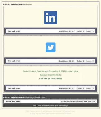
2 icons, 1 MD stack for text - I’m trying to get them to display as single column and re-arrange for 3 columns at 900px. Its not going well. I have been dipping in and out of the Source manual, perhaps I need to go home and read the demos in detail, but I want to get this finished!

The issue:
Screenshot 2021-11-04 at 16.41.29

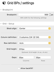
The settings, which seem to be right?


I have global passing of 50 pixels, tried increasing it, but no change. Any thoughts please?

I think you are over complicating this and doing it backwards.

Grid Plus would be better that Pro for this simple layout.

What you need to do is create a colum template of 1fr 1fr 2fr above 900px for icon, icon, text, and below 900px 1fr so that they all “stack”, and there is no need to reposition anything as it will just flow.

2 Likes

Definitely worth going through the demos in the workbook. This kind of thing is definitely covered.

  1. You should have a Grid settings / Breakpoint stack for 0px and over and have this set to have 1 column.
  2. The 900px one you already have is fine but I’d get rid of the 200px grid height as this will let the content dictate the height of the grid.
  3. For the grid items…i think all you need to do is uncheck the specify position options in them (you only need this if you want them to appear in a part of the grid that they wouldn’t normally appear in) and reset the span rows value to 1
1 Like

Thanks both 😊

Ironically, I had this setup in Grid Plus, until I started reading the Source manual. I may go back to Grid Plus, but I’m determined to make this work, to understand it a bit better.

It is looking better with the settings, but still stubbornly, 1 column. I’ll keep trying!

You are forcing the items into rows r1 r2 and r3 which you don’t need to do as they will just flow this way when the coluumn template is set to just 1fr. I.e. the first one fills the available space, then the second one flows to the second row, etc…

Thanks Gary, appreciated. I made the suggested changes last evening, but removing the column allocations didn’t work. I’ll give it another go later on

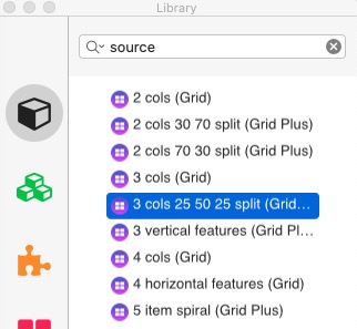
There is a standard Source Stacks Template called 3 cols 25 50 25 split that will do exactly what you want to do with 1 extra click. Unpack it and uncheck the Enable Breakpoint 1 checkbox. That would be the best way to do what you are doing.

Using Grid Pro is overkill and just not the best way to create such as basic layout. I would suggest that you learn Grid Plus first and then move onto Grid Pro once you have mastered the basics. See page 81 and Chapter 5 in the Source Workbook.

Screenshot 14

1 Like

Totally, perfectly, exactly what I wanted…

Sometimes I overlook the obvious, trying to learn the complex stuff.

Amazing, thank you Gary (and Stuart for creating this)!!

I agree with Gary that Grid Plus Pro is overkill for this situation. But… these days I use Grid Plus Pro for everything, because it makes more sense to use one tool consistently rather than a mix of different stacks (and of float, flexbox and grid). Besides, stripped down to its basics Grid Plus Pro is actually very simple and straightforward, and isn’t adding kludges or complexity to the page. If you subsequently want to set some different behaviours for an element at different breakpoints, it’s then very easy to do.

Early attempts to implement grids in RW — like Will Woodgate’s Intrinsic, which was a great start — tended to be shy of the idea of nesting one within another. If the way a grid is set up and managed is quite complex, the complexity can easily become overwhelming. The way Stuart has set up Grids in Source isn’t like this. And CSS Grid is designed for nesting (in many ways nesting grids makes a page much easier to manage than trying to deal with different levels of detail within a single Grid). I tend to have three levels of nesting on my pages: a page level (the ‘orange grid’, which deals with how the page adapts responsively and divides it into header, body and footer, which doesn’t change and is common to every site); a grid that nests within the body setting up the columns (2, 3, 4, 5 etc.) and the elements within them, which gives the page its structure (the ‘pink grid’); and element-specific grids (‘blue grids’) which specify how those individual elements, such as cards, are laid out. If it sounds complicated, it is actually really simple to implement and manage, and it keeps page structure tidy, orderly and logical.

1 Like

I was listening to a YouTube on CSS Grid the other day by Jen Simmons (‘Layout Land’) and I thought a point she made was a really important one — Grid actually makes Frameworks redundant. And it’s true: if you strip away the layout function of a Framework, what do you have left? A group of utility classes, maybe, which is useful but doesn’t demand a Framework. And in RW a collection of general purpose stacks. The way it seems to me now, what Source is, is not a Framework but a post-Framework way of doing things, based on CSS Grid (which has finally, after 30 years, brought precision layout to the web).

In the context of RW and non coders this is absolutely not sure.

  1. Traditional frameworks do not have many utility classes.
  2. Can you manage without:

Accessibility code
Typography
Browser resets
Consistent spacing and Vertical Rhythm
Buttons
Link styling
Menus

I could go on (a lot) but you get the point. Unless you know how to write good code from scratch, a framework provides many of the things that you may think just happen. Frameworks are a lot more than just the grid (in the generic sense) and the extra components (accordions etc etc).

Also, Jen Simmons does an excellent talk on where to use css grid and where to use flexbox - both play an important part in modern layouts.

I only mention that as balance for those reading who may not be coders.

1 Like

Yes, but I’m not sure it’s a question of ‘managing without’ these things: there are third party stacks to do all of them (except accessibility, which has always a bit of a weak issue in RW anyway). I’ve never been able to get on with F5’s ‘top bar’ for instance, even with TBS, and F6’s menu implementation had me tearing my hair out. How many swatches was it going to take to get it to do what I wanted it to do? (So, I reverted to using PopDrop, which has a nice animated hamburger too! ;-) )

The thing there wasn’t a good work-around for before CSS grid were the responsive multi-column stacks that Frameworks supplied. But even these struggled with layouts that were just a little more complex than ‘divide this width into four’. I found myself using SideBar to solve more and more problems that column stacks couldn’t do. But a card that consists of a series of nested two column stacks is not really an ideal solution to anything.

Grid is a watershed, really, between an older ‘inline’ way of designing for the web — which a lot of people are used to, and good at — and the mindset of people like me, with our “I want this to go precisely here — not ‘more or less’ here — and then on mobile I want it to move to exactly there…” Twenty years ago my colleagues would have said ‘Oh, that’s such a print designer’s way of thinking’ (in the days when ‘brochureware’ was a web-developer’s insult). But ‘print’ won the web. It won it with high resolution screens, and @font-face, and CSS 3.0, and delivered its ‘estocada’ with CSS Grid and variable fonts.

I’m not sure that really addresses my points, I certainly recommend that you don’t throw out Source and just use Grid, the common code provided by frameworks is a much better approach for the basic business of a webpage than a load of disparate replicative elements.

I also caution about any sort of evangelical views of any web technology. Grid itself will become a very secondary layout tool when container and element queries finish their journey through the browser validation process. The whole idea about putting content into predefined static layout elements will seem antiquated if we read back this discussion in a couple of years time. Layout elements will adapt automatically to their content ant the view context for truly dynamic layouts free from screen width imposed rigidity. This will truly break the link between print and digital output.

I would also add that it is not appropriate to selectively select frameworks from 6 - 10 years ago and bemoan their lack of CSS grid. (That situation that only existed because Google refused to adopt CSS grid as it had been developed by Microsoft and as such only IE and Edge supported it until the last few years). Modern frameworks from Barebones (that Source uses) to Bootstrap 5 all support CSS grid.

This is not the issue though, my point was that a modern web page and the framework (or not) that it uses is much much more than the layout and visual elements that a designer sees. Accessibility, fast loading, compliance and consistency all play a key role in the conversion rates that a site will ultimately deliver to its client. CSS frameworks have a role to play in that as do front end JS frameworks that are now much more ubiquitous. The real rub is that RapidWeaver is a convenience tool for drag and drop web building that creates more compromises when it comes to these discussions. Frameworks are wholly unsuited to RW as custom builds are not possible, breakpoints are fixed and unused code therefore varies from 50+% at best to 95% at worst. That doesn’t mean that people should stop using them though. RW is used because it offers a simple lego based approach to build websites for non technical people, compromises and pragmatism are therefore fine but having high level techno-philosophical debates about it is rather like discussing the design flaws of the titanic whilst sitting on an increasingly water logged piece of drift wood.

I’m certainly not proposing to throw out Source, but for me Source is post-framework (pretty much as Stuart discusses in his reasons for using it). As I see it, the justification of frameworks in RW was to move from a themed to a blank template. Back then when Joe had just launched Foundation, nobody would have thought of using a blank theme. Would it have been possible, even? I’m not sure. Ironically, though, Andrew, the point at which it did become possible to build pages in RW was with the stacks you released (and as you pointed out with Scribe, you could even build a whole website in it). With Scribe, Sections and PopDrop it was possible to create a responsive, accessible site in a RW blank theme with navigation, typography and the other things you mentioned. (Not that anyone really did, because by then we had Foundation, Foundry, UI Kit, Platform etc.)

And the thing about Grid is that it’s not about ‘predefined static elements’ — for the first time it actually gives us precise control over ‘soft’ and ‘hard’ space, and how they interact with the resizing of the window. The FR unit is a gamechanger here. This was something NeXT Interface Builder could already do in 1992, so it’s only take the web 30 years to get there. But we have finally got here. (I’d also add that this is where the GUI website building apps will struggle, because more and more of the styling of sites will be around what happens at, and around, breakpoints, with approaches like CSS locks making intelligent transitions possible). What Grid does is to provide visual structure — it’s not a nice to have, or a hygiene factor, it’s a necessity to achieve the kinds of precise, complex layouts which characterise today’s upmarket web.

As for the ‘evangelicism’, it a long game for me. If I could go back and present the web of 2021 to my colleagues of 1995 — the consultants, designers and developers I was working with then, who were constantly bending my ear about what the web was, and where it was going — they would be horrified. “Where is the interactivity? It looks like a fucking magazine!” “It’s all database driven, right?” “It’s using a CMS, isn’t it?” My point to them then, and my point now, is that it’s classical art direction which was always going to determine the web: good copy, good type, good images, with interactivity supporting content rather than replacing. There is two thousand years of evolution of visual communication which is pushing in that direction, and it’s bound to prevail. Besides, we’re all building ‘brochureware’ now — it doesn’t matter if we’re doing it in React or Vue, or in RW or Wix. Sure, we can sell also now stuff — and integrate the logic of our sites with out business systems — but fundamentally the web is a type plus images medium. Even moving image has failed to take it over. But then quality moving image content has always been — and will always be — expensive, time consuming and skill-demanding to produce. We can all make videos on our phones, but we’re not in a hurry to upload them on our websites. (Well, Joe excepted! ;-) )

They did. It was, I did it. Around 2013/14. Foundation came out not long afterwards. I suspect I was not the first. But it most certainly was possible to build a “freeform” site using stacks and a blank theme in RW before Foundation.

The site I built remained live and earning money for a good number of years before I eventually replaced it with one built with Foundation. It was for one of my own businesses which I sold it in 2018 and replaced it with a foundry site for the new owner last year. That old Foundation site lasted well.

Until that point, I was modifying themes to do what I wanted but it was a frustrating experience. So I ask about building from scratch on the old RW forum and was told it wasn’t possible, which spurred me on to do it ;-)

I Should add I believe there were two other freeform frameworks prior to Foundation, but I never saw or used them.

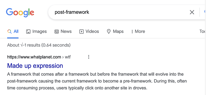
Well, its all gone beyond me. I had to resort to google

3 Likes

I used Blueball Design’s Freestack and Freestack Responsive before Foundation came along.

The “game-changing” blank stacks theme that forever changed how RapidWeaver® sites were created back in 2010, is a full featured RapidWeaver® theme* with extensive theme variations and theme styles, that comes with 26 stacks to build your site pages with. All for just $19.95!*”

I some ways Source is the modern reincarnation of what Blueball offered in 2010 all for $19.95.

I regret not trying out Blueballs Freestacks when I started out using RW. I recall that I couldn’t understand what it was, what it could do and there didn’t seem to be any examples of what it could do.

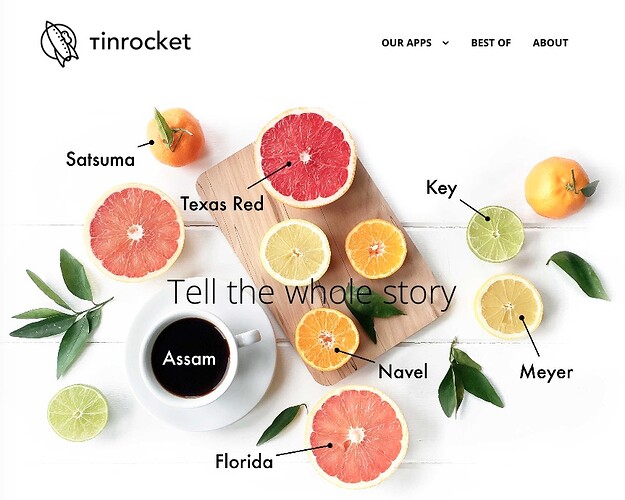
Below is a fantastic example of what could be built with the Blueball “framework” that looks like it was built today. You can tell instantly that this site wasn’t built with Foundation or Foundry by the way it behaves.


https://www.tinrocket.com

Charlie Lockhart was ahead of his time - I was just checking. I purchased FreeStackResponsive in 2013, as an update from the original Freestack that I was using from 2010. Interesting to see his site is still up and running.

Warning - DO NOT CLICK around other links. Some domains have been re-sold…