That works well - really quick too. One suggestion? I’d make the site title a bit bigger on mobile. It just feels too small in relation to the rest of the text to my eyes.
Here’s a recent one I did with Source
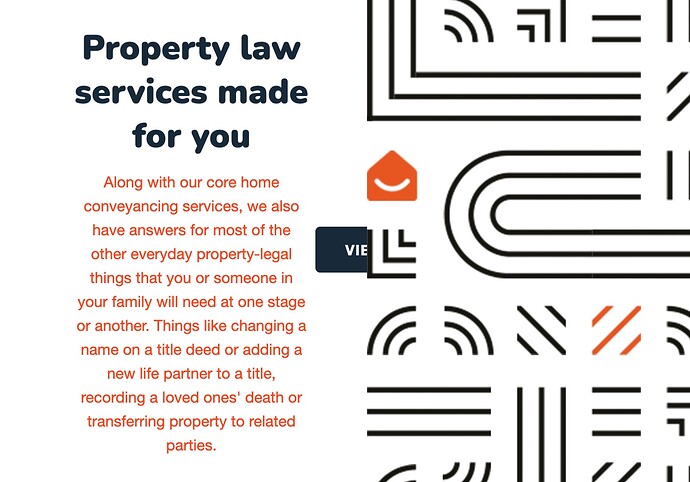
Very nice. I’m seeing a glitch with that button on the home page though. Using Chrome under Catalina.
Really nice site. Love the colours. Thanks for sharing!
To add the padding in your first section (the ‘Conveyancing is complicated’ one) I would add a container plus stack to the grid item and use the advanced padding option in that as you do not want/need big padding on the left on small devices). Another approach - especially if you wanted to re-use this padding set up - would be to use the Container Base stack to set up your required padding values. These can then be applied to the grid item via a class name.
Other thing i would recommend is to change your nav colours to match the rest of this site - i.e. maybe make links the same as your accent colour and the active link be the same as the secondary colour (i should really add an easy way of using these colours for the Nav items as opposed to having to pick new ones!).
Great site and good use of colour and space, and you have succeeded in creating a site that doesn’t look like a RW site.
