The site looks fine to me, but accessibility to your target audience is important. What I would say is that Source has excellent colour control and background control with the Container Base system where you can have 2 backgrounds per base, and up to 999 bases. This makes it really easy to choose colours, and by trial and error arrive at your final colour combinations and adjust if necessary.
To my eyes this site looks really good but perhaps some of the text in the header sections (over an image) may be hard to read for some. I think most/all key text is perfectly readable though. Difficult for sites like this that have to look so good to balance things like this perfectly.
I wondered who made the beautiful Kitchens site - really great work!!
If it is the one I think you mean, it was created by Mike at YourSpaceLiving.
Oh dear Gary, I was reading too fast, not concentrating! Yes, very nice work by Mike!
Here’s a lovely Source site created by Richard Lin at Showcarperfection.
I am biased of course as Richard started with my Project24, but this is exactly the type site that P24 was created for. It uses Poster2 to dynamicaly create each item page.
3 Likes
Thanks for sharing my site, and for all your amazing and fast support! This was my first time making a Source site and I learned so much! I still don’t have the fine control over everything that I want but I’ve had nothing but amazing feedback on the site from friends and colleagues. Please keep making more Projects available. I have 2 other domains to redo now.
2 Likes
I realise I’m late to the party on this thread, but here are a few more Source sample sites. All are one-page sites, and all except one are in Japanese. But they’re a bit different than most of the other examples posted, so I thought I’d put them up.
Sushi restaurant
This was the first site I built with Source. The chef is an avid longboard surfer, so I designed the site to reflect his interests. In addition to Source, I used a BWD Mouser stack for the top banner scrolldown button, a BWD Scribe stack to float the logo in the top-of-page intro, a 1LD Horizon Parallax stack for the ‘chef at play’ surfing photos near the bottom of the page, a S4S ShareStack for the Twitter and Facebook links, and a BWD Limelight lightbox to display the “surfing dog” video that can be opened by clicking on the red button at the very bottom of the page. (The dog is saying, ‘Gimme a free serving of tamago-yaki!’ and is accompanied by text telling customers to display the dog on their smartphone and show it to the chef to get a free serving of sushi-style egg omelette.) I also used BWD’s Pro Styles stack to give the surfing dog the same ocean background as the main site.
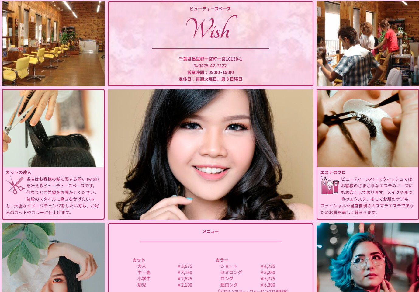
Hair & beauty salon
Source Grid Plus with a couple of BWD Scribe floating image stacks for SVGs. This one was a freebie for a friend, so I cheated a bit and used a number of pre-built Source grid components. A super-easy build.
Stained glass art
Another freebie and an easy build. Basically Source, but I used a Joe Workman Impact stack for the top banner, BWD ButtonPlus2 stacks for buttons, and BWD Limelight lightboxes to display the lamp, accessory, and stained glass window examples (set to autoplay with no controls because the controls overlapped the photos on mobile devices).
Autobody & fender repair shop
Basically Source, with extensive use of utility classes to ensure better alignment at various screen sizes. Also used BWD Limelight lightboxes to display alternate views of ‘this month’s used cars deals’, as well as the privacy policy, and a BWD Pro Styles stack to give the privacy policy the same background as the main site. The animated illustrations are JSON-based Lottie files.
Advertising agency
I made this one right before Stuart introduced advanced font control stacks for Source, so I used BWD Scribe stacks with Fluid Type child stacks to fine-tune the text display in both Japanese and English. The ad samples are displayed in a custom Splide slider that I learned how to build by taking Stuart’s excellent RapidWeaver Academy course. The site was designed by the client, who wanted the three ‘white circle’ top banner buttons to be positioned precisely half-on and half-off the banner at all browser widths, on both standard and UHD monitors. In the end, I was able to satisfy that requirement by specifying the buttons’ vertical position in pixels, which seemed like a kludge, but it was all I could come up with at the time. I also made considerable use of BWD Magic Marker 2 stacks to ensure correct ‘scroll to’ positioning for items selected from the navbar, which also came in three different heights to allow for proper UHD display. I used the S4S Gateway stack for the privacy policy disclaimer, and a BWD Limelight lightbox to display the policy itself. One other feature of this site is the javascript used to detect the visitor’s browser language. If the browser language is Japanese, the Japanese-language page is displayed; if not, the English-language page is displayed. If the visitor switches languages after entering the site, a session cookie is set to remember their preference until they leave.
Many thanks to Stuart for developing the Source framework and the RapidWeaver Academy courses related to its use. There is a learning curve to unlocking the full power of Source, but if I can wrap my 70-year-old geezer brain around it, it should be child’s play for all you kids (by which I mean everyone under 50 ;-)
I’d also like to thank the ever-generous Andrew Tavernor of Big White Duck, who offers truly amazing stacks to the RW community at no charge, as well as the most entertaining alternative to ipsum lorem I’ve yet encountered.
4 Likes
Hello
Nice work.
There are some missing pictures on Wish’s site
Hi Dom, and thanks for the heads up! I can’t seem to duplicate the problem here. Is the missing photo right below the top-of-page “Wish” logo? (see attached screenshot) That’s a Joe Workman Impact stack (that I forgot to list in my writeup) with a slideshow of images. If that’s not it, can you describe roughly where on the page the images seem to be missing? TIA!
I just tried now and all pictures appear. Maybe I did something wrong. I clicked on the link on Safari.
But it works now :-)
Great collection of sites @lehmanad. Thanks a lot for sharing!
And great work on building your own slider too. Really impressive.
Super sites that are very original. Well said about Stuart and Tav.
A recent Source site, thanks to @habitualshaker and @Jannis for giving me the great tools to build this!
4 Likes
Using Chrome, that messenger pop up is way too aggressive. It’s popping every few seconds for me. And keeps coming back even when I try and dismiss/minimise it. Makes the site unusable for me.
Rob, that is really helpful, thank you.
I personally hate FB with a vengeance and have thought about taking it off - however a friend of mine is getting half of his business via it right now, so I am torn. Being FB, the possibility of controlling it are zero. I will take a look and see if I can reduce it, or simply restrict it to a couple of pages.
Thanks again!
Update - now only on the contact page. TBH I am so tempted to close down fb totally, to say I hate it is being very polite
1 Like
I don’t think there’s anything wrong with having the pop up. It was just too aggressive and most importantly, I couldn’t dismiss it. I wouldn’t have any issue with it on the home page for example, if it appeared once and I could then either engage with it or dismiss it. On mobile for example, it looks great. Really like the site by the way.
1 Like
For me, one of the biggest attractions of Source was precisely that I was building sites that were 90% BWD! Why carry a framework’s large burden of unused classes, when all the heavy lifting is being done by a few tightly coded stacks? So while it’s interesting to see a 100% Source site, it also raises the question: “But why?” There are great third-party galleries, modals, lightboxes, forms and other things out there. The problem with a framework is the question: “can I justify using a third party stack to do what is already coded into the framework?” With Google penalising load times, that’s a big question. With Source, it’s easy: there are no forms, modals, or lightboxes built in — so take your pick!
1 Like
Source is so clean and fast, I wouldn’t consider using any other framework.
1 Like