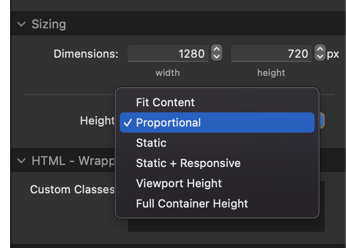
A village hall client is looking at changing their booking software and this should be embeddable as an iframe (not a full iframe page however). However, if I leave the code at width and height 100% most of the calendar does not show. if I set the width and height in pixels, it is fine on desktop but no longer responsive. I could display 3 different instances for desktop, iPad and mobile but its a bit of a botch and I’m sure this can be rectified with some custom CSS.
iframe code is as follows (actual name redacted for security):
<iframe src='https://hallbookingonline.com/xxxx/plugin.php' width=100%' height=100%'> </iframe>
looks like this:
Any suggestions? Thanks

