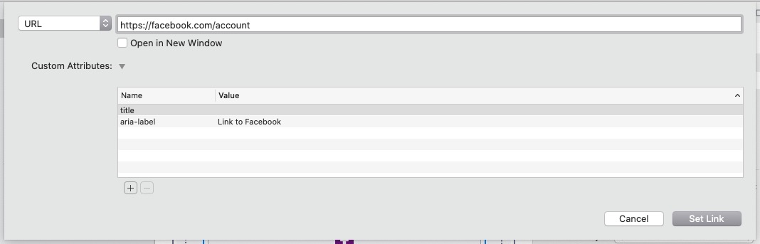
I created a general web design blog article questioning the need for so many icons and also adding in aria-labels to address Accessibility. The specific solution for Stacks users is to add the aria-label into the standard Link dialogue box as shown below for a Facebook icon:
4 Likes
Thanks for sharing how to add aria-labels to links. When it comes to accessibility, we can always learn more.
I think there are still many, many valid places to use icons even or especially in 2022. Since more and more people experience the web on their mobile phones, icons are well established and understood by their users. Both phone apps as well as in phone-sized web pages use icons galore, where a descriptive text simply doesn’t fit.
1 Like
Absolutely. Icons, correctly labelled, are ideal for small screens where there is not enough room for a single row of text buttons.
I was referreing to what was andstill is, a common practice of adding icons where they they don’t add anything of real value, e.g. buttons. Just because a stack has feature to add an icon, rarely, if ever, means that it makes sense to add an icon.
Such stacks, e.g. most buttons, work in the opposite way to the way they should work. They should have an option to remove the text and switch to an icon on small screens. Using an icon and text in a button requires more space than just text.
I don’t often disagree with you, but I do on this subject. :)
Not everyone is textually oriented: some people are visually oriented instead or have trouble reading. Icons are a life safer to that group of visitors. Case in point: iconography at train stations and airports: imagine having to READ all of that info, instead of looking at the icons. That’s true for (amost) everyone, but visually oriented people are simply overwhelmed by too much text without visual cues. They just want to focus on the graphical element of the data in front of them (i.e.: icons).
The buttons near the bottom of every page on this forum (share, Bookmark, Flag, Reply) are another good example. Removing those icons makes orienting yourself more time consuming; now tyou can see what button is what at a glance.
So no: icons are not 2015; they are very much now.
But I do agree with one thing: not all buttons need an icon. A “Submit” button underneath a form should be big an a confirming colour (i.e. green, not red; unless the action is a negative). The colour and the position (at the very end of a form) already conveys its meaning clearly. No “paper airplane” icon necessary.
Cheers,
Erwin
Icons on text buttons are redundant, but I’ve grown to quite like them. A paper dart on a send button, or an envelope on an email link, don’t really add anything but they can make the button more visually interesting. Likewise animation on hover. The problem is making users download a huge icon font just for a few visual touches (and likely some stack is already causing FontAwful to be downloaded). I was thinking of adding the half-dozen or so icons I use to the fonts I use: I know that’s not an answer for everyone but there are some simple and relatively inexpensive font editors available which enable this, and also stripping unnecessary characters out (as a Glyphs user I’d definitely plug Glyphs Mini).
I’ve just shown this thread to my friends son who is a UX Engineer (don’t blame me or him for the title) for one of the largest web and app design agencies in the UK.
He pretty much agrees with @Erwin-Leerentveld and they use icons all the time to increase clicks and guide users through the app. This includes icons on buttons but also just icons next to text as a standalone link. He was actually more scathing of the use of “old fashioned” buttons than anything else!
Admittedly they are mostly hand drawn bespoke icons for each project that match the style but he was adamant of their importance from real world behavioural data.
I must admit I was a little surprised but I think I’ve been turned against them by the horrible (but easy to implement) icon sets such as FA and Bootstrap icons etc.
But sometimes redundancy is not a bad thing (not just servers and storage or making sure you have two emergency pizzas in the freezer at all times).
I do think that the obsession us webdevs have with keeping page sizes as low as possible sometimes gets in the way of usability.
Webdevs should never make the mistake to take themselves as the sole frame of reference for the site’s visitors: boatloads of people have trouble reading, or have trouble focussing when faced with large amounts of textual information; some people start reading where-ever their eye may land and not at the beginning of a paragraph or even sentence.
Any visual cue makes life a lot easier for them. And even when you’re not impaired, having to look between twelve blue buttons for the one that says “download” is a lot slower than to scan for a floppy disk icon.
Cheers,
Erwin
My original article was more about not cramming a web site with FA icons, just because you can, with a single click of a stack setting. That can get messy, because not all stacks have access to all of the icons, e.g. such as Foundry’s reduced set of FA4 icons, and some icons such as TikTok, is missing in FA4. Or as they say in the Icon world, pre TikTok. Some stacks offer other icon families that are easy to select and then you can have a mix of unmatched icons.
RapidWeaver doesn’t have an elegant simple way to add a reduced set of just the exact icons we want, but we can use SVG images for icons without too much difficulty.
@tav Web page development using a non WYSIWYG pagebuilder using relatively simple off the shelf stacks is a very different world to creating App using specialists UX designers.
I wish we all had access to that.
@Erwin-Leerentveld I rest my case - what the hell is a floppy disk and what does one look like. Shouldn’t there be an eject button to eject the floppy first? Perhaps you should show a bank of buttons from Paper Tape reader, Winchester, 5 Inch disc, etc.?
There lies the problem with some icons. They don’t mean the same to everyonewhen the text DOWNLOAD does mean the same.
@jamessouttar Adding a “Glider” icon to a send button could now be interpreted as a “Drone” by some. Changing times - mixed messages.
1 Like
They do websites and web apps (dynamic pages). The visitor experience should be completely divorced from the tool used to make it.
But if people are charging for websites then it is simple enough to do regardless of whether RW/Stacks is being used or not. It is not acceptable to charge people for a substandard product period. It is trivial to create a small icon font (as per the instructions I gave @TemplateRepo) - if someone can get out of bed and turn on their mac then they can manage that, even if they use RW :)
Your original point however was spot on. When people use icons (and anything else) they should consider accessibility. On this note, I would encourage people to use Lighthouse to analyse their pages and not PageSpeed Insights. Lighthouse includes accessibility as well as page speed and is a lot more representative of how Google will rank the resultant page.
As far as I can tell, Google PageSpeed Insights now incorporates Lighthouse. I may be wrong and tomorrow Google may scramble it all again.
Also I noticed they started flagging missing aria-labels recently.
Lighthouse audits a lot more than page speed insights including SEO, more detailed image suggestions and PWA performance (of which several stacks now exist)
In short Lighthouse gives you an much more accurate audit of how your page will perform in the Google ranking algorithm (which is the only real point about measuring and optimising these things.)
@tav I have been using both, quite a bit over the last 18 months or so.
They are now almost identical on a top initial level and both provide the information needed to build better web pages for speed, SEO and Accessibility. The results also match and hightligh the same issues that they both find. The Best Practices result seems a bit fickle in it’s results but may provide more meaningful data in the future.
I think PageSpeed Insights provides a more useful 2 pages or results, one for Mobile and a Desktop set of results which I find gives additional information. Generally, the mobile results drag the combined result down and IMHO achieving a 100% mobile result in the real world, requires some content butchery but still provides a most useful indicator.
The results for both effectively look the same after the resent changes in how they work.
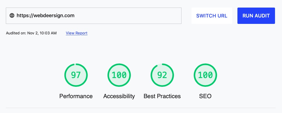
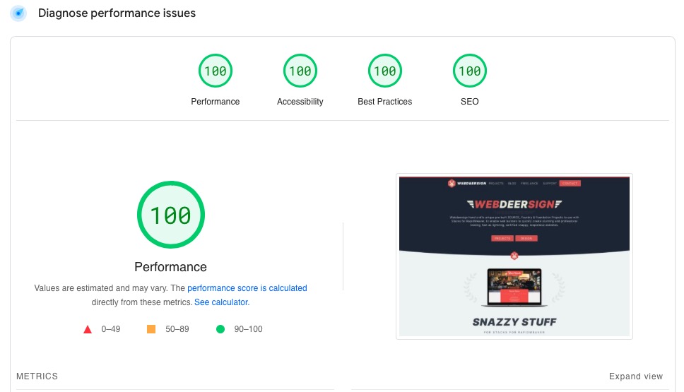
Lighthouse result below:
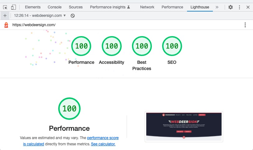
Lighthouse from inside Chrome Inspector, Desktop selected (note the twinky animated confetti):
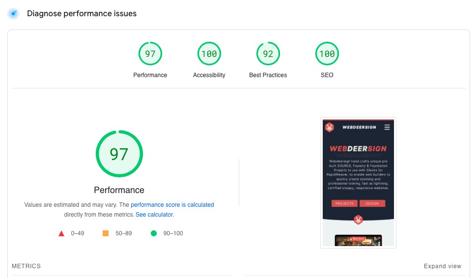
PageSpeed Insights Mobile result below:
PageSpeed Insights Desktop result below:
I just went on the Google specs and recommendations for the two services - they advise that Page Speed has no SEO component and it should be used for debugging and optimisation, Lighthouse should be used for final page/site analysis w.r.t ranking. Lighthouse also gives more image optimisation suggestions.
Given that we are talking about RW and that users will only be interested in testing for ranking / SEO purposes and optimising their visitor experience then I think that Lighthouse should be the recommendation to users of this forum.
1 Like
The information that I see when I Google “Lighthouse” and their current reccomendations I see, are to use PageSpeed Insights which Google says incorporates Lighthouse. Web.dev suggests PageSpeed Insights.
My images above show the same SEO results for both so there certainly is (today) an SEO component. SOunds like Google specs are not up to date. Google can and do make some great stuff, but sometimes trying to navigate around them can be a quagmire of a puzzle.
Excellent discussion starter and a good discussion to boot. Plenty to think about here. I have one site that is full of FA5 icons which the client likes but, for me, there are simply too many now. The client liked the idea of an icon for each menu item but as the site grew, it meant I was trying to dig out icons for a menu that didn’t naturally have one. Plus, on a mobile, I had to reduce the 3 CTA buttons size to squeeze in the icons - along comes the Google alert ‘buttons too close together’. A lot of time and effort for a result I’m not sure about.
Icons everywhere is a real challenge and effort to keep up with the space available and the selection process of an icon to match a menu text item.
Incredible to think that pre-TikTok FA4 doesn’t have icons for Vegan, Vegetarian, Allergy, Nuts or Virgin Atlantic Male Hostess’s in skirts. There is a however the Genderless icon which to the untrained eye looks like a circle borrowed from another icon.
FA5 is not much better with no Vegan, Dark Mode, Light Mode or any of the modes, icons.
I think that icons can be a good idea but it depends on the sort of site content. My book publishing site contains a lot of rather old-fashioned books and I think icons would jar with the content. Similarly, I use an old-fashioned font, EB Garamond, rather than some jazzy sans serif.