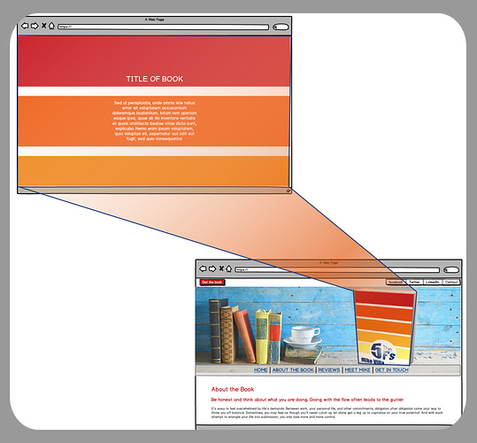
Suggestions on how to create the first part of the iOS 13 website? I love the way the background becomes (or is) actually an iPhone, once the page is scrolled. I’m designing a website now for an author - I’d love to do something similar with his book, as shown in the screenshot below. Initial landing page would be the book with some text; the text would disappear as the page is scrolled and the image would come into focus as the book. Doable? Of course, it’s essential that it look perfect in mobile devices, too.
Scroll Mate from BWD
Absolutely, ScrollMate for the win.
- The text moves up and fades out early in the scroll.
- Next, The image of all the phones starts scaled up and then scales back to 100%.
- It fades out to reveal an identical dark mode image that completes the scale to 100%
- The image of the icons then fade in with a subtle scale.
I’d suggest that the png of the icons would be exactly the same size as the big image of the phones, this way positioning wouldn’t be an issue.
On mobile its nothing at all fancy. No animation at all that I can tell. Just a pretty regular looking site.
I wonder what percentage of visitors are on mobile? High I suspect.
Interesting, it’s working on my iPad (tabletOS 13)
I see the animation on my ancient iphone
Thanks, Paul,
I knew Scrollmate would be the solution - I just hadn’t worked out how. I think I can do it now.
Cheers
Maybe iOS and that site are optimised to work together?
No point Apple putting in the effort to get it to work on Android, they know its users already had the new iOS features two versions ago.
:-)
That animation doesn’t work on iOS 12. So if you only have an iPhone then you have to already have iOS 13 to see the full visual impact of the iOS 13 site. I don’t think Mr Jobs would have approved that.
I think Mr. Jobs would be happy with anything that made money.
I do love the way he is referred to as someone who cared. He cared about profit, little else.
Most of his alleged genius was stolen.
He was a genius marketeer, little else.
(Cue someone mentioning the “fact” he never drew a salary.)
I’m not anti Jobs, but he was a dreadful human being.
(Sorry for going off topic).
I wasn’t suggesting he was a wonderful human being, but he did sweat the details, and I admire that side of him.
I know, sorry, I’m just grumpy.
My little (opposed to medium sized) dog did his cruciate last week, had it rebuilt on Thursday, he has to be monitored 24/7 for the first while, and as everyone else is still at work and I’m meant to be on holiday, means its falling to me.
Being still a pup (2 yrs) he of course doesn’t understand and just wants to run, and jump and play with the others, so I’m exhausted keeping him safe!
Suggest all posts from me are ignored for the rest of the month.
There is also a pretty ugly, initial flash of the image with many iPhones under the coloured image, when the site loads.
Also when did that new top left “burger” icon become a thing? The burger with no meat icon - just 2 horizontal lines? Apple must be confident that Apple users will know that it is indicating a menu.
Not so slick on Win10 Edge where it works but is nowhere near as impressive as on a Mac or perhaps it needs more power for the full smooth effect.
Firefox/ Windows and there’s no animation whatsoever.
Apple must be using so hyper specific coding to only target certain devices/combinations
I made this as a christmas present for @bret in 2014 - its all very old hat now!
(I have just updated the image updated for Catalina)
Scroll the page
https://test.bigwhiteduck.com/ap/
I remember that very well.
The original BWD logo - things were a lot more simple then (and more enjoyable)
That’s pretty much exactly what I’m looking for, with the exception of having some text that scrolls out of view. Is the Catalina image a background image, or an image stack within a ScrollMate 2? Any chance you’d like to share the demo?
Very old hat perhaps, but exactly what my client is looking for. He loves the big bold colors being present upon landing on his page, and then that scrolling out of view while, at the same time, his book scrolling into view. Sort of a cross between my initial thought and what I thought looked much more professional. (He likes the initial landing page much more than my reworked page)
I’m rewatching your SM2 video now, by the way. :-)
The trick is to use 2 images. One scales down and is fixed. It then disappears behind the normally scrolling version of the same image which then scrolls up the page with the ever smaller original one behind it.
I did the demo manually with a bit of code as I can’t be bothered with setting up all the margins and sizes manually. I’m happy to help if you want but lets do it manually and not with an horrendously complicated stacks setup.
You can actually see this happening if you scroll slowly as I’ve changed the size of the image when I swapped to the Catalina one - I didn’t bother adjusting the margins on the normal image so it is just a little high when the scale down image goes behind it.
