So I’m updating everything on a site and using webp for the first time. I have a full screen image that’s currently 1920 by 1080. Do I double the size for retina?
So 3840 by 2160? Seems awfully big.
So I’m updating everything on a site and using webp for the first time. I have a full screen image that’s currently 1920 by 1080. Do I double the size for retina?
So 3840 by 2160? Seems awfully big.
Hi @aidy,
“Retina” means that the resolution of the screen is 220 or more pixels per inch. Smaller Retina screens (13" machines, iPads and of course all models of iPhone) are 220 pixels per inch or over, but nowhere near the 3840 x 2160 you propose.
3840 x 2160 is indeed awfully big and your pagespeed score will plummet if you use images like that (except in a modal or lightbox).
It’s best to test several sizes out and see what looks acceptable, and don’t make the mistake that everybody has a Pro Display XDR or any kind of 4K screen. And if they do, how likely is it that they’ll maximise the browser window on displays that size?
Cheers,
Erwin
Hi Erwin,
Good to hear from hear from my friend,
My thinking was, based on what I can gleam from the internet, is that 640 mobile width becomes 1280 and so on. 2X basically.
So for large full screens my math should be correct. Just seems off to me.
Yes I should experiment, just asking those who know better what they do
Aidy
This is a good case for the approach I‘ve described in the hero image thread. The fundamental question is: does all of your image need to be in totally sharp detail? Obviously there are images that do: a map, for instance. But with most photographs the depth of field is limited, and only a portion of the image is in sharp focus. If you can separate the sharp detail from the background, the background image can drop down to something like 1270px with compression and be plenty big enough. Then you can have your detail area super-sharp at retina quality resolution.
[If you’re not using Source, you can do the same thing with a layer stack — DeFliGra have a couple of good ones, at very affordable prices.]
Hidden behind Cloudflare if that makes any difference
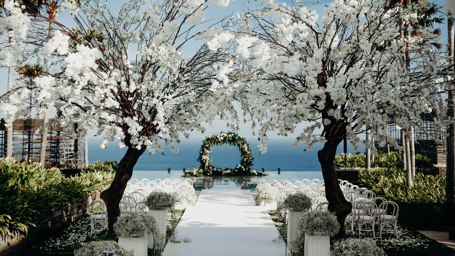
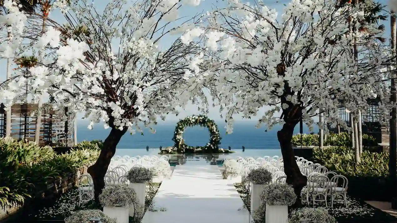
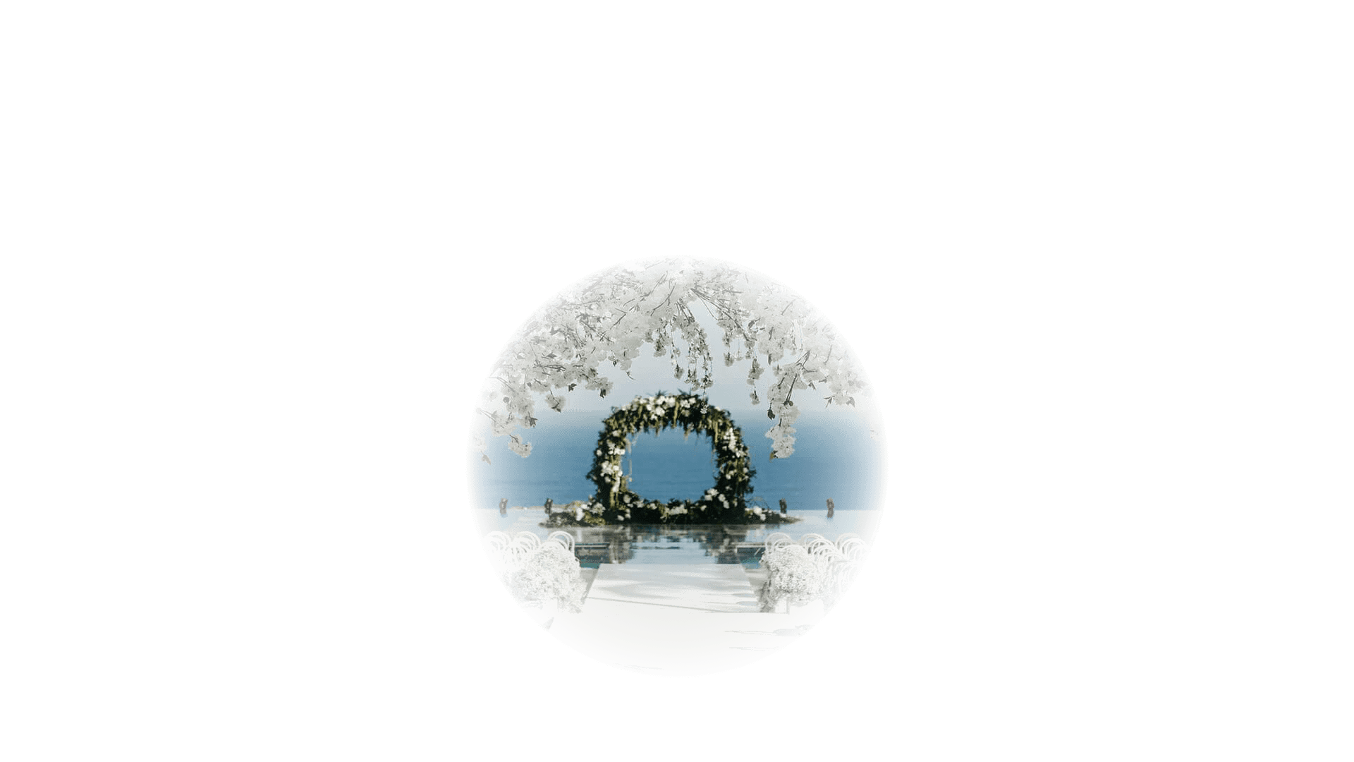
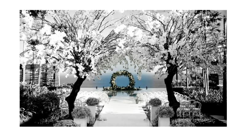
Was experimenting, but can’t show how it would work without a hi-res image to work from. The image here compresses to 97k at 1270px with wepb and no great degradation of detail. What I’d like to see is what happens if we take a circle based on the focus of the image and make it a radial gradient mask, so that the centre of this area is in super sharp detail (and the detail fades gracefully).
Don’t take this the wrong way James, because I’m always very grateful for help and pointers. But I’ve got no idea what you’re talking about.
Is the a PS thing?
Aidy, a demonstration is better than an explanation.
I’m talking about a sandwich between a low resolution image which fills all of you image area:
Like this one, resized to 1270px width and compressed with webp — now 97kb in size, rather than the 514kb of your original;
And a high resolution image which contains only the focal detail of the image (and, by virtue of being mostly transparent, can be a relatively small file), like this one:
Which is 135kb.
When one is laid on top of the other, the high-res image provides the fine detail at the focal point that the background image is lacking (now fuzzy with compression, out of focus).
It’s a solution to the problem of a hero image that ends up being a huge size to take advantage of high resolution screens (like retina), takes forever to load, and is punished by Google. And all most people are going to notice is the detail at the focus, which draws their eyes.
Your image actually compresses really well, and there isn‘t that much difference between the detail at the focus on the original and the background, so the demonstration doesn’t show this as well as it could.
Hi @jamessouttar ,
Out of curiosity (sorry… reading along here); which stack would you use to “stack” these images on top of each other?
I have Foundry and all expansion packs.
Cheers,
Erwin
Sorry for not getting back earlier James and Erwin - I have a bit of a situation going down. Let me reply properly tomorrow.
You can’t build these type of layouts with Foundry. The only way to build these controlled layered layouts using Stacks, is to use Source. Source has CSS Grid baked into it, but the really clever thing is how Stuart created such a rich way to maximise CSS Grid using the 3 stacks and also facilitate using everything else, that Source provides, inside the grids. Also AFAIK Foundry has no fallback webP image support.
Also, be aware that the entire Source framework costs less than a single Foundry Addon pack.
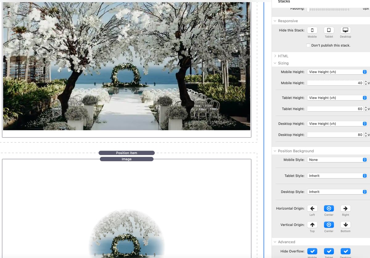
You could use the Position stack to overlay the images as described above. It can do a lot more, but it can also stack images without any offsets.
You can do this with a layer stack — DeFliGra’s Multi Layer is a good one, and only $10 (https://www.defligra.com). You could probably also do it with a SectionsPro (I’ve not tried) with the background as a background and the foreground element in the stack. But, as Gary says, it’s the way Grid is integrated into Source which makes a huge difference. With a layer stack, it’s still part of the flow, while using a Source grid stack allows you to integrate a layered element into the layout in a coherent way.
@jamessouttar Thanks, that works!
See the result below, built in Foundry’s Position stack. For clarity, I applied the inkwell filter to the bigger of the two images, so you can see where the smaller image (the top layer) is.
Settings:
Thank you for the explanation - I understand. I used to have the layer stack years ago, I’ll see if I can find it.
Never even considered doing anything this way so it’s a new way of working
Couldn’t get the Layer stack to work as when it resized the images didn’t resize well together and became offset. I’m using F6 as I built in that years ago and don’t have at the time rebuild in a new framework, I do fancy doing the site in Source but again it’s having the time to learn all over again.
I did get it to work in Sections Pro, one inside another and setting everything to background images. Then i realised I only needed one SP and a layer child.
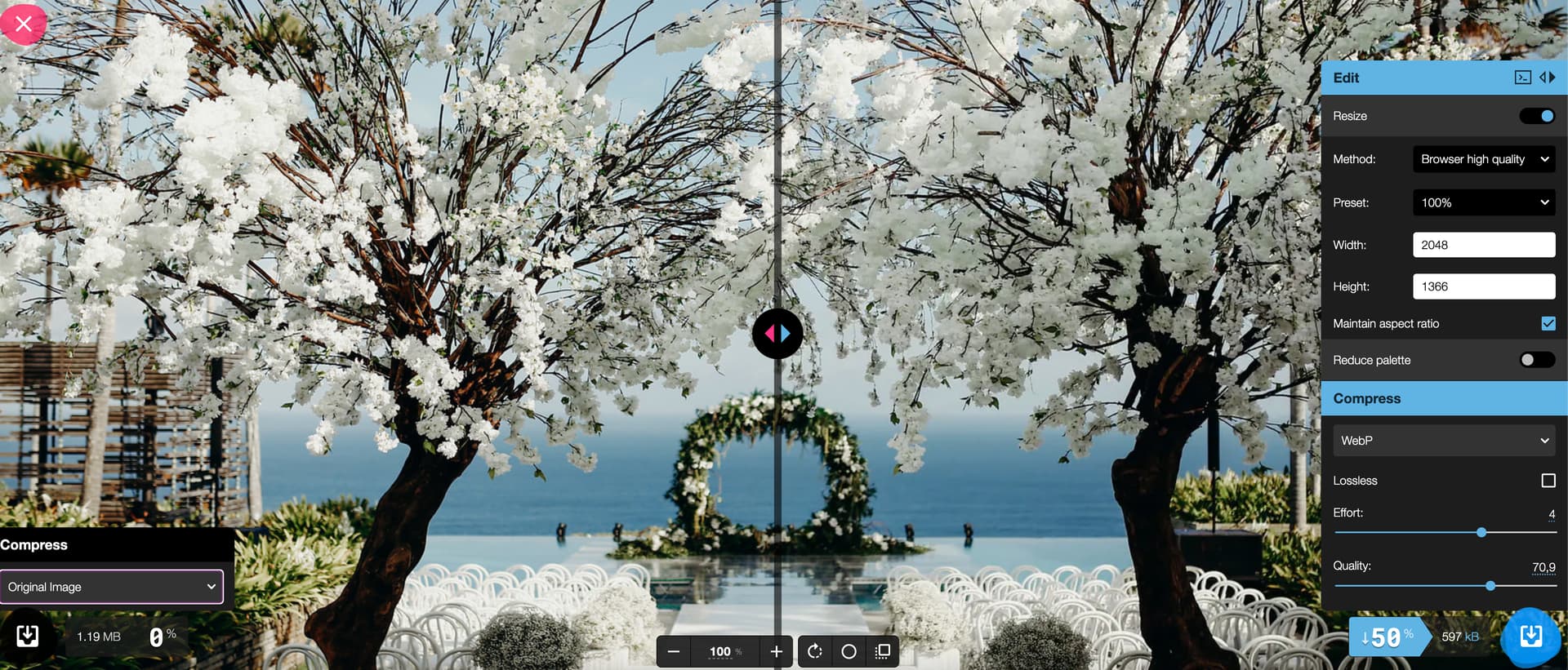
One question about converting and compressing jpg to webp. Excluding the image focus overlay option above. As you can in my attachment its dropped the size by 50% but still above 600kb
Your image, apart from being a perfect money shot, is a pretty complex image with a great deal of small areas with subtle gradients, in the leaves/blossoms for example.
I woudl suggest starting with the original image inSqoosh set to 75% and check the size for jpg, png and also webP images.
If teh webP image isn’t teh smallest then forget using a webP version and then focus on the smallest of the jpg or png images. Yes png versions can sometimes be smaller than the jpg version.
Then play with the slider to reduce to the point where you are happy with the appearance and use both a webP (if smaller) and the jpg or png as the fallback.
That approach will give you the smallest possible download for that image at that dimension.
Alternatively, alter the site to use a fixed image size to equal the main page width to make a significant size reduction.
Personally, I think that image would be just as stunning at a 1100px width.